Illustrating for learning
I have written previously about how learning design is fundamentally connected to the idea of creating a hospitable learning environment.
Once the structural aspects of a course are in place, and I've spent some time creating a variety of support resources - I usually round things off with my favourite part of the work: making hand-drawn illustrations. While these might not be absolutely foundational to learning design, they occupy a really important place in the finished course.
A unique function of illustration is to illuminate meaning. This becomes particularly relevant within an educational programme where conveying ideas and helping people move forward in their understanding is of paramount importance.¹
Illustrating the idea of unwitting, institutional racism.
Done well, illustration functions a bit like an athletic neighbour stepping in to unload the shopping when your tottering legs are feeling a little frail. It’s able to do all sorts of heavy-lifting bringing relief to the course text.²
This all started for me in my work as a high school teacher where I would scribble spontaneous whiteboard illustrations to assist verbal explanations. I love the creative energy associated with those moments - something which I have self-consciously carried into my illustration and learning design projects. Keeping it lively and loose - channelling meanings visually - has a rare power that enables all sorts of engagement and understanding that text-only experiences can lack.
From 2011 would you believe…
It's often a lot of fun as well! We get quite a bit of feedback from Crosslands users who say lovely things.
"The illustrations were beautiful and particularly helpful."
"The images were wonderful visual aids."
Being very British, I’m reluctant to attribute too much credit to these things, but it's true that they bring joy to the user which is personally gratifying.³
In my previous post about the importance of creating a place of warmth and trust for the learning experience, I alluded to how illustration can serve this aim.
To be clear: I am NOT talking about AI prompt-generated material or stock footage. I mean bespoke images for a particular point in a particular course. Hand-drawn pictures contribute to the sense that this is a place of warm, intentional hospitality. Your learning journey is important enough to us to furnish it with these things. I remember coming home from junior school once and my mum had made me my first ever fried-egg toasted sandwich. It was delicious! Here I am remembering it nearly fifty years later - that says a lot about her hospitality. This is how we want people to feel about these courses.
In an age of scaled-up digital-delivery platforms it is always a red flag if cold efficiency takes precedence in the cultivation of a learning space. This is why I am convinced about the importance of carefully-curated illustrations in learning design.
(I did write a couple of paragraphs about specific tools and approaches but it felt boring so I compressed it into this footnote⁴ just for the nerds out there)
One more thing: visual course maps
There's one further aspect related to making Crosslands illustrations that I want to highlight here: the fresh tradition of creating a visual course map.
For every course we produce, there is a bread-crumb trail which is automatically generated within the platform coding.
Usability dots showing your unit location: helpful.
While this is a good usability feature, I always longed for something extra - something more fun - that would define the learning journey in a more playful visual form. Hence the arrival of a course 'map' which has now become standard practice across all of our courses.
Isn’t this a bit more fun?
I usually make these towards the end, once I am well acquainted with the material.
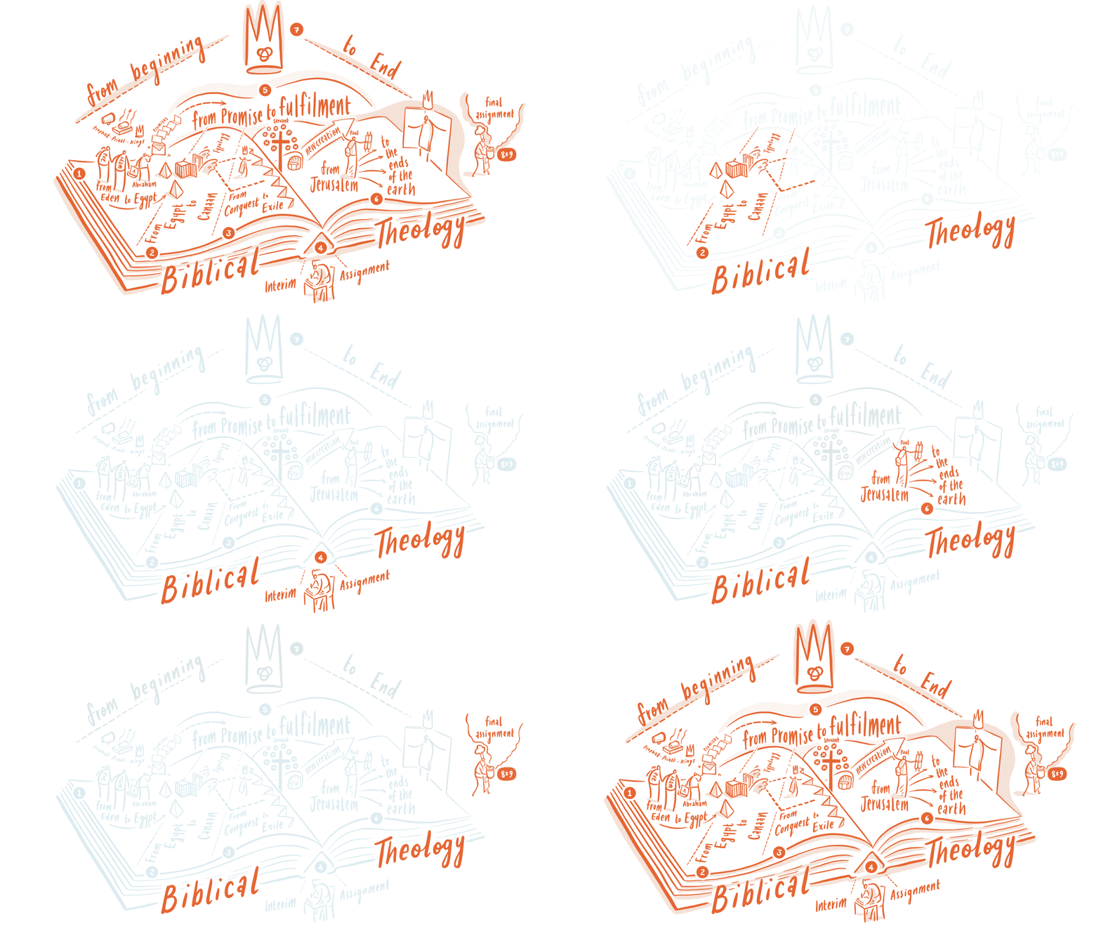
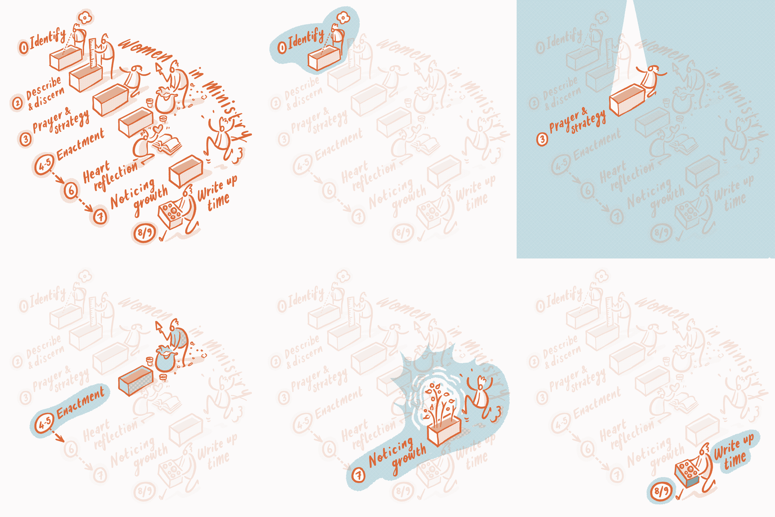
As you can see, each map consists of several 'zones' that correspond with the unit being studied. As the course progresses each zone gets highlighted at the relevant point.
Here are some of my favourites.⁵
Who would have thought that a technical relic from the earliest days of the internet - the animated gif⁶ - could be such a blessing in 2025?
At every point, our culture is being drawn deeper into harsher economic realities. There isn’t a strong tradition of creating playful resources.
And yet… they can make such a difference.
¹ It is true that this isn't the only valid use of illustration - decoration, influencing pace, providing reflective experiences - these are all useful for learning design and I occasionally switch it up as required.
² If we are going to get exhaustive here, there's a whole bunch of neighbours who can be employed like video explainers, worksheets, reflective exercises, quizzing etc. Imagine this legion of the most helpful neighbourhood ever pitching in.
³ Within the first twelve months I drew approximately one thousand illustrations - often making more than 100+ per course. Five years later, the number is now likely in excess of 3k.
⁴ At the drafting stage, I often scrawl at high speed without worrying too much. Tools: either a bunch of large post-it notes and a biro - or scribbling across a PDF file of the course using an iPad app like Notability. When it comes to creating final artwork, my combo tool of choice is Clip Studio Paint on an iPad with a cheap bluetooth keyboard to access my personalised shortcuts. CSP is brilliant (if you can get past the steep learning curve and interface).
⁵ At the time of writing this post there are thirty of these. I wanted to create a post with all of them on it but less is always more. Plus it might break the internet.
⁶ Animated gifs are a lovely thing... they don't require the bandwidth-heavy resources of streaming video and they can be uploaded as a single picture while still giving you something that feels alive.


