The Lost Box Film & Infographic

18 months ago a friend of mine mentioned that he was working on a school space project with some ambitious and talented Year 11 students. The principal idea was that they were sending a weather balloon up into the stratosphere with a bunch of devices that would capture data and beam it back down.
I had the opportunity to capture the amazing story in a couple of short films. Here is a YouTube playlist that brings together all of the clips.
My ongoing fascination with creating infographic material led me to begin constructing a diagram that summarises/commemorates the journey of the first Lost Box.
Roughs

Biro on a notebook. Some quick thoughts summarising my general approach. Remember tat I had spent a lot of time absorbing the material at this stage, so I wasn’t coming ‘cold’ to the event.
Provisional Mock-Ups: exploded diagram and characters

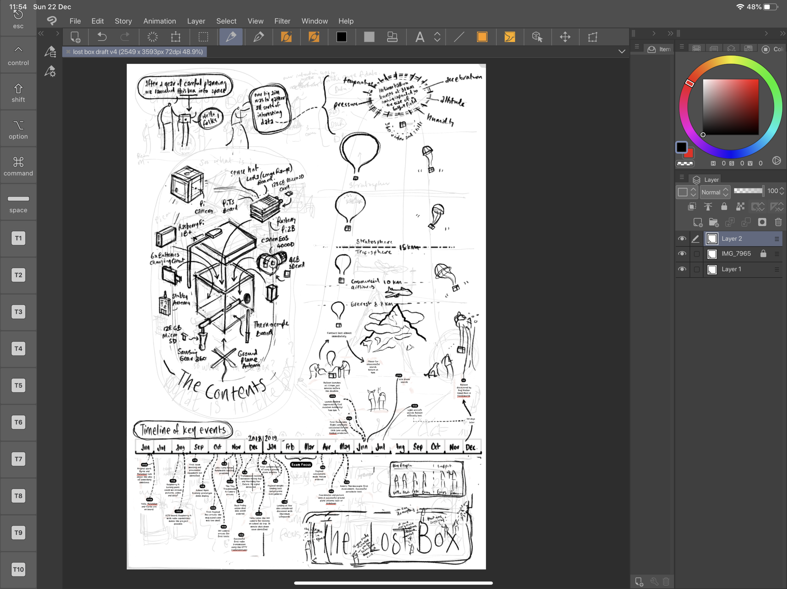
This image was a combination of biro on paper, clip studio paint and some rudimentary colouring. I labelled all of the parts and used it to enquire with Pete Clarke (the lead teacher on the project) what each item was.

I began playing about with some humorous renditions of the main figures involved. One of the 16 year old students is quite literally like a Wookie, so this was particularly satisfying.
Exploded Diagram 2

This time I took the material into Affinity Designer - my favourite vector app ever, complete with the ability to bring hand-drawn strokes. I love that app.
The Flight Path - some early messing about

The main benefit of making mistakes is that you can clear the way to something far better - this early attempt at combining dates with the flight of the box has a few issues with it that became immediately obvious on producing the image.
Exploded Box further annotations


You can see where this was going.
Data-crunching the old fashioned way
I asked the team to produce some detailed (and date-specific) notes on the stages. I think it was interesting reflective exercise for them to undertake. I then processed these into a shorter version that would translate well into a poster format.


Here is my first attempt to try and understand how it might look graphically spread out across a page. I think this was the first time I properly understood what had been going on all that time with my mate Pete.
I then produced this outline with the possible idea of illustrating each of the dates. I particularly liked the bit where Vella and the 360 camera go skiing together but this was dumped later on because the overall poster was in danger of losing it’s focus.

Scale of ascent - solving it visually
The problems identified with the early diagram led me to do some extra homework and thinking about how to picture the ascent in a way that was simple to grasp. What was meaningful to the audience? How could you communicate this journey?

First Proper Compositions
For the first time I felt I could bring all the different elements together. It takes a while to understand complicated bits of information and how they link up - I now had the confidence to create an all0in-one summary. The project was beginning to fly.


After sleeping on it, I adjusted the shape of the diagram to reflect the height of the ascent. I like that this rough was done in red biro.
Timeline - first vectors
And so I began the long slow shuffle between biro scribbles and actual legible text/image in vector format. Everything was shifting as I knitted the bits together.

A more detailed composition

A step closer
This is a screenshot from Clip Studio Paint - I am taking a vector timeline (see above) and mashing it up in a bitmap format. CSP is my favourite drafting app - I just like the pencils set up I use. I can work quickly with it and move things around in ways that feel natural to my thought process.
Inking (AKA vectoring!) the final version

This is my favourite stage - most of the underlying thinking has been done and so I can listen to some music while enjoying drawing carefully. I could spend days in this state. Affinity Designer I love you (although I should add that it is essential to have it on both Mac and iPad because organising thousands of vector layers can be a royal pain on a tablet).

This page was generated using my previously posted process shots on this page.
POSTCRIPT
Just a week before the end of term we received news that the project had been given a finalist place in the Big Bang fair in March. This event is very well attended, so I am delighted to say that both the film(s) and infographic will get the opportunity to reach lots of people with this inspirational tale.