Affinity Designer on the iPad: Taming Vectors
Travelling to that Far Horizon
This summer I took a break from paid jobs and spent a solid chunk of time sharpening my skills with vector graphics. Affinity Designer for the iPad was released just before the school holidays arrived and I felt it was worth taking the time to get to grips with it. This blog post is a crude attempt to document what I have been doing. I hope that this is of use to others out there who have similar leanings. Apologies for any over-baked verbiage.
Affinity is a great alternative to Adobe
When Affinity Designer/Photo came out on the Mac a few years ago, I bought them without hesitation - an Illustrator/Photoshop replacement suite of tools that side steps cloud-subscription fees. It was a no-brainer - I now had something I could use to open and edit all of my legacy .psd files without the same kind of frustrating commitment.
But... I wasn’t using it to create much stuff
I have blogged a few times on this site that Clip Studio Paint and Procreate are superior bitmap drawing tools. I had no need to use Affinity - partly because vector drawing often gets in the way of the creative process¹ .
And then they brought out the iPad version of Designer
This software has a number of terrific qualities that will permanently change my illustration practice. Here are a few of my tips, observations and conclusions:
Vectors are confusing and difficult.
They are not spontaneous expressions. You have to be organised and put in the foundational prep work to get decent results. Whenever you see some fantastic vector-based artwork remember that this didn’t just appear one day because the sun started shining - the person creating it took the work through a very careful journey.
It might help to think of vector art as existing at the end of a carefully staggered journey - a bit like this:

Vectors are largely unforgiving and unintuitive. Yes the end results can be spectacular, but it takes a lot of hard work get there². I think I have managed to find my way somewhere across that horizon this summer. Here are the steps I took towards taming the vector beast:
A. I watched all of the official videos. Tip: have the app open while you are watching and try to do something parallel. These baby steps are really useful for getting around the interface and will open up your brain what is possible. Even seasoned pros usually miss something.

They really are a superb introduction.
I would also highly recommend purchasing the Frankentoon tutorials. They are really well produced and give you a clear idea of how an excellent vector-practitioner might approach the creation of gorgeous imagery. You can trawl around on youtube (I did) but in the end the paid stuff is worth it. I think I spent about two hours studying something I paid £20 for, but it guided me in lots of valuable ways.
B. I took something that I had previously produced adapted it using my new knowledge.
<BRIEF DETOUR KLAXON>
A couple of months ago I constructed an infographic to support a course I currently teach in my day job. This is the initial sketched out plan (created on a whiteboard and then photographed/bleached using Prismo:

I used the Mac version of Affinity Designer³ to add editable text to the image:

Then I inked a careful set of drawings over that exported image using Clip Studio Paint. In the image below you can see three layers: a fainter draft set of lines, and two final artwork layers - black ink and grey shading:

I then brought it back into Affinity and combined/adjusted the two pieces so that they worked smoothly together:

Finally I made a final colour pass to emphasise different areas of taught content:

This final image is a combination of vector (text) layers produced in Affinity Designer, and bitmap/raster drawn layers produced in Clip Studio Paint.
<DETOUR OVER>
I took this infographic and attempted to draw the entire thing in the same style with the pressure pen capabilities of Affinity Designer on an iPad Pro. Here is the end result:

I was really pleased with this - vectors feel a lot less threatening once you get stuck in, and it took less time than expected.
Here is a closer detail of the image.

Trust me - those edges are all really smooth and there is no bitmap rasterisation going on anywhere!
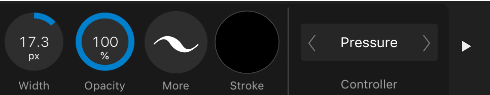
These are the brush tool settings I used. Firstly, the controller needs to be set to ‘pressure’ (for some reason this has to be done every time I open the app - quite annoying) - it gives you the lovely variable width using the Apple Pencil.
I set the windows stabiliser to 30. It feels just about right when I am using it.

Clicking on the 'more' button takes you to the 'size variance' setting. I stick it onto 100% as so:

Something else that I did early on was to delete all of the existing brushes and stick with one basic brush⁴:

I renamed it as you can see, but it's the basic default solid brush.
C. I went further and converted a huge mural into vector format.
Here is a mini snapshot of the finished mural design in question:

Originally drawn as a bitmap raster piece in Clip Studio Paint. It was big enough to work at scale, but vectors would be waaaaay better.
And here is a detail from it:

And an even closer detail:

Look: rasterisation!
Once I had completed the re-inking the vectorised result was sent to the printers as a CMYK hi-res PDF. The result was a very clean super-sharp image:

Trust me - it looks terrific.
Working through this was surprisingly straight forward - and I discovered a couple of extra techniques along the way that are going to be useful going forward:
Creating a 'parent' blank vector layer first will mean that all of your strokes end up automatically grouped from that point on. Arranging and keeping a grip of all of your layers is really hard to do once you have thousands of layers knocking about. (I also noticed that if you nest everything in this way, the brush pen responds more quickly).
An eraser layer. This is a HUGE thing. After creating a parent group for all of my ink marks to be dumped into, I then figured out that if you create a similar blank group WITHIN the parent inking group like so...

...and change the mode to ‘erase’ you effectively get a layer that can be used to carve out and erase/sharpen up any messily inked lines.

I usually change the name of the layer to 'erase' just to keep everything clear while I am working.
I’m not entirely sure that this screenshot does this justice, but the principle is a very powerful one - to be able to carve out aspects of your inking with an editable erase tool is a hugely powerful feature.
So after this I decided to have a go at creating something from scratch.
D. A meditation on Psalm 63
Taking some notes I had scribbled into my sketchbook from a church meeting I started to doodle and create some visual ideas. If you look carefully at this image you will see an initial attempt to structure the image around some geometric shapes.

Sketchbooks are the best.
I then created a similar layout using shapes and the alignment/layout tools in Affinity Designer on my Mac:

I exported this as a jpeg and began to draft some ideas in Clip Studio Paint (I prefer the way the pencils work here and am able to lose myself in the drafting/erasing/thinking process).

Then I applied all of the above and created a final piece:

There's a typo here somewhere.
E. Using a Mac and an iPad are the best of both worlds
As was said before - the taming of the vector beast on that far horizon requires considerable resolve and energy. If you are fortunate enough to possess both a big-screen Mac and an iPad you have the opportunity to muscle-in from both directions.
The weakness of the Mac - it’s input method is more than compensated for with the iPad Pro/Apple Pencil. The weakness of the iPad - it’s interface and organisation of huge numbers of layers - is very ably dealt with on the Mac. For this reason I have been using the 'open from Cloud’ function throughout.

Each time you save it, you can just pick up where you left off on the other platform. Simples.
Each platform in isolation can be frustrating, but taken together you have a brilliant context for making some gorgeous artwork.
F. Finally a few thoughts about Artboards
The Artboards function is another aspect of the software that I almost missed - to my loss. Two projects I completed in the last week or so (yes I have been busy) have made good use of the Artboard feature.
The first was for a series of images for an educational blog that I contribute to. If you look at the screenshot here you can see the ‘all art in one go’ Artboard at the top left. I used this for laying out the material in a logical arrangement once I had drawn it.

Then I broke the panels into moments and gave each a discrete Artboard. I applied final presets to each and did a batch export. It was both useful for arranging the material and creating a final set of shareable results simply.
The final example is from a series of tweets I illustrated last week. In a similar way to the example above, I used the Artboard function to create a spread of pages in a way that was meaningfully laid out. I was able to make something easily and export in the same way.

One of the great benefits of using Clip Studio Paint is the ‘story’ multi-page creation feature. If I am illustrating a book with 40+ images I usually give up on something like Procreate because it becomes such a chore churning out pages one by one. Multi-page creation is the way to go, and CSP has it sorted.
The Artboard feature on Affinity Designer goes one further than this by allowing you to arrange the pages however you want on the same screen. I love this feature and have already used it to save lots of time arranging an upcoming book project.
My main anxiety with using software like this is that when I am investing so much time into it - will it be dependable? Will it output reliably? The answer so far is pretty good - this will change the way I work permanently.
(Edited 13/1/2020 - this post is toooo long by half)
¹ I think about this quite a lot - there is a sweet spot for all great artists where expression is effectively minimal - doing just enough without overworking things. The best tools go at the speed of your decision making - if something occurs to you, ideally you should be able to change it there and then RAPIDLY. If the tools slow you down or snuff out those sparks of creativity then something is probably wrong. Perhaps you need to spend more time with a biro and scraps of paper and less time on a computer?
² This is probably why Procreate is so (rightly) popular as an app - you can just get stuck in. Vectors on the other hand usually take some thinking - how you organise your material, how you manage the tools etc. It can feel quite the opposite of creativity at times, so somehow you need to build those more fluid stages in BEFORE you get there.
³ This was about a month before the iPad version was released.
⁴ Yeah man I am badass. Actually I honestly think that limiting your choices is probably a better thing long term. "Creativity thrives within intelligent constraints" - John Maeda.
Clip Studio Paint - on an iPad
A few months back I posted a few notes on using Astropad Studio to link an iPad to a Mac running Clip Studio Paint. I used this set up to create finished artwork for the MELC books.
The great benefit of Clip Studio Paint is that with the right tweaking¹ you can produce digital illustrations that ‘feel’ like natural media in a way that I don’t think Procreate can. At the time the added bonus of Astropad Studio meant tremendous advantages for the final artwork.
Around November last year, Clip Studio Paint was released natively on the iPad and I have been using it ever since.

When it originally surfaced there were a couple of excited discussions bouncing around the social interwebs:
It is too expensive.
Can it handle ‘big’ files?
Both of these discussions are now redundant in my view.
It isn’t too expensive.
If you are making professional quality art these tools are worth it.
Just a few years ago we were in the era of hundreds (and in some cases tens of hundreds) of pounds for software. Now the pendulum has swung wildly the other way with incredibly powerful apps costing under £10. Anything costing above that is easily written off, but let me just remind you that if you are living in a weird goldfish-memory mindset if you consider CSP as too expensive. It is worth every penny.

Sorry dudes.

As far as I understand, the Pro version doesn’t handle multi page creation.
And it can handle ‘big’ files.
The iPad version of CSP is bizarrely as good/better than the desktop Mac version. It easily handles multi-page creation². The Apple Pencil translates immediately into a better-than-Wacom experience and the ability to import/modify custom brushes means that this app just stole the lunch money of a lot of crying competitors. So far I have seen nothing to undermine this, and if you add in the point made by Frenden that an iPad Pro is a form of away-from-your-desk freedom, the cost savings become clear.
My current set up.
I took ages adjusting the CSP user interface to reflect how I actually work. It was worth taking the time³. The brushes are all carefully imported ones that are limited to what I find useful⁴ .
The artwork then gets exported via airdrop or directly through iTunes to my 5k iMac which gets used as a final layout platform. Affinity photo and my desktop copy of CSP exist for the sole purpose of being a big glossy compositional screen. Although this makes me a little sad about great tech becoming redundant, the big screen is great for seeing the work put together.
What could be better?
The myriad opaque UI choices are frankly bizarre (but don’t change anything yet because I have only just got things how I like them!).
The file management system is horrible - so many steps for exporting artwork. SO hard to navigate afterwards. In this regard Procreate is the Boss. Looking through completed artwork is way better - with CSP it is like pulling teeth and I tend to avoid it.
If you want to make it cheaper I won’t complain.
¹ Using a variety of imported brushes from people like Frenden and DAUB.
² Something I missed sorely while using Procreate for the 100+ images for the Dear Theo project - reordering and finding files in their folder system was quite tricky when I had to swap iPads mid-process. It also means that Astropad Studio is now going bye bye. The £60.99 annual subscription is now heading to the pockets of CSP. Sorry and thankyou guys - I made some of my best art using your terrific stuff.
³ This is something that Procreate doesn’t try to do for good reason. CSP has an unintuitive opaque UI that would leave you airless in a mineshaft if you weren’t too careful. There are a few places on YouTube where a simple search will give you tips. Don’t be too put off by all this fiddling about - once you get this baby set up right it is amazing.
⁴ I was pretty deliberate about limiting this - too many choices will overwhelm and drown those visual ideas. And we don’t want that to happen do we? We want that little dude to live and become a hairy beast all on his own.
#TeachingTalk & MOJO
This article is about how I took the principles of the emerging MOJO (mobile journalism) movement and successfully applied them to a new teaching job. I have tried to keep things short while providing enough detail to encourage like-minded people to do something similar. If I have missed anything please get in touch.
In September 2016 I had the pleasure of returning to teach at Durrington High School in West Sussex. In the decade since i'd last worked there Sue Marooney and the team had accomplished some impressive educational feats - year on year incremental improvements across the board making it a place that both teachers and students seek out. I had the strong sense that I was participating in a teaching culture that punched well above it's weight.
The MOJO movement
Glen Mulcahy and Marc Blank-Settle are two key figures encouraging traditional news and journalism institutions across the world to embrace the mobile phone revolution in their approach to producing broadcast materials. While there are tons of different approaches, the general idea is for news teams to embrace a lighter (more mobile) tech footprint while retaining excellent standards.
My interest in this kicked off through the documentary work I had been doing exploring worldviews while teaching Religious Studies at another school. While I have a 'serious' film kit with a combination of fluffy obtrusive pro-microphones, these are cumbersome and require a certain amount of inflexibility. With this new approach to capturing material my equipment can be with me all of the time and deployed within ten minutes. I have provided some equipment/software details at the end to save boring some people senseless. I love you Fiona.
#TeachingTalk enabled
After successfully trialling this new approach, Shaun Allison encouraged me to step out further and explore teaching practice across the school community. To date I have completed 23 'episodes' of #TeachingTalk that would have been virtually impossible without the flexibility provided by the MOJO set-up.
What was the value of #TeachingTalk?
From a purely non-tech point of view there is tremendous value in making time to be open about your teaching and thinking. It breaks down the possibility of arrogant blind-spots and strengthens others who may have similar struggles. Andy Tharby explains here why choosing to talk is a healthy option for overworked conscientious teachers:
From a personal (more technically-minded) perspective, I think there are some terrific advantages to this project:
people (and their professionalism) are powerfully affirmed - I often felt that my interviewees were sharing important ideas and insights that are really worth hearing about
the interviewee develops their own convictions - in the clip above, Andy is right to say that the explaining/presenting of something always clarifies our own thinking
a clearer perception of what the wider teaching community is doing - this is where the power of technology is properly felt. It's reach counters that all-too-familiar sense of isolation and helps a wider audience to see how others are getting on
the sharing of good ideas and contextual thinking - yes you can't simply drop an approach on every context and expect roses to grow, but you can step into different contexts while reflecting on your own
if it is done well, it builds trust - my personal approach is to make it clear to teachers that nothing will be used without their permission. Being filmed (and then sharing this online) puts someone in a position of vulnerability, so it is important that those who are being captured are happy with how they come across. This is a potential minefield, but is definitely a path worth treading. Occasionally I have had to withdraw pieces (some which were amazing) because the people being filmed were unhappy. Occasionally I had to try and explain why the piece was really valuable and worth going along with. For this reason it is worth restating how appreciative I am of the colleagues who agreed to taking part in this project.
With or without the equipment (and documentary-obsessed teaching staff) there should be no reason why schools aren't seeking to develop a culture of reflection and sharing. It's a healthy no-brainer.
Now what about your MOJO set-up?
Currently I am using this equipment:

iPhone 7 Plus and FilmicPro - I consider myself fortunate enough to be able to have this expensive phone and it does the job brilliantly. I use a 256 gigabyte storage just in case. Occasionally I get near to filling it with 4k footage. It has the added advantage of being weather-resistant. I once shot some footage underwater and it worked beautifully. For the budget conscious - there are lots of other possibilities - the iPhoneSE is both compact and captures superb 4k material if needed. Filmic Pro is pretty much the standard recording app. It has lots of superb features that are genuinely useful.
a Manfroto monopod and Glif/Shoulderpod grip - this works better than a tripod because a. it can move and b. the weight of the hanging arm creates a really handy balancing effect. I tried some gymbal systems but none of them worked that well - especially with a microphone which is crucial. Also note that I rarely use the monopod against the floor. Hanging is always better even if your arm gets a bit tired. Also the ability to extend it and reach extreme heights is awesome - like a selfie-stick on steroids. The Glif is recently new (and works superbly - particularly the quick release function) but I originally used the shoulderpod for ages - either are great.
a flexible ball mount - this provides an immediate way of changing the angle for those occasionally different shots. I leave mine permanently attached to the monopod. The extra weight is worth it.
on board and mobile microphones - I use the Zoom iQ7 with a RODE Deadkitten (Shaun Allison keeps calling it names that I don't really understand) as my default sound-capturing method. For remote recording I use an older iPod Touch with a Sennheiser Digital ClipMic. I usually record the remote audio using Ferrite - with a fully charged iPod I just set the recording going and can get up to an hour and half.
Anker battery pack - there are lots of these around and they are very good indeed for portable serious battery back up. Never leave home without it.
Lights - currently I don't bother with LED lights because the situation doesn't need it at the moment.
Editing - if I was editing on the go I would use LumaFusion which is a seriously great mobile multitrack video editing tool. My own personal situation means that it is actually easier for me to important my footage onto a Mac and chop material using FCPX, which is the daddy as far as I am concerned.
For those still here - what are the pros and cons?
Advantages
having your equipment with you all the time means getting those opportunities which would otherwise not happen - capturing sensitive perspectives means having flexible mobile and unobtrusive kit.
being able to make eye-contact and talk intimately takes a bit of practice but this set-up absolutely allows for it to happen relatively easily. If you have a look at the episodes produced, most of the people are making near-eye contact with the camera. This is an approach that Jonathan Demme popularised and Errol Morris swore by.
shooting in 4k means that if you shoot stuff at an odd angle (which often happens because you have to really focus on the person not the shot) you can edit the sequence at 1080p and crop in/rotate the image with no discernible loss.
Disadvantages
mobile phones do not have the delicious flexibility of a zoom lens. This often feels like a major deal-breaker. When I am shooting stuff with my 'serious' camera I love the freedom to smoothly zoom in and out. BUT there is a way forward - if you shoot in 4k you can crop-in on the subject and actually get even closer still with no problems. It isn't the same and feels really different but creativity is all about working intelligently within the limits.
All 23 episodes of #TeachingTalk can be watched here. If I have missed anything or if you have feedback then please get in touch.