Four Key Design Questions - Scott Berkun
As you read it you get the sense that he has spent a lot of time teaching and reflecting on his material - the chapters consist of short, well-arranged chunks of material that lead the reader into a holistic grasp of design culture.
One of my favourite sections does an effective take-down of ‘drive-by’ design: work that creates a slick visual re-think of an existing format (in this case Boarding Passes) without proper regard for the wider context of the existing infrastructure. In other words: your design might look amazing and get loads of likes on Dribbble/Behance but if it can’t be produced by the existing printers you are living in a fantasy world. This is where this book really shines for me - drawing attention to the design powers that lie behind the design choices themselves.
There are loads of design books that explore the specifics of the choices themselves, but this one pulls back for a grander sweep of the horizon and the tectonic plates beneath. I valued the reminder that there are influences that make certain biases plausible. Nothing is ‘natural’ or ‘common sense’… an apple falls that way because of the invisible gravitational forces acting out. Every design team is limited by - and reflective of - the organisations that recruited them.
If I had a wispy beard I might stroke it right now.
Four Key Design Questions
Anywho… I made a few drawings as I went through the book, needing a personal way of chewing over the insights. I thought it was worth illustrating the central thesis of the book.
What are you trying to improve?
He makes the brilliant distinction between building and designing. Many organisations are obsessed with building something, completing checkboxes and shipping items rather than asking tougher, deeper questions about what is at the heart of the problem. Only when you have probed deep enough to examine the issue at stake will you be able to make meaningful progress. Yes there is a place for shiny self-initiated expressions, but great design does better.
Who are you trying to improve it for?
Numerous examples in the book point to blindspots in design thinking: where a solution seems awesome within the team but ignores something fundamental about actual users. This is a reiteration of the point that there isn’t a ‘natural’ or ‘common sense’ solution to a problem - people either employ data with careful insight to inform their outcomes or they unwittingly follow the invisible rails that recruited them.
How do you ensure you are successful?
Everything comes back to the design problem and building in smart feedback loops that draw you closer and closer to an effective response.
Who might be hurt by your work (both now and in the future)?
I was delighted to see this given careful consideration in the book: we need to bring serious ethical consideration to the things we design - it’s not enough to hand it over to the client. It takes mature wisdom and incredible self-awareness to see the consequences of our choices further on down the line and this takes conviction to master. Examples given include familiar ones such as
connected technology bringing greater isolation
convenient faster food enabling widespread obesity
For those of you who know me outside of this website - I spend a lot of my time reflecting on ethics with my High School students. Excellent design surely has ethics embedded within it’s DNA.
Thankyou Scott Berkun for the helpful book.
UPDATE: I changed the third image because the first one wasn’t good enough. How appropriate for an image about feedback loops…
Managing an Organisation Through a Crisis
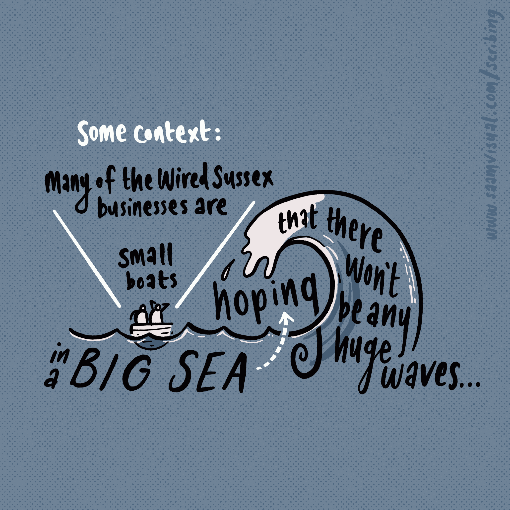
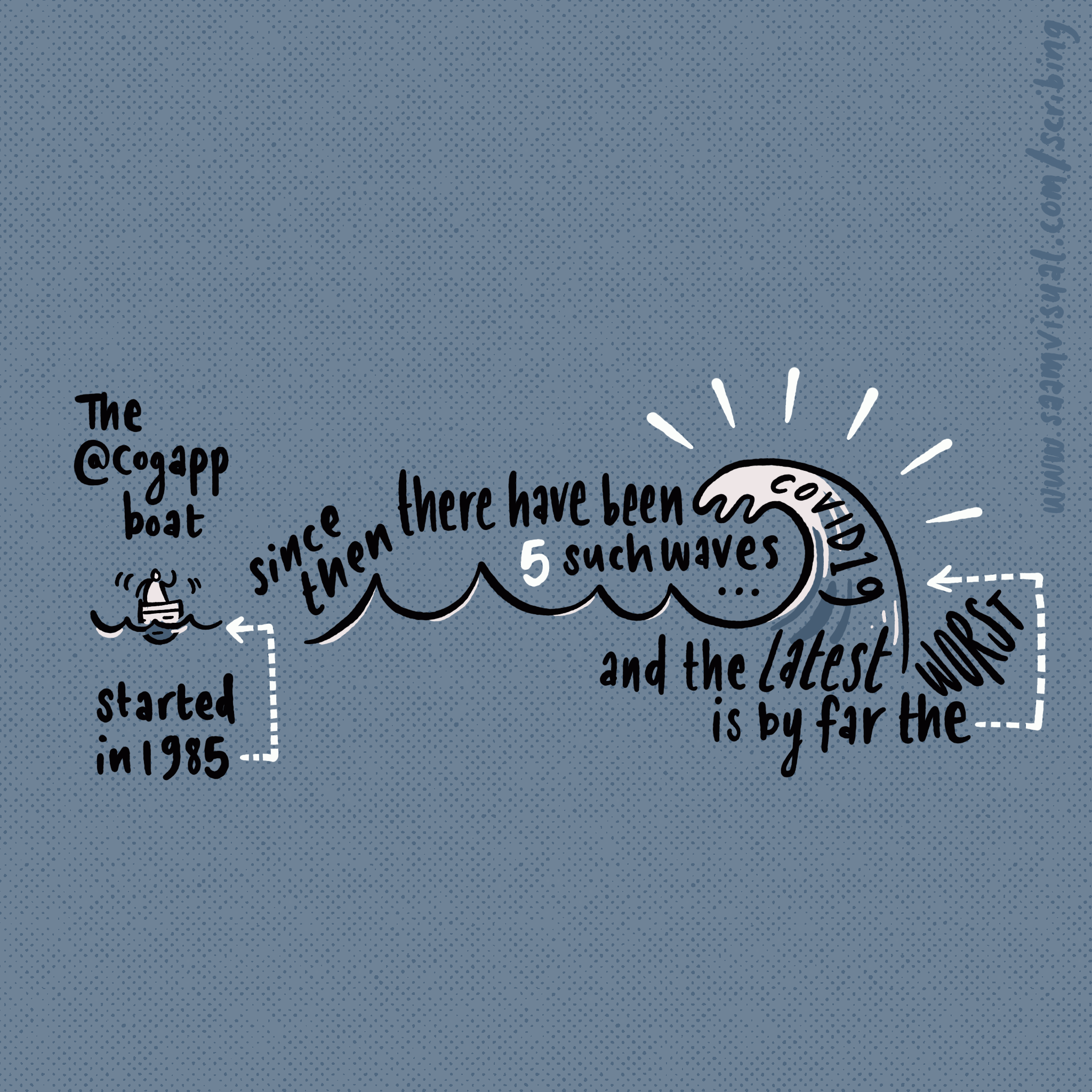
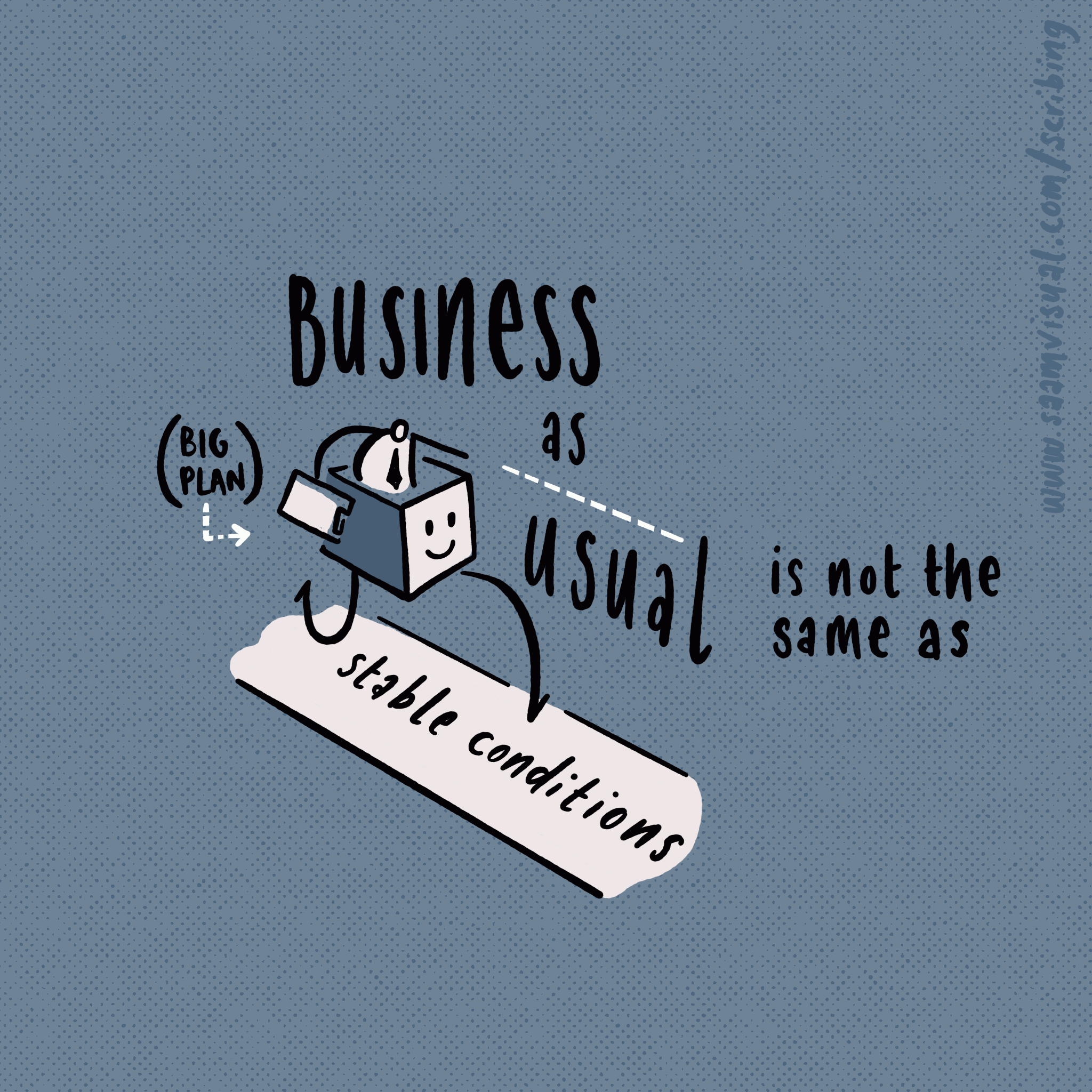
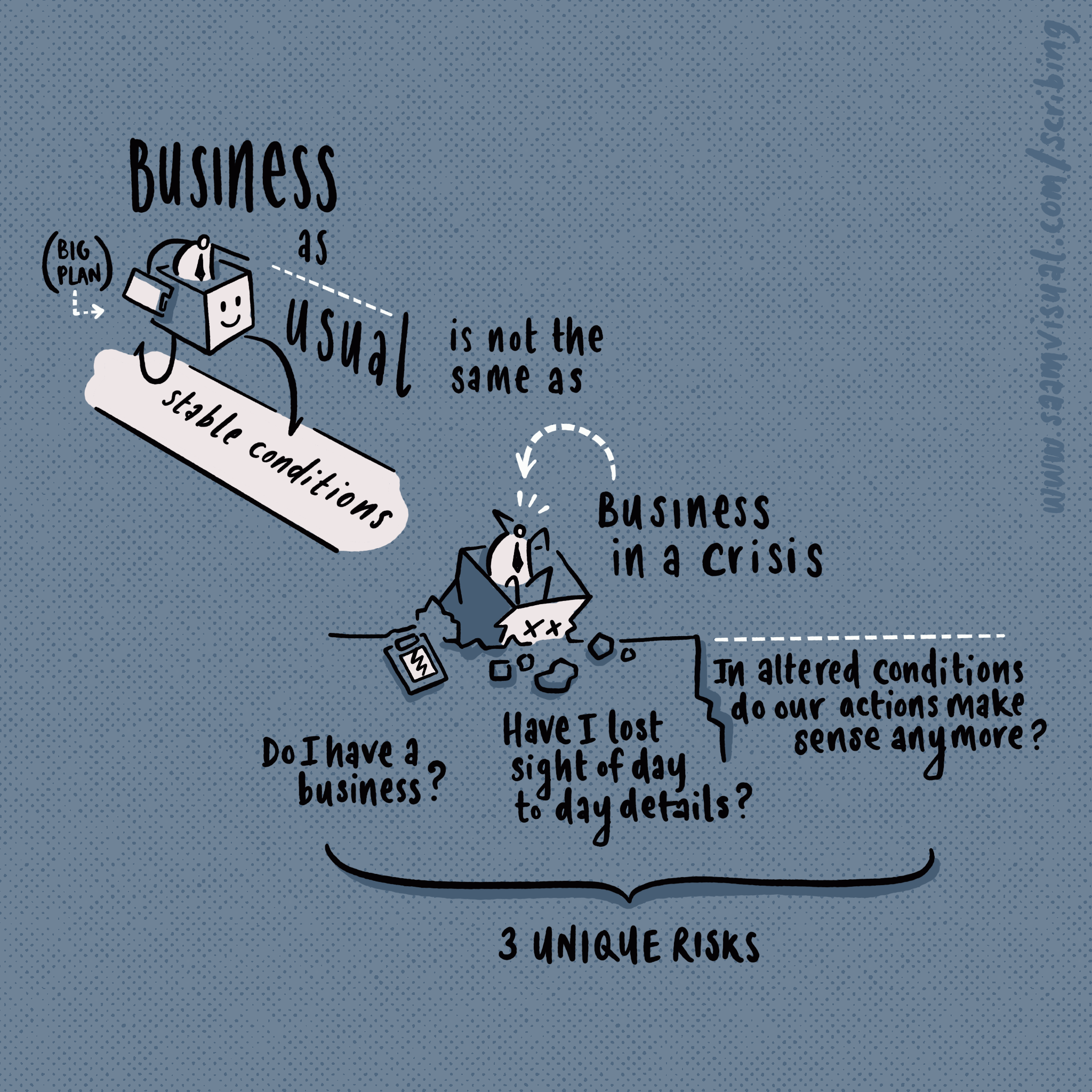
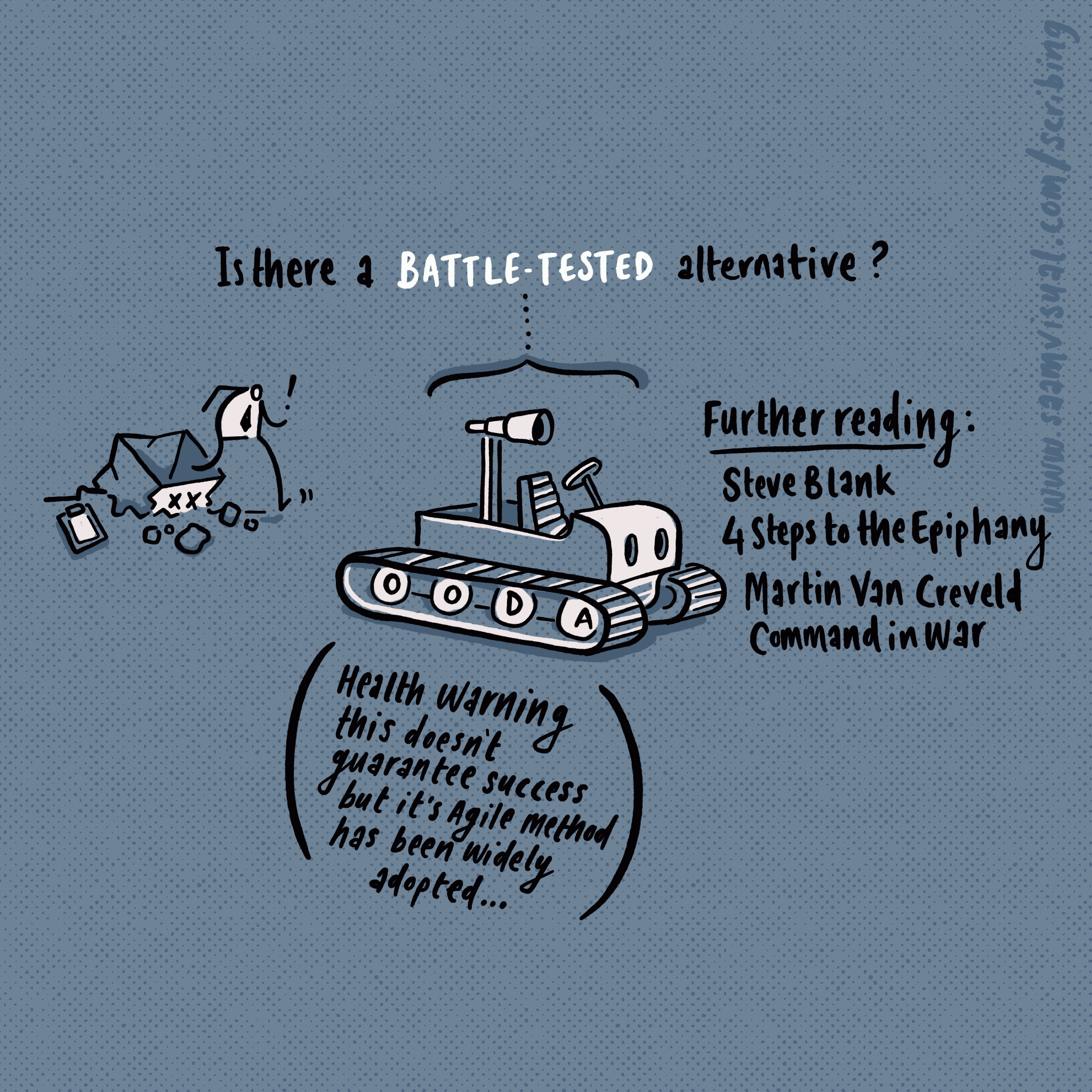
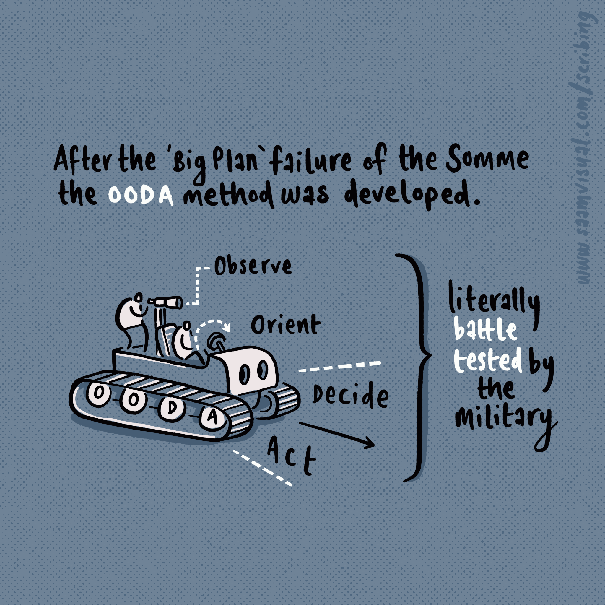
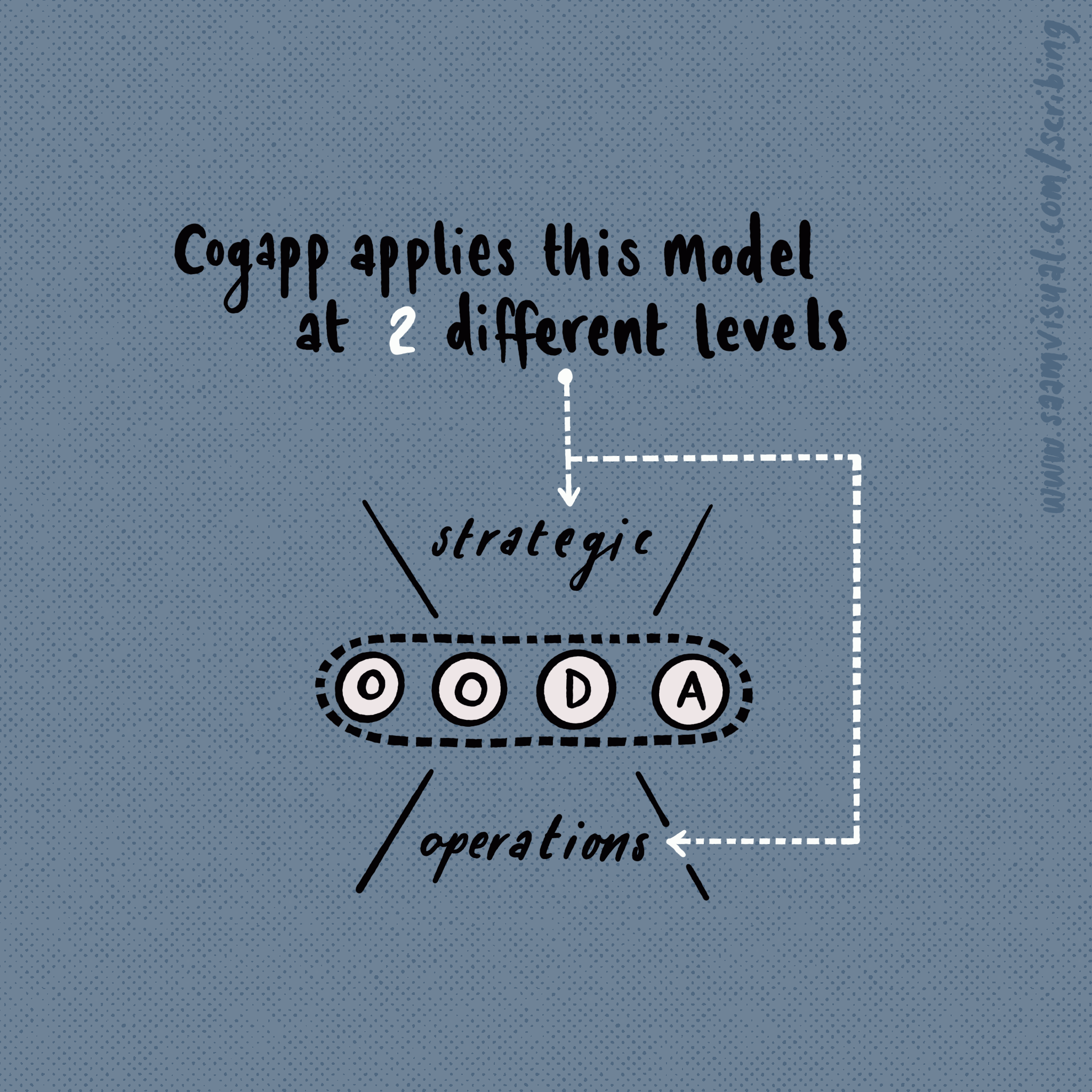
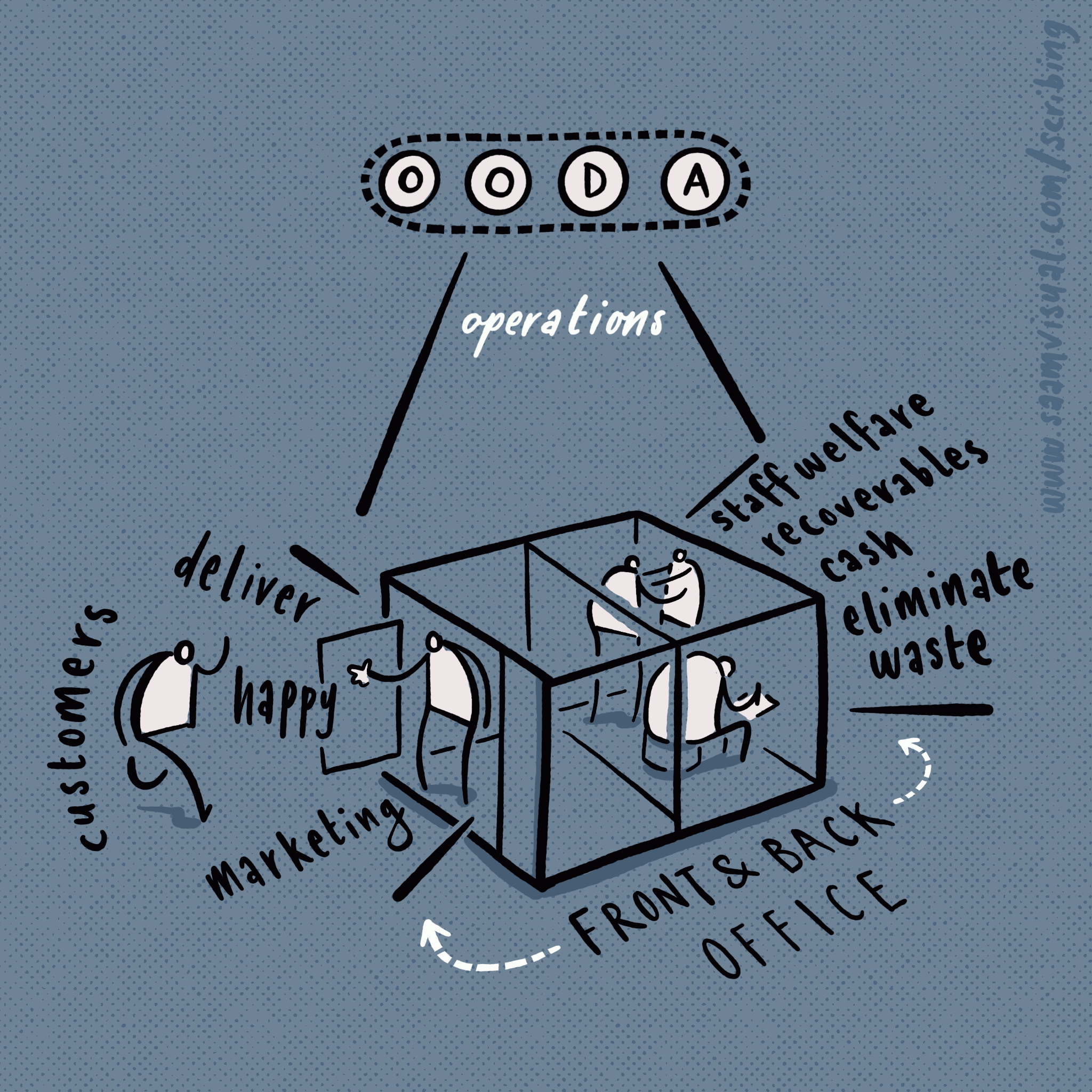
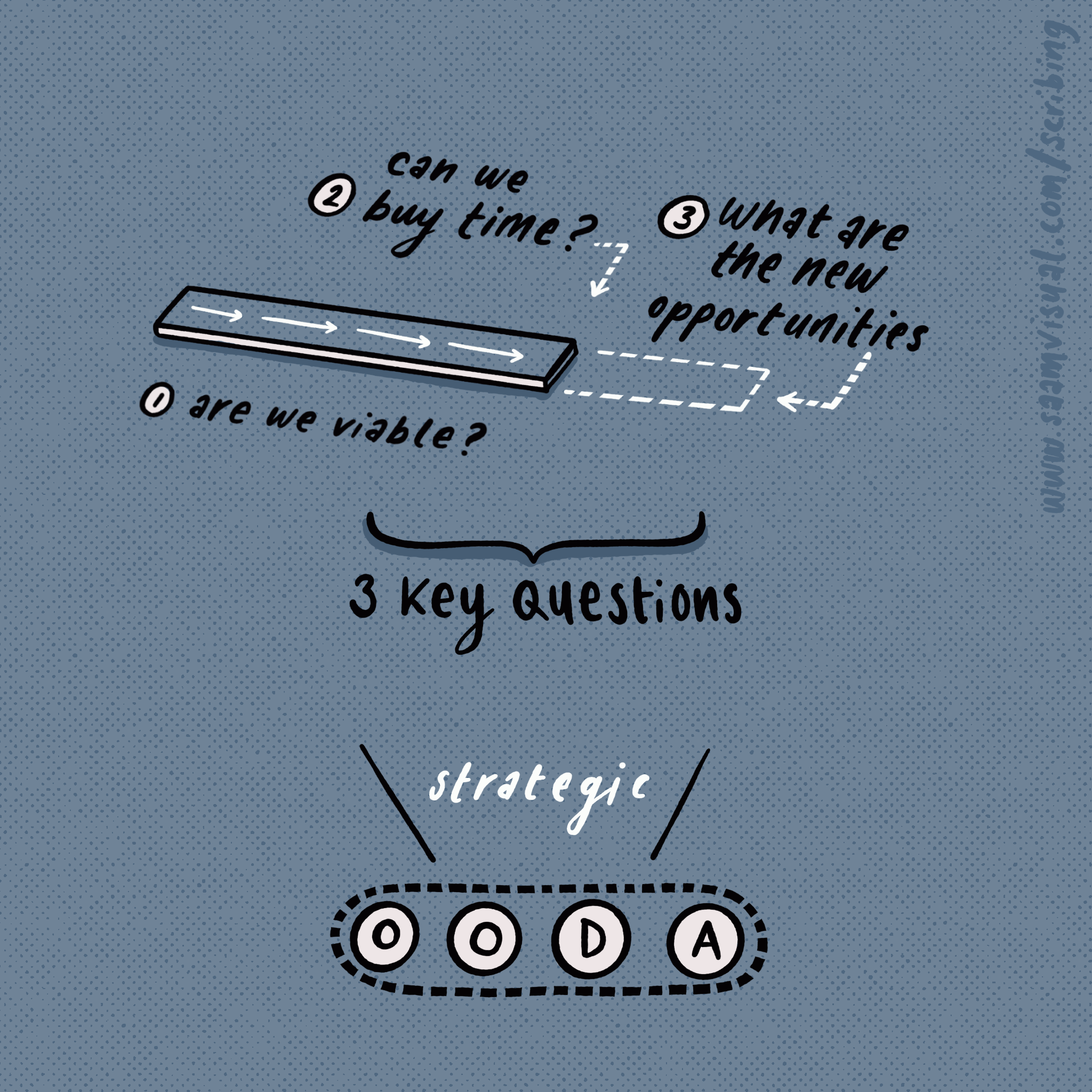
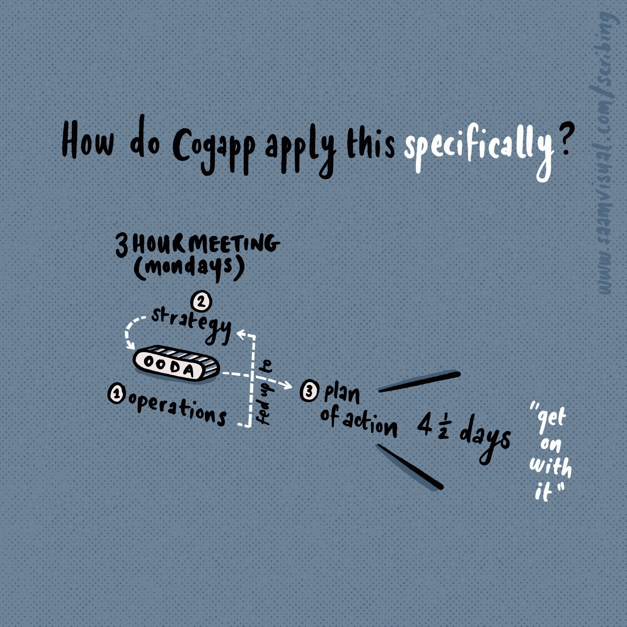
Alex Morrison wrote a superb article about managing an organisation through a crisis (eg C19). He presented this as a free webinar via Wired Sussex yesterday and I made this A3 infographic from my notes.
If that is too tricky to zoom in on I made a slideshow version below.
If you see this and think that my scribing service might be useful then please get in touch to chat about working together.
Sketchnoting for More Than Robots
Cliff Manning runs More Than Robots. Focussing on the shifting intersection between ‘tech/youth/support’ the group consists of a stimulating newsletter and quarterly meet-ups. As I am mainly working from home as a high-school teacher in lock-down I was able to attend the most recent event via zoom. Cliff’s encouragement to contribute something initially left me a bit cold… but as we discussed mutual areas of interest I realised that creating a set of sketch notes would probably be the best thing I could offer to promote the excellent work represented by the attendees.
Here are the eight snapshots I created for most of the presentations:
Some process footnotes:
as this was my first remote scribing experience I gathered as much source material as possible for later review. This included a variety of things - initial talk slides, audio, weblinks and screen captures for later reference/review, notes in my sketchbook.
I agreed with Cliff beforehand that it was counter-productive to create facsimile drawn notes for everything being said - there were already slides that could easily achieve this - better to grab a few resonant moments and illustrate those in a useful, shareable way. Below - is a scan of my initial notes: the boxes in red denote areas that looked worth developing into something more.
From here I used Clip Studio Paint on the iPad to compose something that I felt worked better.
And then I dropped this into Procreate which feels like a better final inking solution for this kind of thing. It’s funny that the way CSP works seems facilitate thinking in a way that Procreate enables toddler bitmap art. If the project had required something more involved I would have gone further using Affinity Designer for polished hand-drawn vectors.
Thankyou to Cliff for letting me in to this group - it gave me a strong impression of how many serious-minded groups are trying to serve those who so often get left behind in society. If you are interested in using me as an illustrator/facilitator then please get in touch and we can discuss your needs.
Loom: Redressing the Swing To Flipped E-Learning
The Covid-19 pandemic is having a curious impact on teaching and learning.
For years I have been interested in using digital tools to enhance and extend what we do in ‘traditional’ teaching situations. My thinking has always been - take what you do well naturally and extend this with technology. I have often felt annoyed about poorly-implemented systems that create unnecessary friction, often hurting the teaching/learning process.
While I have sometimes been seen as an early-adopter with a taste for shiny things, I have tried to encourage others into using gadgets for learning. I like to think that some people have been inspired by my limited example and made their own tiny steps into an exciting new digital world. But now that choice (and the corresponding joy of finding your own way) has disappeared as all teachers have been exiled online with little or no warning.
Certainly the first couple of weeks have been weird, stressful and bemusing for us all. In conversation with a number of parent and teacher friends across the country it is clear that we are in some kind of gold-rush frenzy as different groups lay claim to uncharted territory. Many are finding the sheer intensity of the school work being set extremely stressful. Balancing brand new home pressures that never existed before with excessive expectations appears to be driving a few families to the wall. Others are loving it - for them this is an opportunity to get on without distractions and cut to the chase. Who needs all that teacher talk? Just give me the good stuff and let me get on with it!
It’s quite bizarre just how polarising this situation is. I have students who adore the ability to dive in deeply, do their thing and then get out; I also have some who are lost without the friendly banter, interactions and scaffolding. The loneliness of the long-distance flipped-learner, if you will.
Just like that scene near the end of the Titanic movie where everyone is flailing around in the water, we are just trying to stay afloat at the moment and make sense of a new learning culture with whatever seems to be buoyant. My casual guess is that a number of changes will take shape in the near future - some so-called VLEs will be seeing the end of their contracts as robust and more useful platforms prove themselves; the concept of homework will get a permanent facelift and the distinctive contribution of localised expert teaching will be (hopefully) re-evaluated as essential for student progress.
Wherever we end up with all of this palaver, I hope that solid teaching principles are applied to any post-Covid analyses. I would hate for this moment of cultural re-setting to be squandered by impoverished insights.
Finally - something practical…
For the time being I would like to add to the growing list of recommendations for Loom.
Last week, Andy Tharby wrote a glowing review of his first experience with this capable screen-capturing tool. In many ways, this is perhaps the best kind of endorsement for an app seeking teacher approval - Tharby is not someone I would consider to be a member of the honorary Nerd Clan (something that can be easily ascertained from his ‘light aircraft pilot’ look wearing those dorky headphones…). Yet - he was easily able to put something confident and clear together in a short amount of time. As tempting as it may be to think we could be the next stars of YouTube, teachers ideally should be doing the unflashy basics well - avoiding gimmicks and enabling students to progress to greater heights. I believe that you have these qualities expressed effectively in Andy’s recording. In this situation, less really is more.
I spent a few hours playing about with Loom today and have posted my own piece below. It isn’t very polished, but as I have been saying already, that is part of the point! If you choose to watch some/any of it you will notice the warts-and-all presentation where I make a bunch of mistakes as I rattle through a few things. I have combined some technical observations with a bit of didactic teaching and an example of playing/annotating a video from a browser window. It’s something I might use as an introduction or conclusion to a topic to reinforce certain ideas in the mind of the collective online audience.
In addition to Andy’s observations, there are several things I would want to say if you are going to use this application:
Devote some time to thinking-about/listening-to the recorded sound quality. The audio makes up more than half of the presentation. You might need to make your peace with whatever sound you end up getting, but it is always worth tinkering a bit - e.g. I tested three microphone set ups and stumbled accidentally onto something far superior I had forgotten about. It might be that you have some headphones with a built-in mic that work better than the native laptop mic. Try both options out - you might get something better.
The combination of your explanation face and the work itself is really valuable for students who are feeling that isolation. It’s not the same as being there, but if you have a strong bond with them, it will hopefully warm their spirits a little.
The iOS iPhone/iPad version of loom doesn’t have the picture-in-picture function - but it still works really well (and: it’s mobility might make all the difference especially when we find ourselves working less at home once Covid-19 has been defeated - I can picture myself making a speedy feedback video after going through some books at 4.30pm in my classroom - having a clear sense of what needs correcting it makes sense to be able to make a quick in-the-moment video doesn’t it? Once I get home, and family life takes over, the moment is often lost. With this you just whip your device and booom).
Loom are offering Pro subscriptions to educators for free - is seems substantial.
The page where the video is embedded has some great feedback elements - being able to place timestamped comments and emojis are a useful touch for some situations. You have to judge your audience accordingly - I think for some groups this could be brilliant.
Variable playback speeds are a helpful option.
Sharing/editing possibilities - you can trim and then download the clip for use on other video platforms (YouTube/Vimeo/Google Drive are all possibilities for me and I appreciate being able to retain some kind of ownership/flexibility in this way).
There is a password protection option and a private link that stays out of search results. (Just like that bit at the end of Jerry Maguire: “You had me at password protected”)
You can link to other sites at the end with a ‘callback’ feature.
There is a lot to like about Loom, and yet, in the wake of all the stuff about the all-conquering Zoom being more-than-flaky with their security standards, I felt a bit nervous granting so many permissions to Loom as I installed it on my iMac. Any technology embraced by the teaching community means handing over a significant chunk of trust - and for good reason. Teaching is a very personal thing - you give of yourself in ways that many other jobs never do.
To revisit that imagery from the end of the film Titanic - my hope is that this app is big enough for Rose and Jack.
UPDATE: for what it’s worth here are my first ‘proper’ lessons on Loom.
Part 1 - introducing some concepts in Hinduism which the students then have to respond to on a document.
And then part 2 - which takes things further into evaluation and analysis.


