The St. Oscar Romero Promotional Video 2020
Having just spent the last three weeks creating a promotional film for my school I thought it was worth taking a moment to reflect on the design process.
Some background
I joined St. Oscar Romero Catholic School in January 2018, a term after Pete Byrne had arrived as the new headteacher (it was previously known as Chatsmore). I was the first teacher he recruited.
In the nearly three years I have been working at the school it has been dizzying¹ seeing just how much has changed. Ofsted landed very favourably for us in the first year; then we achieved an ‘all-category-outstanding’ section 48 inspection by the Diocesan inspection team the year after. Results have since risen dramatically, lifting the school into the top 20% nationally.
What used to be viewed as a ’nice but harmless’ small school in Goring is now an organisation with real teeth on the national stage. The Lost Box passion project² coordinated by my physics-teaching pal Pete Clarke is a symbol of the culture change within the school. The two sides of the timetable have been renamed Oxford/Cambridge with the first heads of school under Pete Byrne currently applying for Oxbridge after successfully winning scholarships to Brighton College and Christ’s Hospital to study their A levels.
In 2018 I created this promo video which provides an insight into where the school was at:
A sweet collaborative spot
Pete Byrne approached me just as lock-down hit earlier in the year with the idea of recreating this first video. In the end we ended up with something shorter and sweeter:
I am particularly pleased with this end product because it hit a collaborative sweet-spot. Some notes:
Instead of playing it safe and repopulating the original video with updated uniform shots we were adventurous and took a more organic approach with the material. I worked hard at trying to explore what was in front of me - playing with how it might be seen. In the end this material took it’s own shape in the edit that a cast-iron approach would never have allowed for.
I combined four very different camera systems - an Insta360 One X, an iPhone Pro Max, a Canon 4k with 20x optical zoom and a DJI drone (ta Second Unit Director Dougie Hauser). Having a sense of where the respective strengths lay was important - I spent a day wandering round using the 360 camera testing it out and was delighted to bring it into the tool box.
Being an insider has massive advantages. One of the problems with corporate video production is that the end result is often hollow, even dead inside as the prompted marionettes parade their obedient moves. That famous saying: ‘the best camera is the one with you’ could easily be exchanged for: ‘the best cameraperson is the one who is known by the subjects’. If the people in front of the camera aren’t at ease it all becomes a bit artificial and cosmetic. This video has soul - those aren’t fake smiles. Real people are really engaging.
The process was a journey of discovery for us all. It’s interesting to hear Pete Byrne speak about how this production clarified his own thinking about the school - not something to take lightly! Drafting, forming and refining this brand statement was exciting because we ended up discovering a diamond at the end.
Rebranding: a new skin or identifying the emerging, underlying character?
The last point raises an important question when it comes to rebranding any organisation: much of the time it becomes an inevitably cynical (and expensive) exercise in logo/font/graphic design. The thinking goes like this: if we look better we will become better - thus inspiring inner change and providing value for the target audience. You can probably tell that I don’t like this approach - I think it lacks integrity. I believe that the best thing you can do with a rebrand is to identify and polish the best of what is already there.
As I said above - in this instance we discovered a diamond - a school identity that had substantially moved on (Infinite Possibilities - imagine what is possible) to something more concrete (Every Door Open - lets get on with walking through and grasping those opportunities).
Last words: I loved making this video because I got to hang out with really fun people and enjoy collaborating on some awesome images. Having said that, the biggest pleasure was what we discovered about the underlying character of the school.
¹It is no understatement to say that being a secondary school teacher is extremely demanding - every day feels like you are working in a 24/7 Formula 1 pitstop crew. The experience of solitude and quiet reflection are largely banished to holidays and occasional weekends so be warned if you are thinking of following this career: it is simultaneously amazing and crushing.
² Winners of the highly respected Big Bang competition this summer and now shortlisted for the TES awards this November.
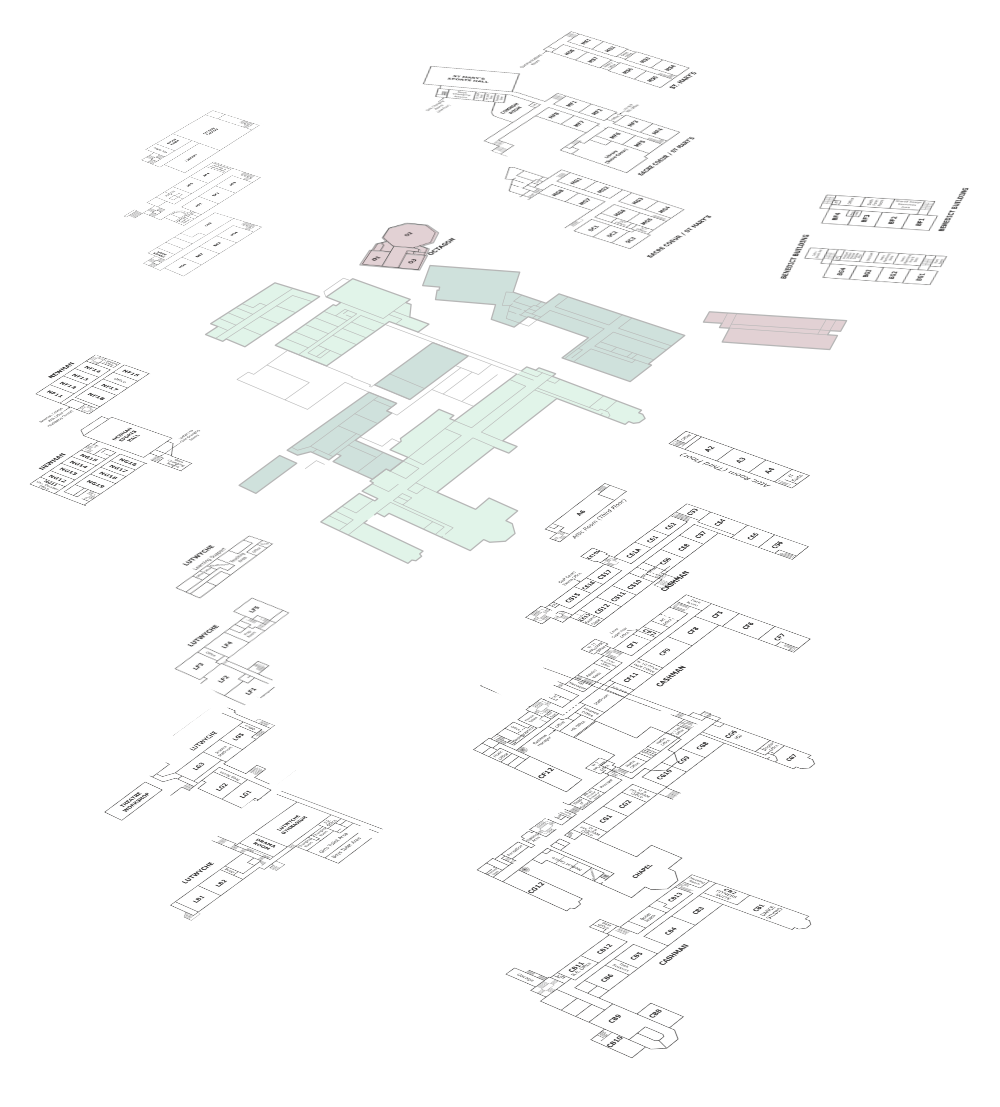
Cardinal Newman Campus Map
A Map isn’t simply about sharing geographical details: it frames your relationship to that information
In a lovely chapter entitled ‘Tools of the Mind’, Nicholas Carr discusses the connection between cartography and thought processes:
The map is a medium that not only stores and transmits information but also embodies a particular mode of seeing and thinking. (p41, The Shallows)
The idea of a seeing ‘mode’ was central to my thinking as I designed this map for newcomers arriving at Cardinal Newman Catholic High School.
Some process notes: now in timelapse form!
Here is a one minute video of the process.
The thinking behind the design
It became clear early on that CNCS has a complicated layout. In figuring out how to find a solution I found myself returning to Scott Berkun’s Four Key Design Questions:
What are you trying to improve?
Who are you trying to improve it for?
How do you ensure you are successful?
Who might be hurt by your work (both now and in the future)?
So what were we trying to improve - and for whom?
Newcomers to the school who need a quick way of grasping the ‘zones’ and ‘arteries’ of CNCS.
Success criteria
In developing the map it was great to speak with people who had recently ‘learnt’ to navigate the campus. The most useful conversation I had was with a current year 8 student. First term confusion was still fresh in her mind and proved a valuable experience to dig into. I learnt that after a couple of weeks most students are competent at finding their way following others and muddling through, but there was still a need to speed this process up (plus: not all visitors have two weeks for exploration).
I started with the idea of creating a set of room-by-room exploded floor diagrams: similar to the Sussex University map (below). But after a short time of breaking everything down, the complexity became a bit of a concern. It seemed to me that there were three problems to solve when finding your way around a new school:
What the main buildings are
How they link to each other
How you find your way inside each one
You can see how this might have gone - fortunately this approach was rejected.
Example of a map I produced for Sussex uni.
After some reflection and deliberation with Jo Henderson (the marketing and communications manager) we decided that solving the first two problems was the best use of our time. In my mind it was rather like a London Tube map consisting of stations/zones and lines/arteries connecting them. To my relief this was now the settled plan.
In posing the the question “How will you know if you are truly successful?” - one can’t really know until mid-September but I am confident that we have arrived at something that will improve the experience of people visiting the school. I love that Jo Henderson has termed this as ‘phase 1’ of an ongoing project. Being able to return to this in a few months to consider incremental improvements sits well with me. I look forward to seeing how things improve.
future harms?
Berkun’s fourth question is concerned with ethical forecasting - and is probably quite annoying to the casual reader. What are the consequences of placing this design in the public arena? Will it introduce damaging patterns of thought or action? Will it cause cultural confusion - and if so, how might this be mitigated in advance? Yes, this is probably overthinking things, but these are issues that deserve consideration - a map isn’t just a pretty picture - as per Carr’s writing above, it is a ‘mode’ of seeing which will frame how people relate to a physical space. Maps maketh culture.
If I was going to respond to this baffling question, I might point to the self-conscious limits of the design brief. While it doesn’t aim to teach people how to get to some of the tucked-away rooms, it bears some responsibility for the inevitable frustration a Year 7 might feel on September 5th as they try to find one of those obscure Attic rooms in the Cashman building. Realising this from the start means that other good combined solutions might be implemented - such as the existing mentoring relationships that are encouraged between older and younger students. To me this is a significant strength found within any healthy school community - when students take active responsibility for each other.
Thankyou to Principal Claire Jarman (for warmly inviting me to make something for CNCS) and Jo Henderson for being so flexible and kind as we worked through the different stages.
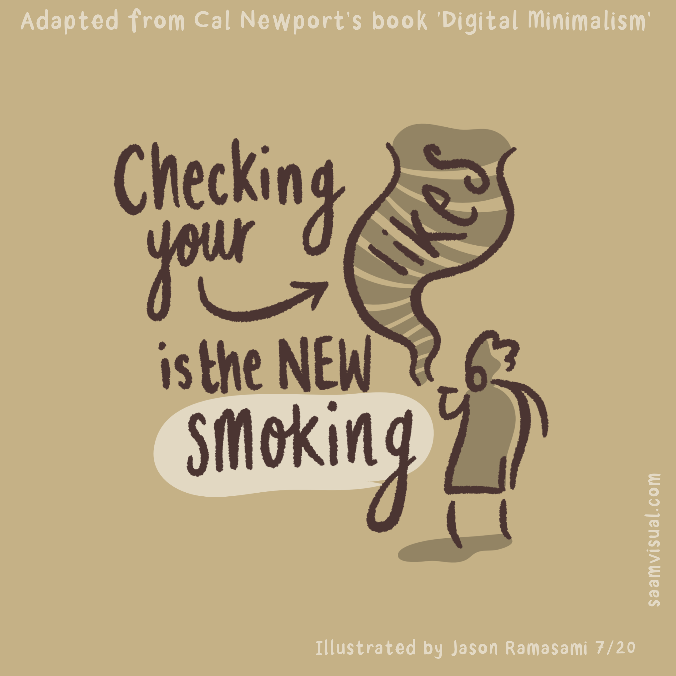
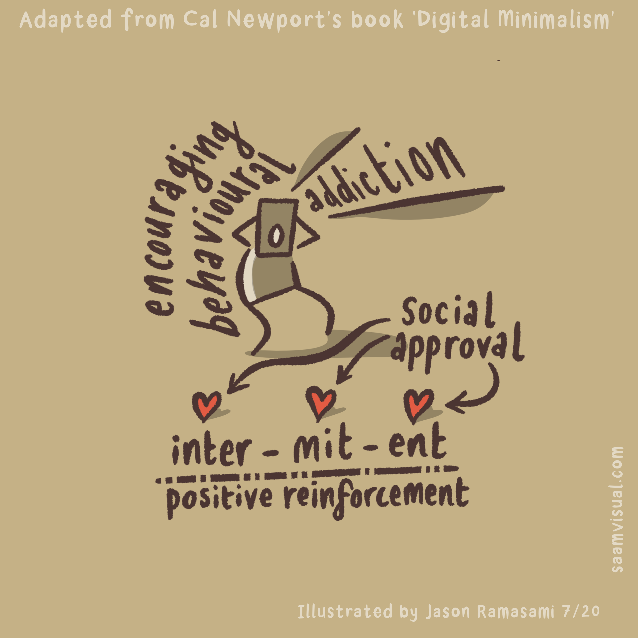
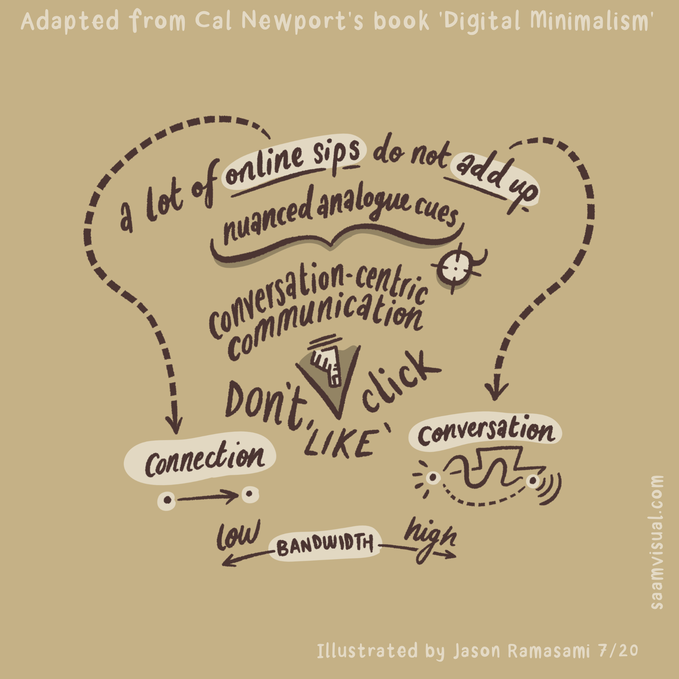
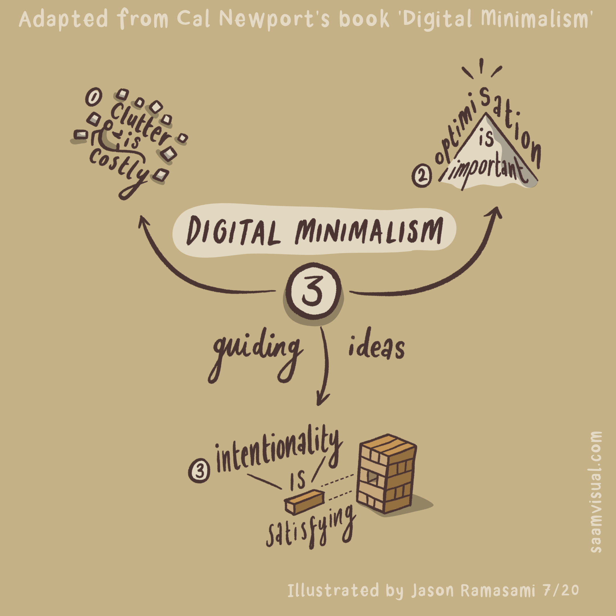
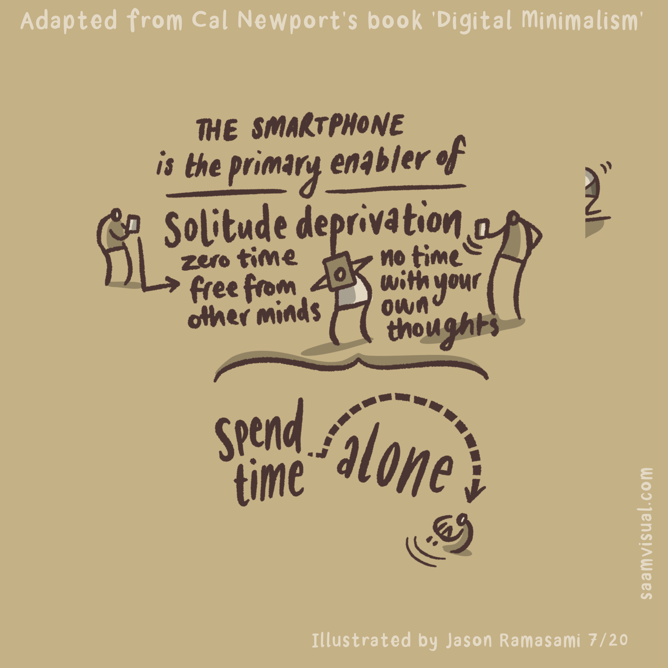
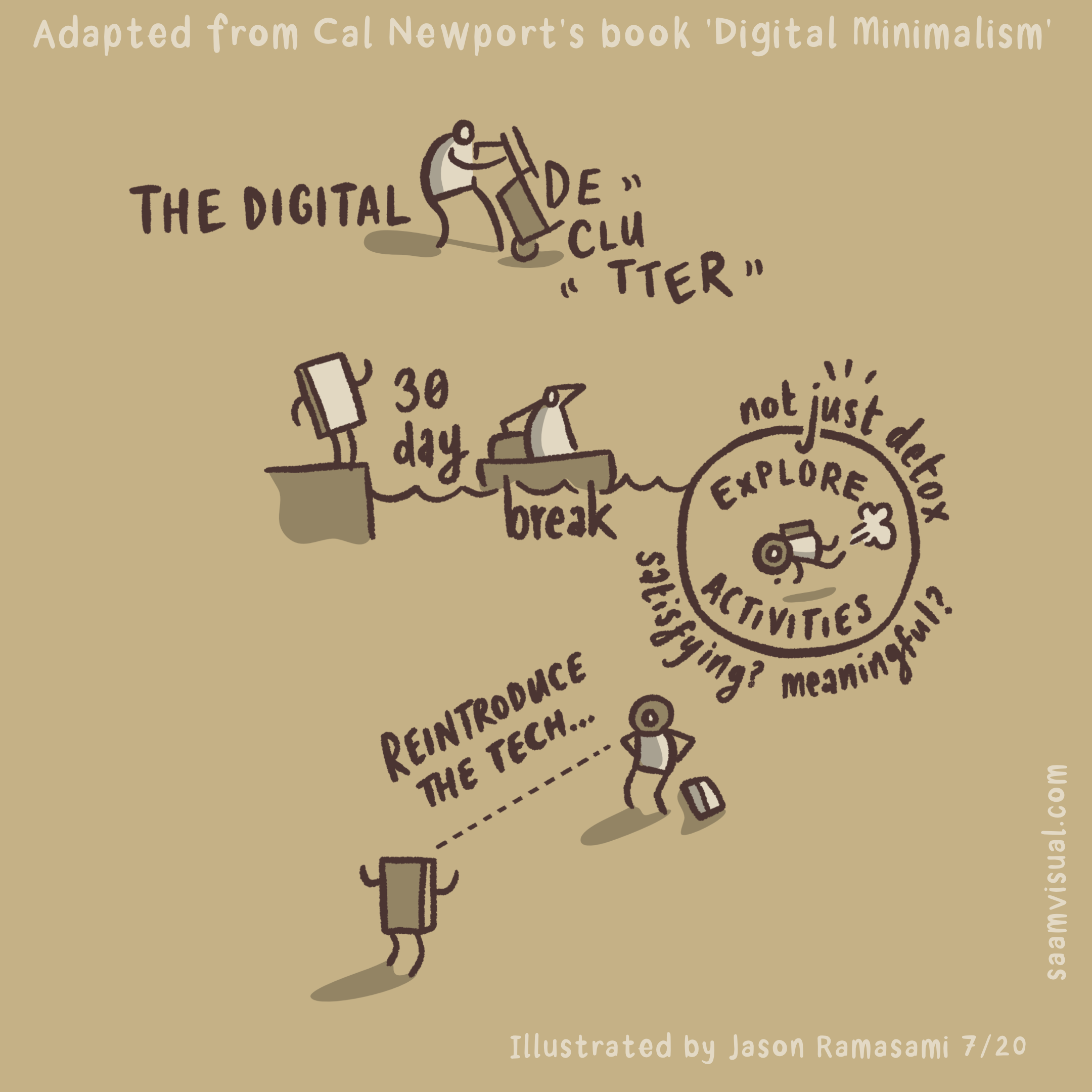
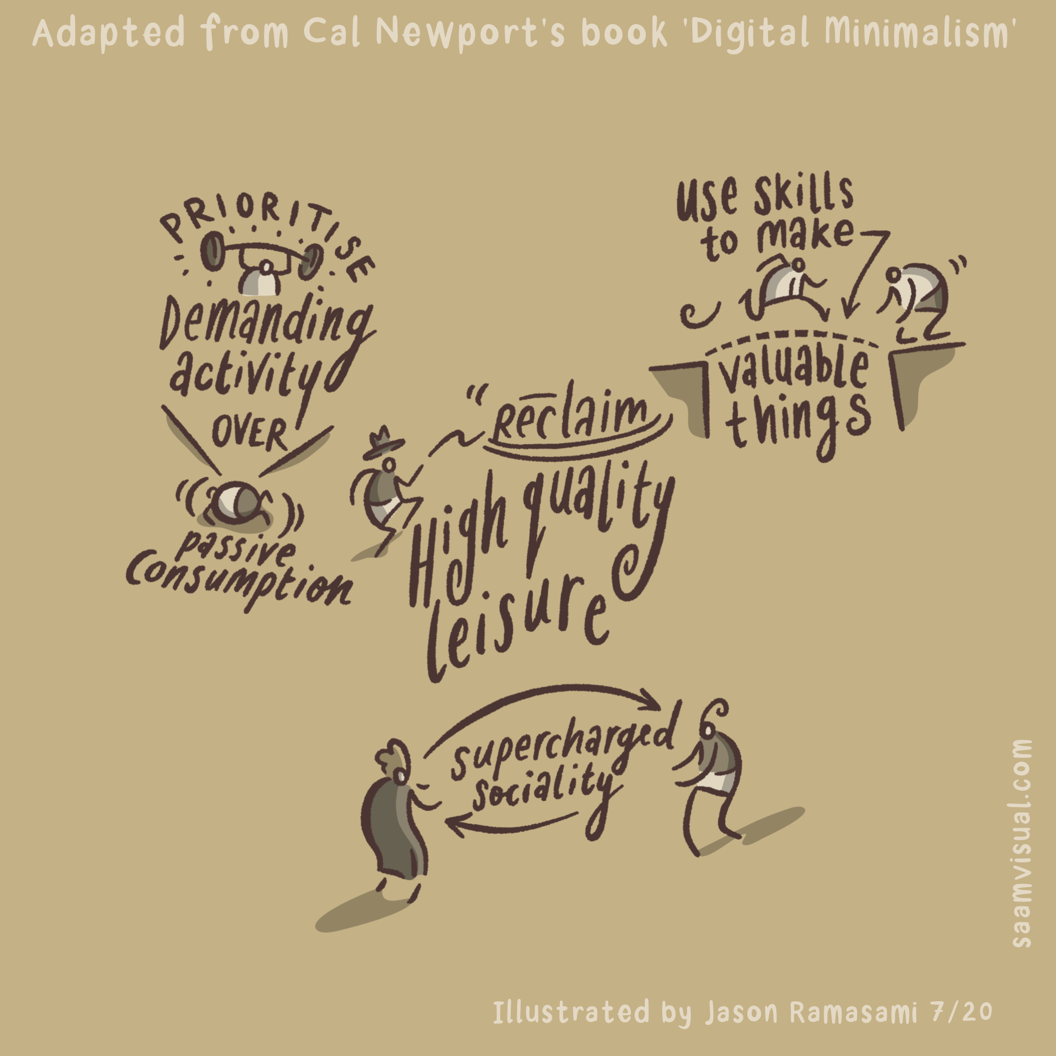
Cal Newport's Digital Minimalism
Cal Newport’s most recent book really hit a sweet spot for me. I devoured it from the get-go. All of those tiresome lockdown months sat in front of google classroom left me desperate for some fresh reflective space. Newport certainly provided that for me!
In this (short) 26 minute video I run through the following:
Introduction to the book (0-1:30)
Making the infographic (1:30-6m)
The Ideas in the book (6m - end)
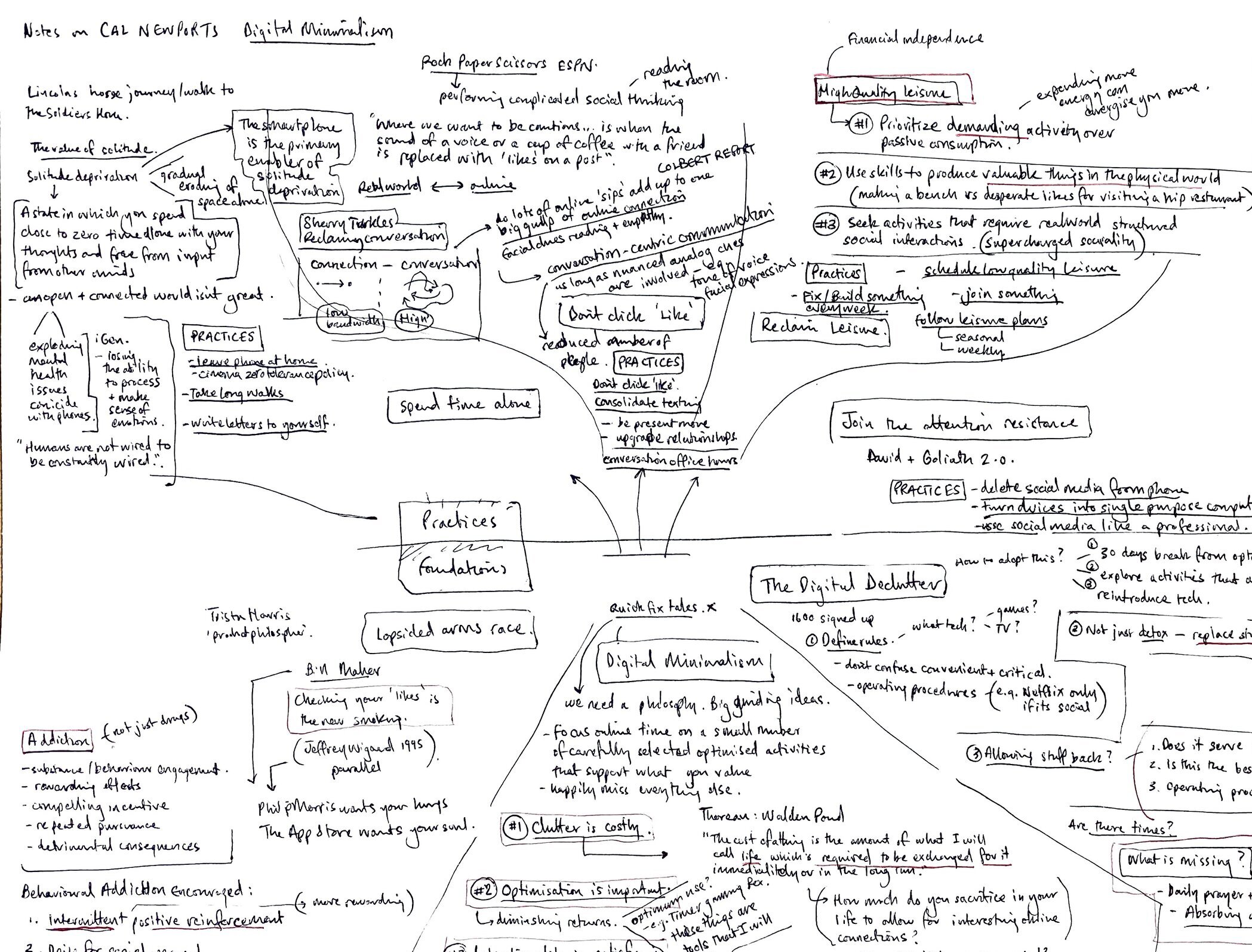
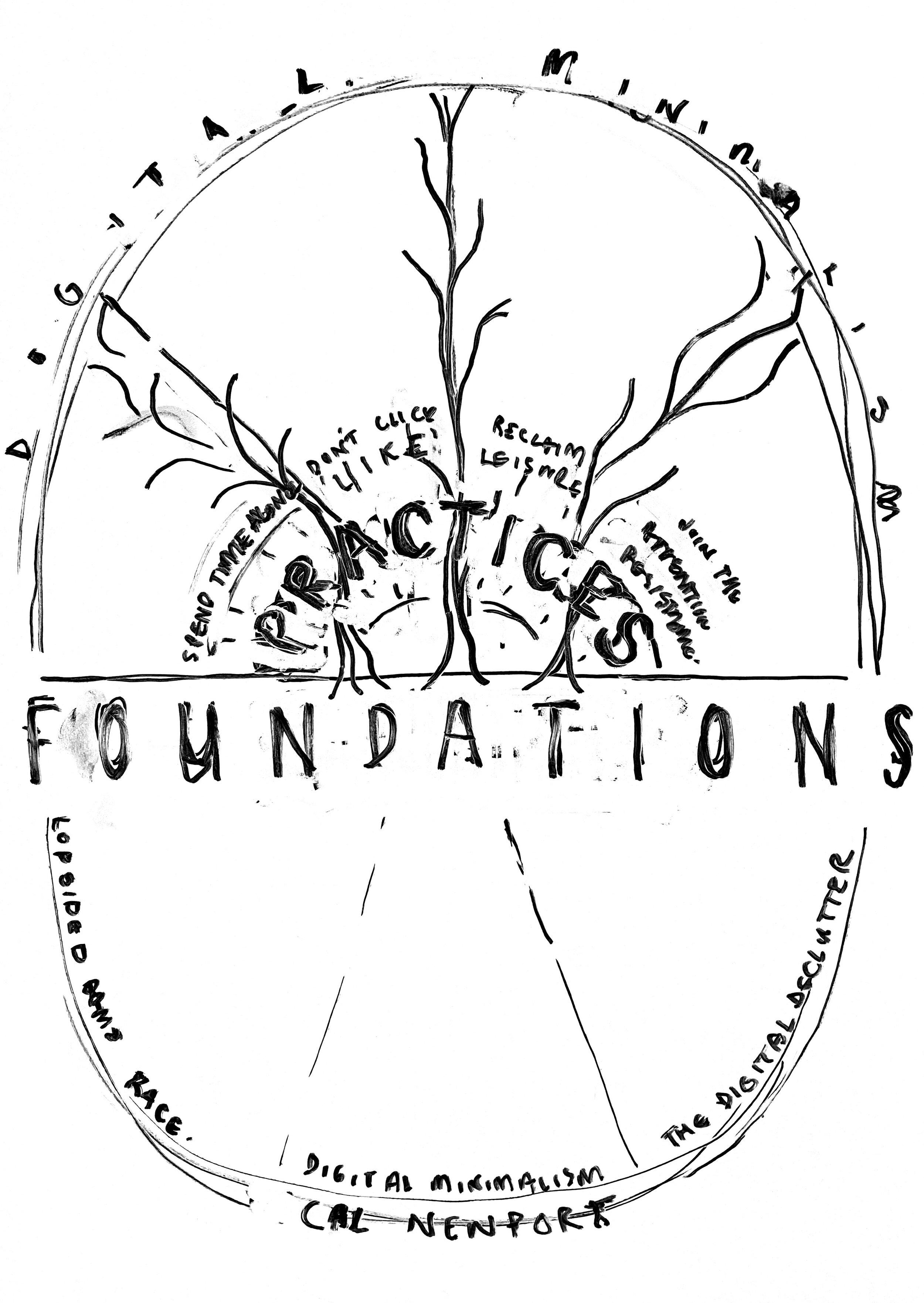
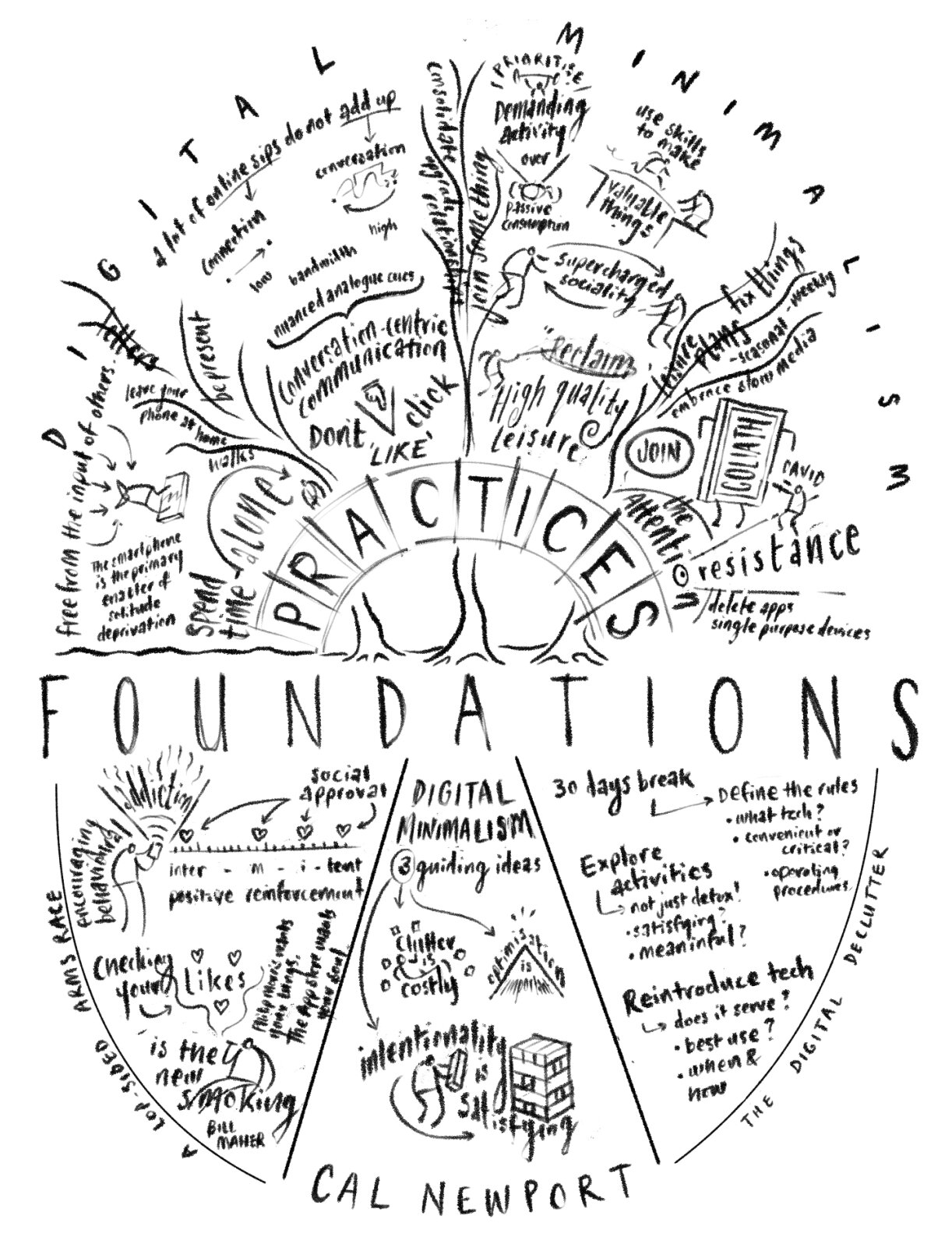
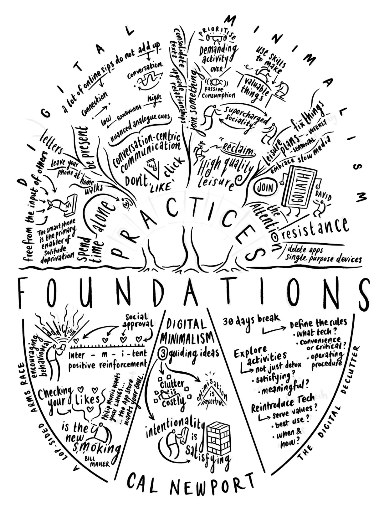
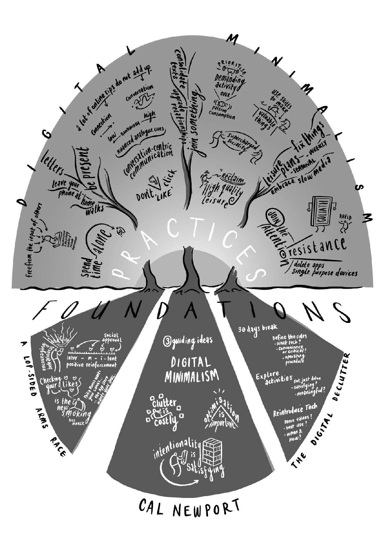
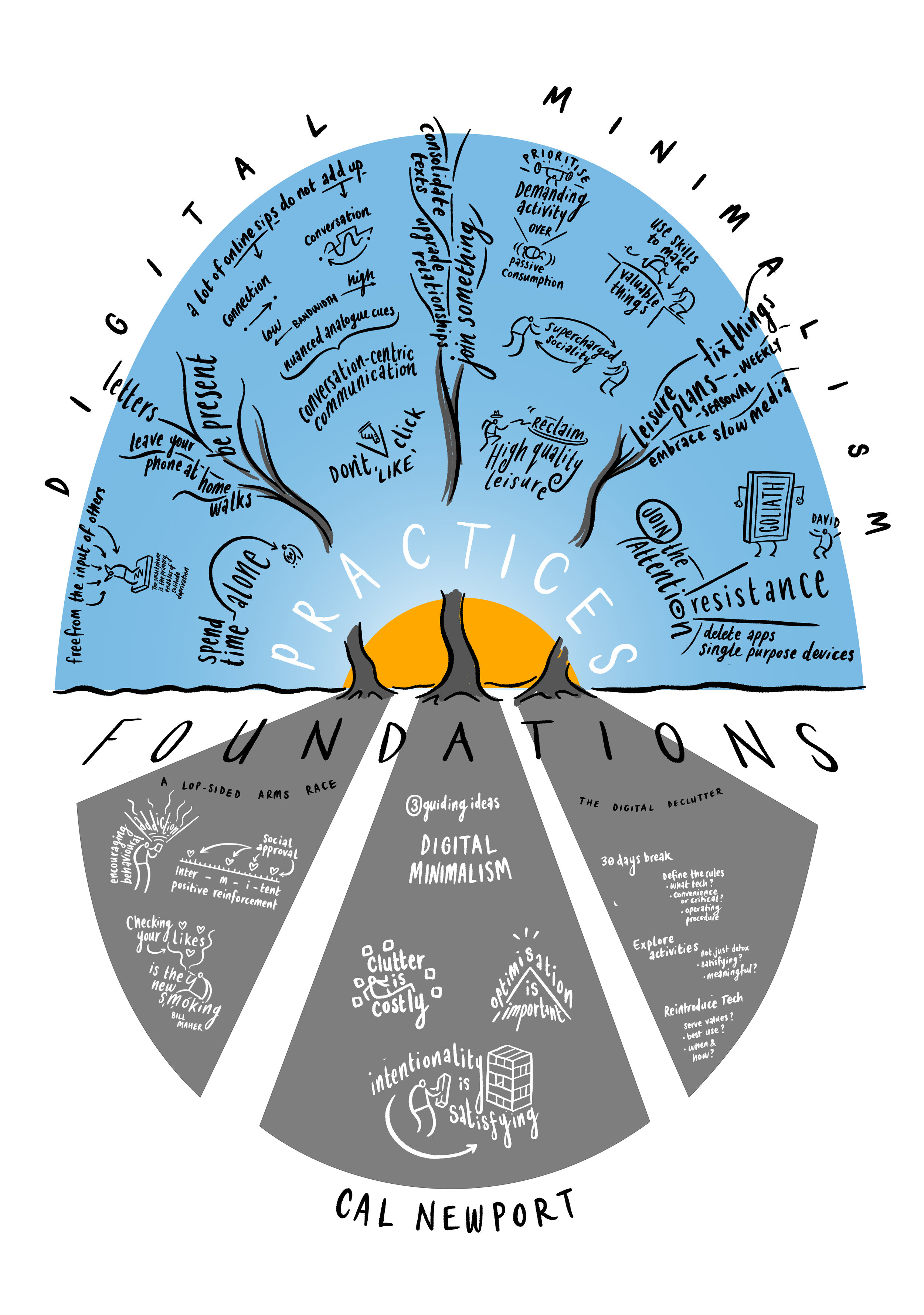
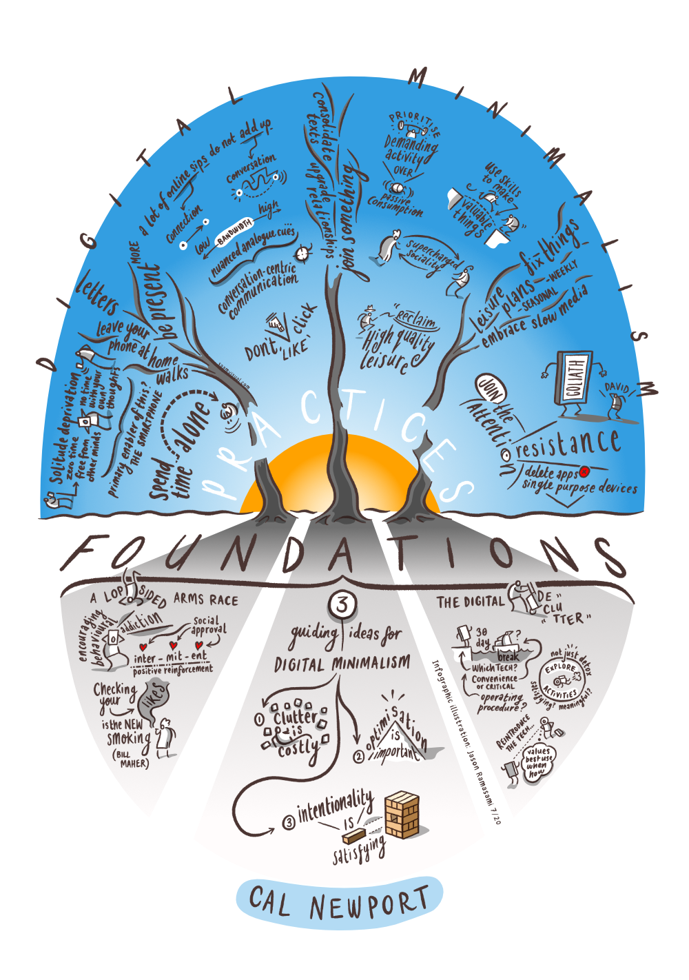
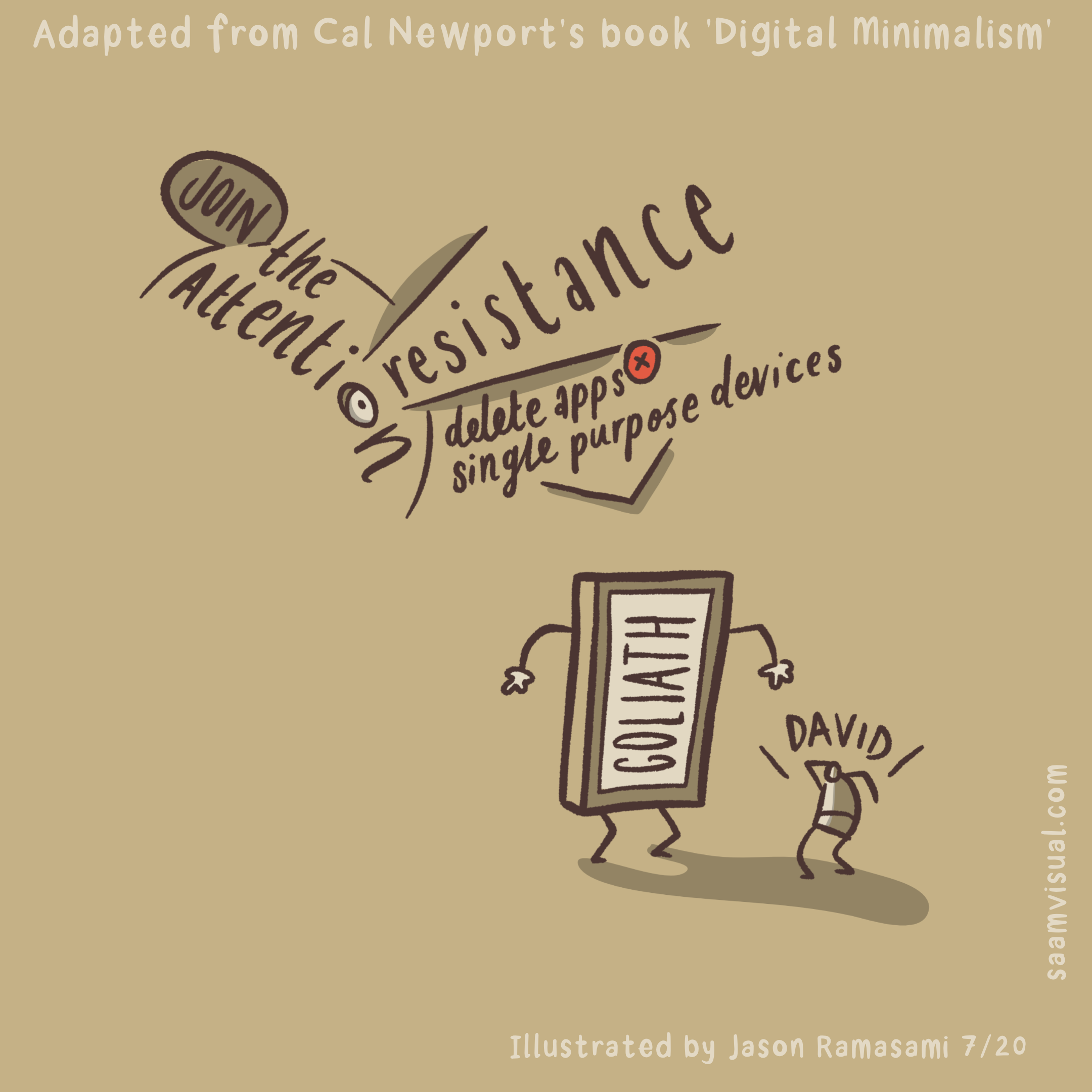
Here is a quick summary of my process for this one:
detailed notes on paper
very early whiteboard composition
Clip Studio Paint drafting using ‘pencil’
back to CSP for more detailed inking
initial shading and tone work using Affinity Designer
final inking and composition in CSP
Affinity Designer for colour/shading
If you are interested in using my skills then get in touch or take a deeper dive into my infographics material.
#thesocialdistancerun
How a reverse-idea sparked by awful COVID19 funeral arrangements led to our school community growing stronger
It was only to be expected: when the news that one of our students had lost her mum to COVID19, we all felt the wave of sadness. The funeral instructions didn’t help change the mood much either:
You could line the streets of the route but the church event itself is out of bounds.
Frustrated with things being the way they were, I had an idea - what if we could turn social isolation on its head and use it to enhance things?
Side note about spirituality
Teaching Religious Education is my full-time day-job, as part of the role I regularly tackle the concept of ‘spirituality' with both religious and non-religious students. The definition I find the most useful is this one:
Spirituality is when you connect with someone or something beyond yourself.
It is a non-material link that can be experienced in open-air concerts, national sporting events and especially within belief communities. It is an engagement with an invisible reality that is hard to quantify. It is something that can often be felt or sensed but is difficult to prove in strictly ‘scientific’ terms.
This idea was aiming to facilitate a truly spiritual event - just when lockdown measures were isolating our school we were daring to reverse the trend and remake a non-material connection.
#thesocialdistancerun
It didn’t take long for Joe Fairbairn (our IT manager at school) to input all of the school postcodes into google maps and arrive at a bewildering map spanning the distance between Barnham to the west and Shoreham in the east. Then, in conversation with Chris Sloggett (a maths-teaching, marathon-running colleague) we drew up a zig-zagging route that travelled within two to three roads of every student on roll.
It seemed good to break it into two routes - A and B for simplicity - which we then cycled to test it’s viability as an ultra marathon route. From here our amazing team at school got to work on creating a day that would involve everyone in the school:
Phil Dean: overview support & conjuring up numerous parallel activities to occupy everyone else!
Julie House: thinking through the ‘what-ifs’ of safety and support during the route
Chris Sloggett: arranging the chain of runners and a set of loom explainers to communicate stage breakdowns
We settled on two minibuses for A/B back-up along with two dedicated cyclists (Chris and Emma Hughes - thank you!) to guide the runners. Now we just needed to create some kind of visual media communications system that would draw it all together.
The YouTube Live Channel
This was going to be event ‘hub’. Members of the public had to be able to easily hop onto the broadcasts and get a sense of what was going on without too much fuss. We decided to go with YouTube early on rather than Google Meet, Vimeo, Facebook Live or even Instagram mainly from a UX perspective: this is the natural place for high-school students to watch live video.
From the ceiling webcam - Doug, Sam, Adam, Zoe, Ellena (leg only) and Molly (unseen). I look like an idiot in my Mexican Wrestling outfit.
It became clear quite early on that Doug Larkam was the perfect person as anchor for this part of the process. When you see my edit of the broadcast below you will know what I am talking about here. In thinking through our transmission material it seemed sensible to plan for half-hourly bulletins with a route map being updated constantly. In between the broadcasts we would prepare our in-coming material for the next slot.
Key to the technical success of the event were the combined efforts of Joe Fairbairn (IT manager - mentioned above) and Sam Reed (one of our pandemic-era Year 11 students). With Joe’s mentoring and support, Sam pretty much ran the entire broadcast single handedly - someone give him a job soon - he is amazing.
I asked Sam to feedback on the precise technical arrangement:
“We had three inputs into OBS (Open Broadcast Software):
- a main 4k camera (with a lovely 20x optical zoom and xlr microphone input) plugged into our Elgato HD60 Pro capture card
- a ceiling-mounted USB webcam
- Google Meet
OBS is very versatile - we were able to combine all of the inputs with ease, add scrolling text and images into our live feed. To ease the load on the central GPU we had to incorporate a second computer for sifting through the material that was being sent in from various phones across West Sussex. One of the key improvements for a future event would be to bypass the confusing OBS audio controls with some kind of sound-deck.”
Relaying information throughout the day
One of the most satisfying elements of the day for me was the chance to be able to design some graphics that would solve some of our communication problems. Having a fully operational studio two days in advance was immensely useful because we were able to judge how effective the existing graphics were in situ. It became apparent to me that we needed something better than a conceptual illustration stretched across a 1080p area. In the end I arrived at the following the design solution:
The TV infographics would employ two ‘modes’
1. An interactive/explainer route map.
This is Doug Larkam the main presenter, a maths teacher and generally great person. I love it when he regales me with tales of his helicopter missions in Vietnam. You should ask him about Oliver Stone who once dated his mum.
Sam had figured out a way of taking bespoke images and enabling us to drag our own markers across a map rather like an interactive weather map. I loved this idea and thought that it provided a really good entry point into the event. With hindsight it might have been better to stick with the second map mode.
2. The live-update map.
The idea with this graphic was that it would be shown in between our half-hourly bulletins. It needed to give a more detailed sense of the route without overwhelming the viewers. I included a handful of details like the A27/rail links and followed the precise map as a guide when I was putting it together. I created a bunch of highlighted zones that give an at-a-glance sense of the stage, timing and people involved. I also went with two simple colours that indicated route A/B immediately.
Below is my proof-of-concept video for the team:
Other features worth noting: we had a ticker function running throughout the day and some clear ’next transmission’ signs that could be easily placed between sessions for clarity. It is a source of personal pride that my own font was used.
How did it go?
In the end we had very few hiccups. Testing things proved to be a wise move (when isn’t it?), but even so I think the media team were surprised how smooth it all turned out. Maybe one of the biggest things for me on the day was the sense that we were doing something original and that everyone present made a huge difference to the overall result. Having students in such key roles is a sweet thing - in particular I want to thank Molly, Ellena and Zoe for being so helpful. Adam was brilliant on camera and of course Sam had big capable hands. The YouTube analytics told us that there were 1800 impressions on the live stream.
As a treat for those of you have come this far: here is a one hour edit of the whole day - it gives a good sense of us monkeying about.
What does it all mean?
While the final analysis is yet to come, there have been many indications that we came together to make something very special.
I wanted to make contact again to say just how impressed we were with the ultra-marathon event yesterday. What a unique and fabulous way to reach out to all of the students and such commitment and enthusiasm from the staff.
Parent email.
My personal impression - which lets face it is entirely subjective - is that the school became bigger somehow during that day. I can’t prove that but it felt as though the very act of reaching out enabled us to become something more than the sum of our parts. To meet a pandemic head-on with this level of community participation is very special. I am convinced that the ‘spiritual’ event I had originally anticipated had happened.
Finally - to everyone who took part (however small - it all added up) thank you for engaging with our very strange event. And to Pete Byrne - thanks for the buy-in. Your trust makes all the difference.


