More Animation Tests
These experiments can get tiring to the outsider reader pretty quickly so I am going number my updates down the page as this piece develops and keep publishing the same post - feel free to skip. This is for my own brain tracking changes and developments.
1: Write-on using line segments
For this:
I drew a line on the iPad - saved it to the cloud
opened it on the Mac and sliced the route into four or more sections
exported this into a single SVG file which I then opened in Pixelmator Pro/exported to a Motion project
in Motion I create a duplicate (black underneath with a wider outline) converted the top pieces into a yellow thinner line
I broke the four pieces into ease-in/out write-ons
I created a default marker in Affinity and did the same thing as above
then I added various animation behaviours - fade/type on/fade out
duplicated the pieces along the line and changed the pointer with shape manipulation within Motion
For this method to work it needs the stages to be decided in advance - the write-on behaviour is quite quick and easy to do instead of using keyframes.
2: Camera movements using ‘Frame object’ and ‘ease both’
Using the ‘Frame object’ menu function to position the focus on the placed markers. Then I use the scale slightly to bring it in. I don’t really like the wiggling going on in the camera movement. It probably needs a bit more love to get it feeling better.


3: More careful handling of keyframing
I went back and scrapped the camera moves and tried a bit more care. This time I used less scaling. It feels efficient and (perhaps) a little less human but I think it functions fine.
4: Redesign the map elements

I went into Affinity Designer and used all of my prior ideas to make this. It went back and forth between the Mac and iPad to make the most of the various organising/creating tools. Notice that I have used the green (going there) and red (returning) colour scheme. I also added in some edited segments for where the hills are most extreme. In an earlier version I tried to bring in a moving gradient diagram but it felt too busy.
5: Animate the sections
Pixelmator Pro didn’t play well with a handful of elements when I tried to bring my design into the SVG file/Motion project process.
the mile marker numbers didn’t translate accurately, so I ended up converting them to vector curves feeling pretty sure that I wouldn’t need to change the text again
the sections I had cut out to represent steep hill sections were re-interpreted as rounded sections (see below).

The Affinity designer squared ends (left) and the resulting Pixelmator Pro rounded version (right). In the end I quite like the look so it wasn’t such a sad time for me.
I needed to go in and tweak a few of the numbers that hadn’t translated very well even after converting them to curves.
Overall I was happy with Pixelmator Pro but be aware that it isn’t a perfect translation tool. It’s great but not perfect for Affinity files - worth bearing in mind if you cry a lot at night.
Anyways - here is the latest build:
There are a few framing issues but you get the idea - I like how this is turning out. When it comes to the video I am hoping to make with the actual Three Forts run, I need to remember to break those sections into smaller parts (as per section 2 above). Another issue is how the interplay between shot footage and the map works - so far this is a nice set of moving information - how do you integrate shot video into this without overdoing it?
Run Notes 2
This is my next attempt at recreating a running story. I’m not going to waste time talking this one out, so some brevity will have to do. Soz.
In my day job I work as a learning designer (a lengthy blog post has been been written telling the story - will link it here when I publish it imminently) - I am currently preparing to produce a set of course materials that utilise an animated historical timeline. I am mainly using Run Notes as an excuse to flex my muscles and learn effective ways of making this kind of thing quickly (and cheaply).
I wrote in a previous post about my earlier experiments. This one is a stage on. Some bullets:
I used a GoPro Hero 10 and ‘Shorty’ in my Salomon 8L backpack - very compact and light to use. It worked way better than the Insta360 set up and was much more convenient than taking my bag off and taking my phone out - it was also very quick to get to the footage which was such a barrier with the Insta360 system. In this instance I think I might have used it too much. I was just finding my way after all - on the actual Three Forts Challenge in a week or so I shall work out the points I want to record in advance and stick to that. It is possible to have too much of a good thing.
The initial screencapture process was way too exhausting - I had about 60 pngs saved and strung together - Motion couldn’t actually cope with them. In the end I had to use one simpler map - the one you see. One huge learning point is to try and find a sweet spot - how minimal can I get without losing impact?
On the GoPro front - it is worth saying that it is a remarkably smooth and reliable system with very pleasing results. I did some timeworn recording on my bike yesterday and it is just easy. I am still finding my way on the use of Wide/Narrow shooting modes. Will need to practice that a little more before the big day I think.
Having small images appear on the screen is okay… I think I want to try a slightly different mode next time. I like that there is a unified map and that everything links back to it.
The more conventional non-satellite map is impossible to stitch in Affinity Photo as a panorama - satellite works way better - more details to find and link up.
So in terms of developing an effective visual language this one is making forward steps. Will post more as I go.
Career Journey Map
Back in mid 2021 (I know, I was busy!) Culham St Gabriel’s Trust approached me to produce a teacher’s career map. They wanted something which would help specialists to reflect on where they were heading and how to get help going from within the Religion and Worldviews community.
This is what we arrived at:

There are four profiles to follow across the map.

They should probably make this into a board game or something.
Each of the profiles links to a more detailed grid which is updated with useful information.
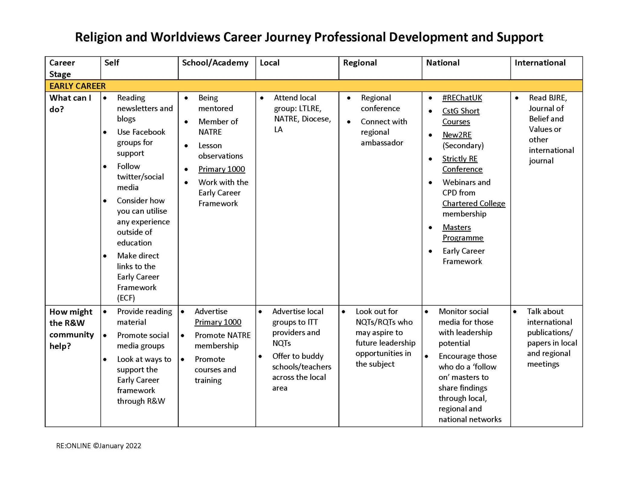
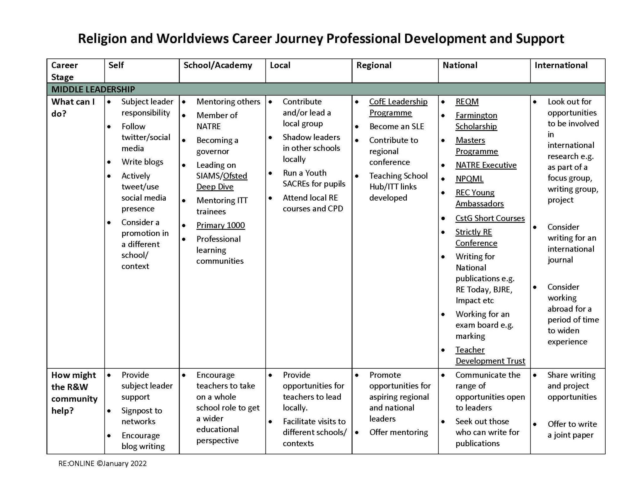
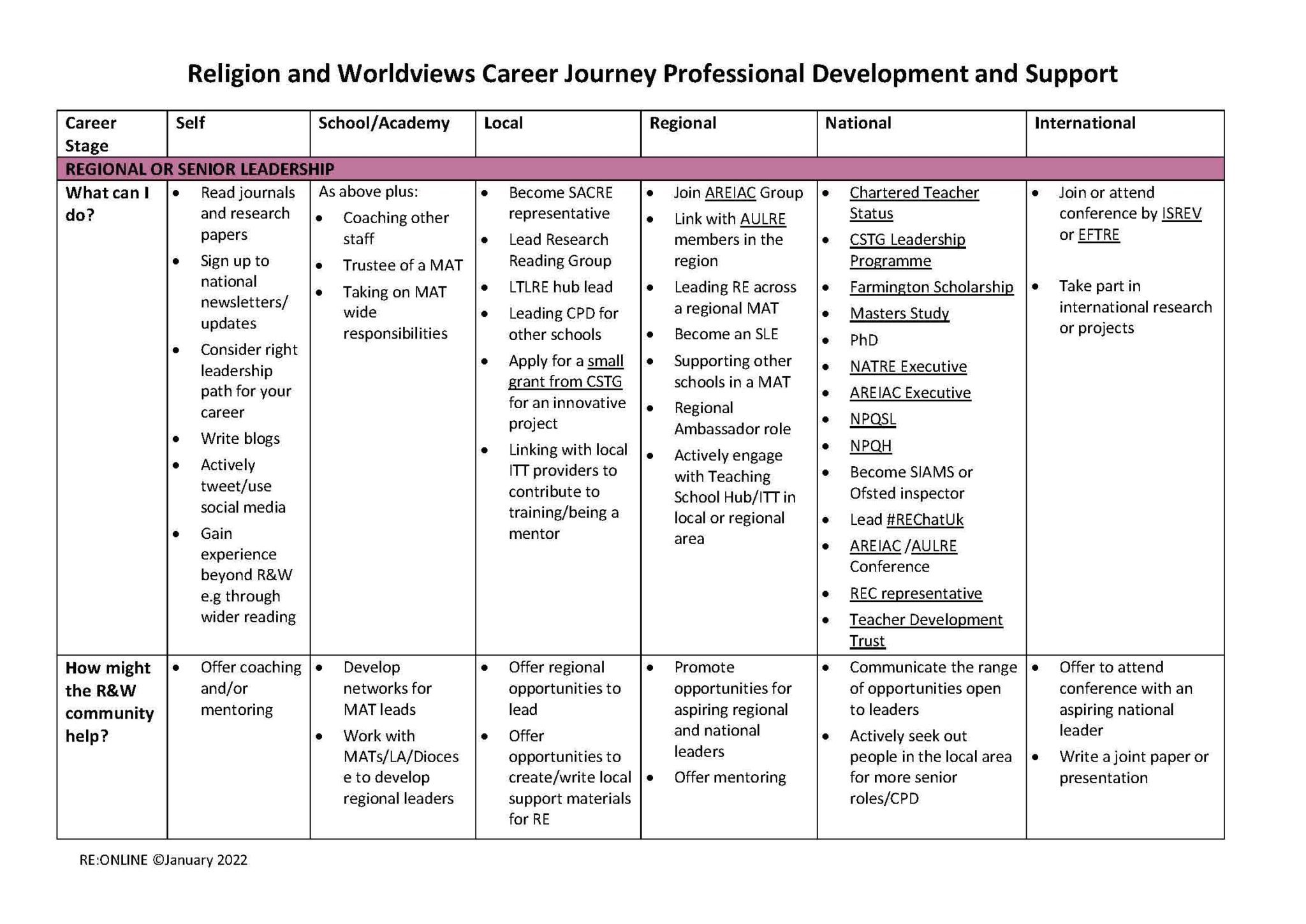
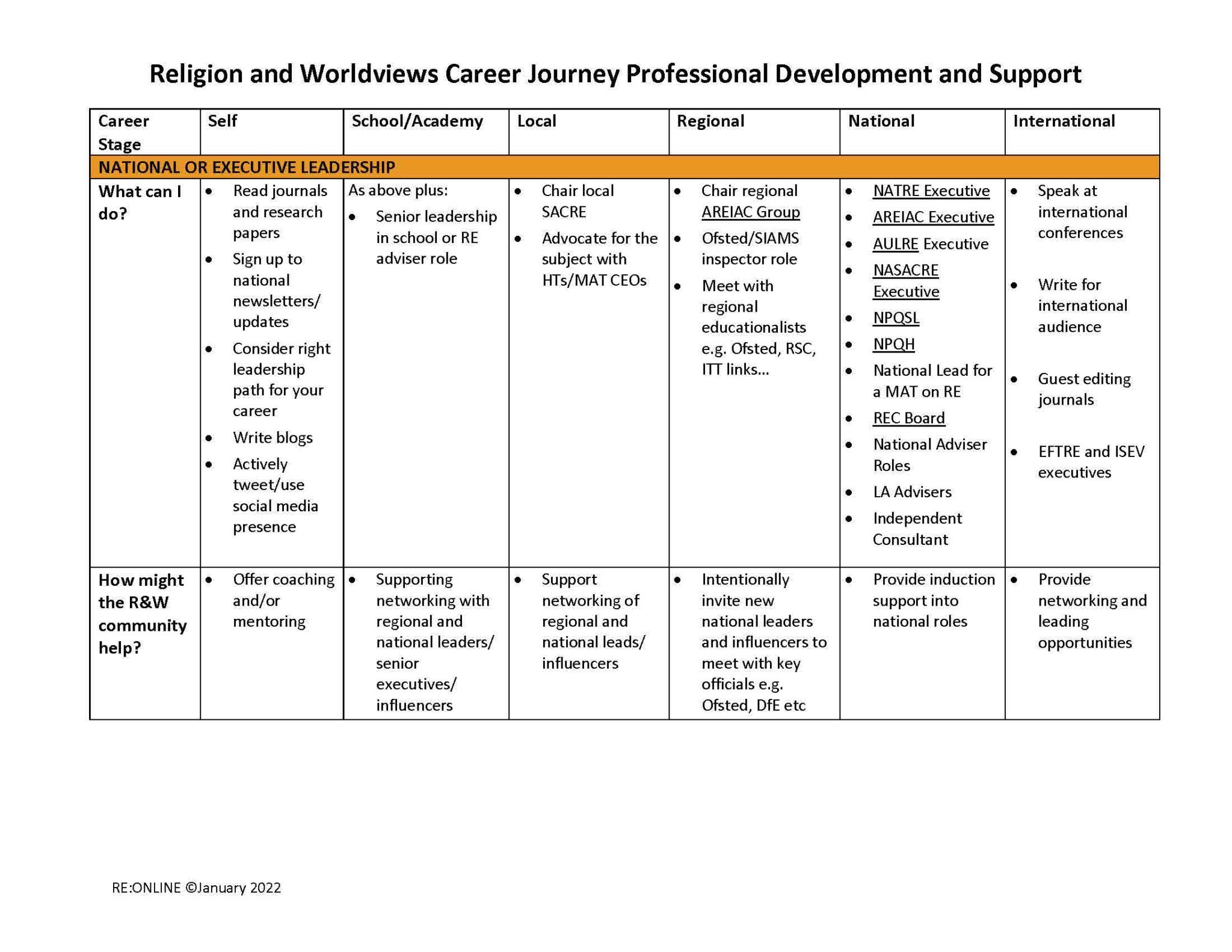
I spent many years working as a teacher in this area and it was so satisfying to make this map because I know how important this information would have been for me at different points. Professional development and a sense of direction are often crucial for surviving different (and unfortunately, occasionally toxic) work environments. I love that Culham St Gabriel’s works so hard at joining up the supportive dots in so many ways. More info here.
Thankyou to Dr Kathryn Wright for involving me in a valuable project.
Run Notes
This is very much a work in progress - I am trying to find a way of capturing the story of a good run… which is quite hard to achieve without it becoming an exhausting endeavour. This is my most recent attempt. I ran up some hills while on holiday in Athens last week. (Warning - it has too much of me in it but it also represents some progress as far as technique is concerned - which is why I am sharing it here.)
The contextualising of personal footage via a bespoke animated map is a solid step forward for my storytelling technique - I took data recorded on the Workoutdoors app and then used the brilliantly flexible Footpath app to create a reference video (via screen capture) as a basis for the animation that you saw in the clip:

The video footage was shot using my iPhone - and although the image quality is superior in so many ways I felt sad about having to stop so often to remove and open my rucksack to get it out. I need to find a better way of filming more flexibly and immediately - there are so many things you see on a run which would be fab if you could capture them more quickly. It’s all about removing friction and layers of hassle. I feel I am nearing the solution…
Each week I try to take part in the local Worthing Park Run - this is a piece I shot recently with an Insta360 camera which I don’t think works very well due to the limitations and friction of the technology involved.
(I should also say that I detest the music on this clip but I was pushed for time so whatevs…)
I think the 360 camera isn’t quite there yet - although the form factor is cute, the shots are too often grainy; the labour involved in reframing shots is annoyingly tedious. Once the novelty has worn off you are left with essentially 1080p clips of occasional quality. I want something better and I think a switch to GoPro after so many years of resistance might be the way forward.
I am hoping that I can:
easily store one in the front part of my running bag without it being a hassle
whip it out quickly and record decent 4k (and higher) material with good stabiisation
be able to access and edit the material quickly in FCP
not be hindered by battery issues (assuming that I am not filming everything - just the odd clip of something that catches my eye)

This is a sketch of my next kit list when I fully intend to capture a longer South Downs run - possibly the Three Forts Challenge…
I will be posting more updates as I make progress.