Four Key Design Questions - Scott Berkun

As you read it you get the sense that he has spent a lot of time teaching and reflecting on his material - the chapters consist of short, well-arranged chunks of material that lead the reader into a holistic grasp of design culture.
One of my favourite sections does an effective take-down of ‘drive-by’ design: work that creates a slick visual re-think of an existing format (in this case Boarding Passes) without proper regard for the wider context of the existing infrastructure. In other words: your design might look amazing and get loads of likes on Dribbble/Behance but if it can’t be produced by the existing printers you are living in a fantasy world. This is where this book really shines for me - drawing attention to the design powers that lie behind the design choices themselves.
There are loads of design books that explore the specifics of the choices themselves, but this one pulls back for a grander sweep of the horizon and the tectonic plates beneath. I valued the reminder that there are influences that make certain biases plausible. Nothing is ‘natural’ or ‘common sense’… an apple falls that way because of the invisible gravitational forces acting out. Every design team is limited by - and reflective of - the organisations that recruited them.
If I had a wispy beard I might stroke it right now.
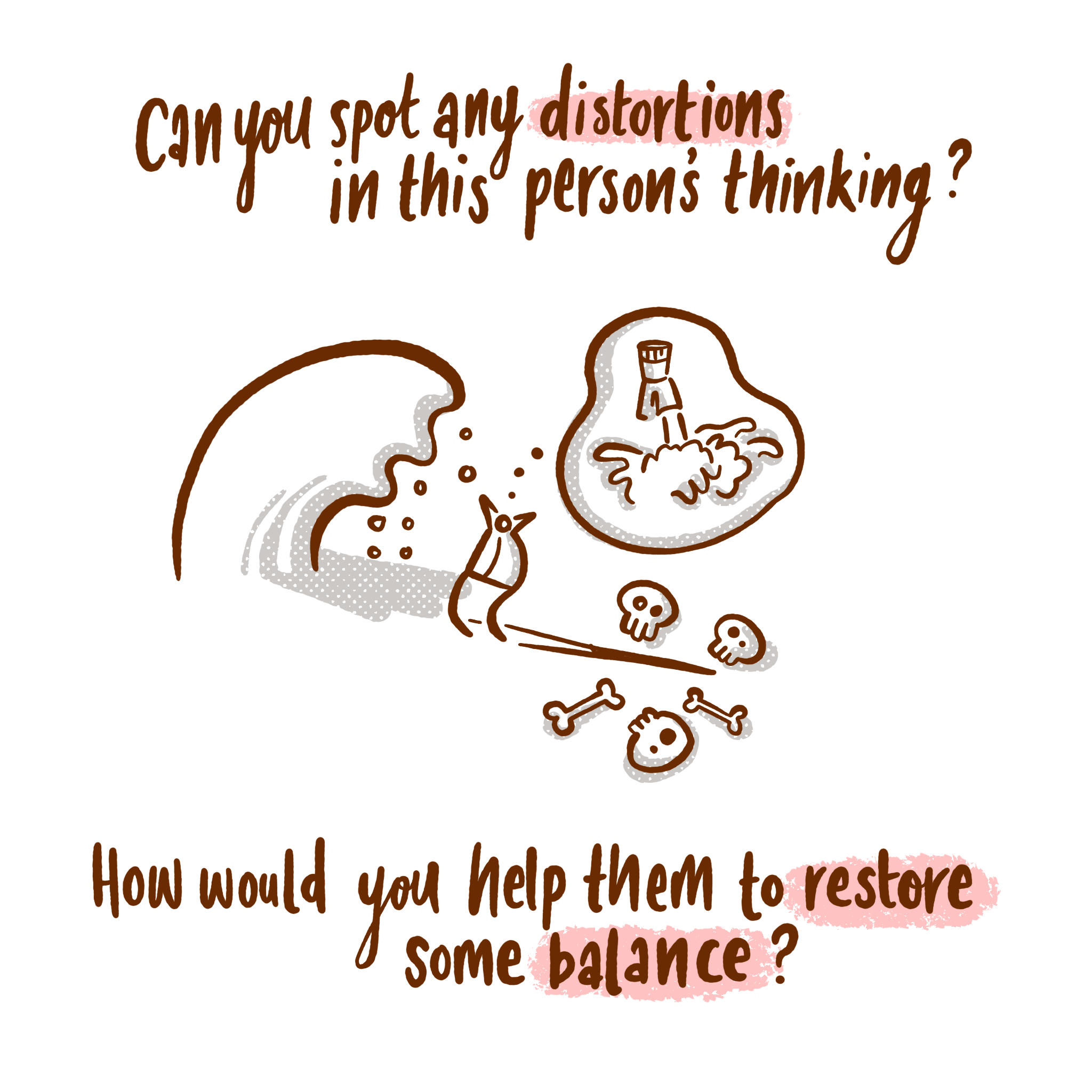
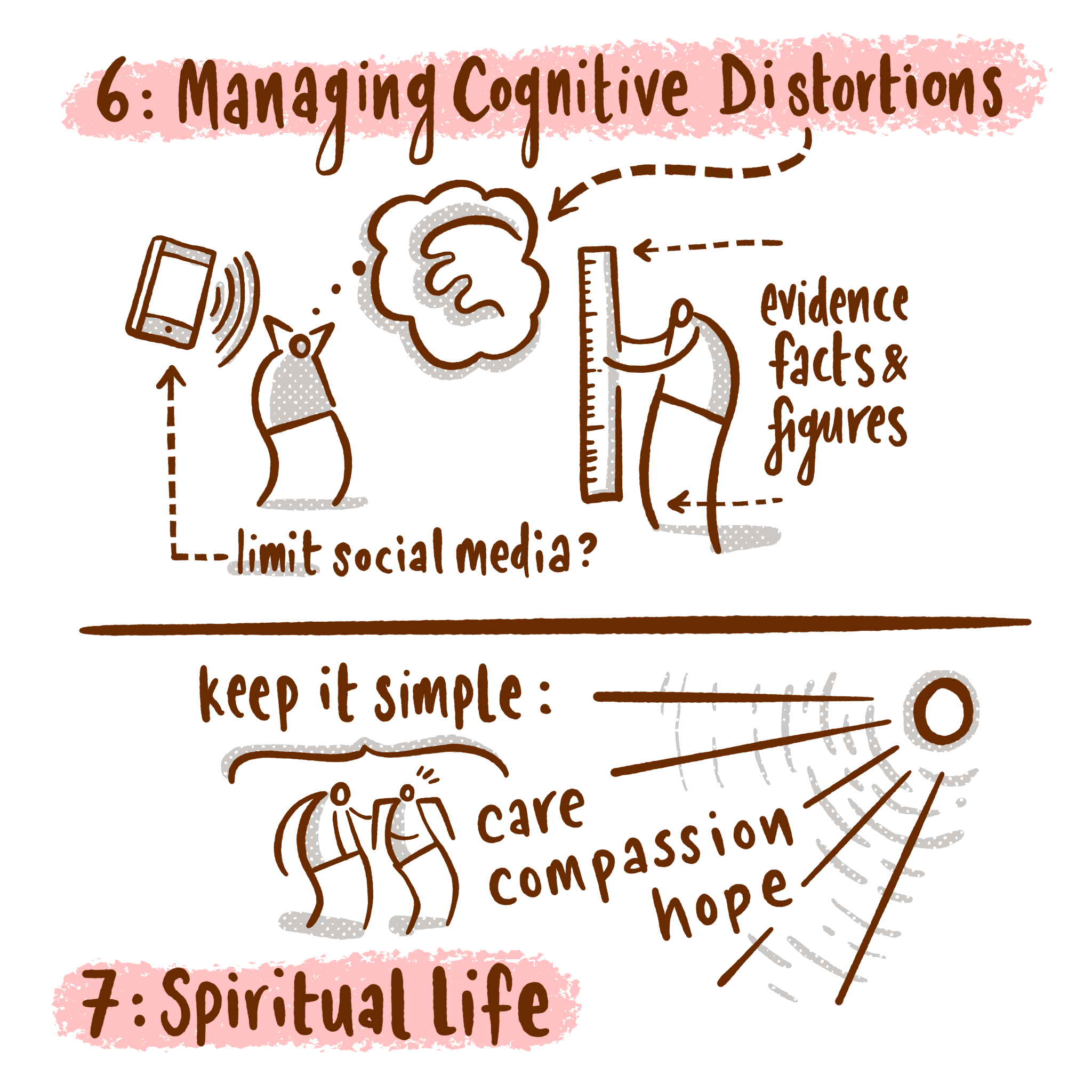
Four Key Design Questions
Anywho… I made a few drawings as I went through the book, needing a personal way of chewing over the insights. I thought it was worth illustrating the central thesis of the book.
What are you trying to improve?

He makes the brilliant distinction between building and designing. Many organisations are obsessed with building something, completing checkboxes and shipping items rather than asking tougher, deeper questions about what is at the heart of the problem. Only when you have probed deep enough to examine the issue at stake will you be able to make meaningful progress. Yes there is a place for shiny self-initiated expressions, but great design does better.
Who are you trying to improve it for?

Numerous examples in the book point to blindspots in design thinking: where a solution seems awesome within the team but ignores something fundamental about actual users. This is a reiteration of the point that there isn’t a ‘natural’ or ‘common sense’ solution to a problem - people either employ data with careful insight to inform their outcomes or they unwittingly follow the invisible rails that recruited them.
How do you ensure you are successful?

Everything comes back to the design problem and building in smart feedback loops that draw you closer and closer to an effective response.
Who might be hurt by your work (both now and in the future)?

I was delighted to see this given careful consideration in the book: we need to bring serious ethical consideration to the things we design - it’s not enough to hand it over to the client. It takes mature wisdom and incredible self-awareness to see the consequences of our choices further on down the line and this takes conviction to master. Examples given include familiar ones such as
connected technology bringing greater isolation
convenient faster food enabling widespread obesity
For those of you who know me outside of this website - I spend a lot of my time reflecting on ethics with my High School students. Excellent design surely has ethics embedded within it’s DNA.
Thankyou Scott Berkun for the helpful book.
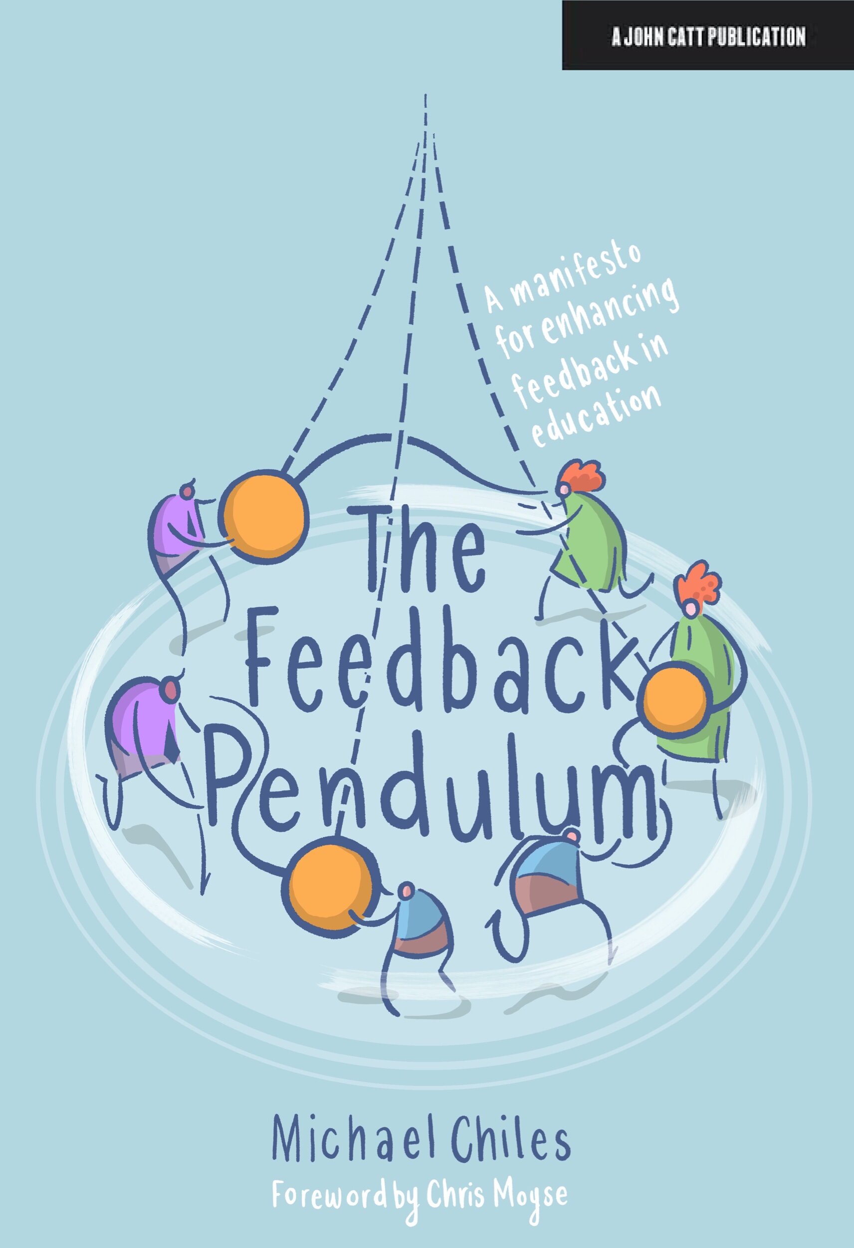
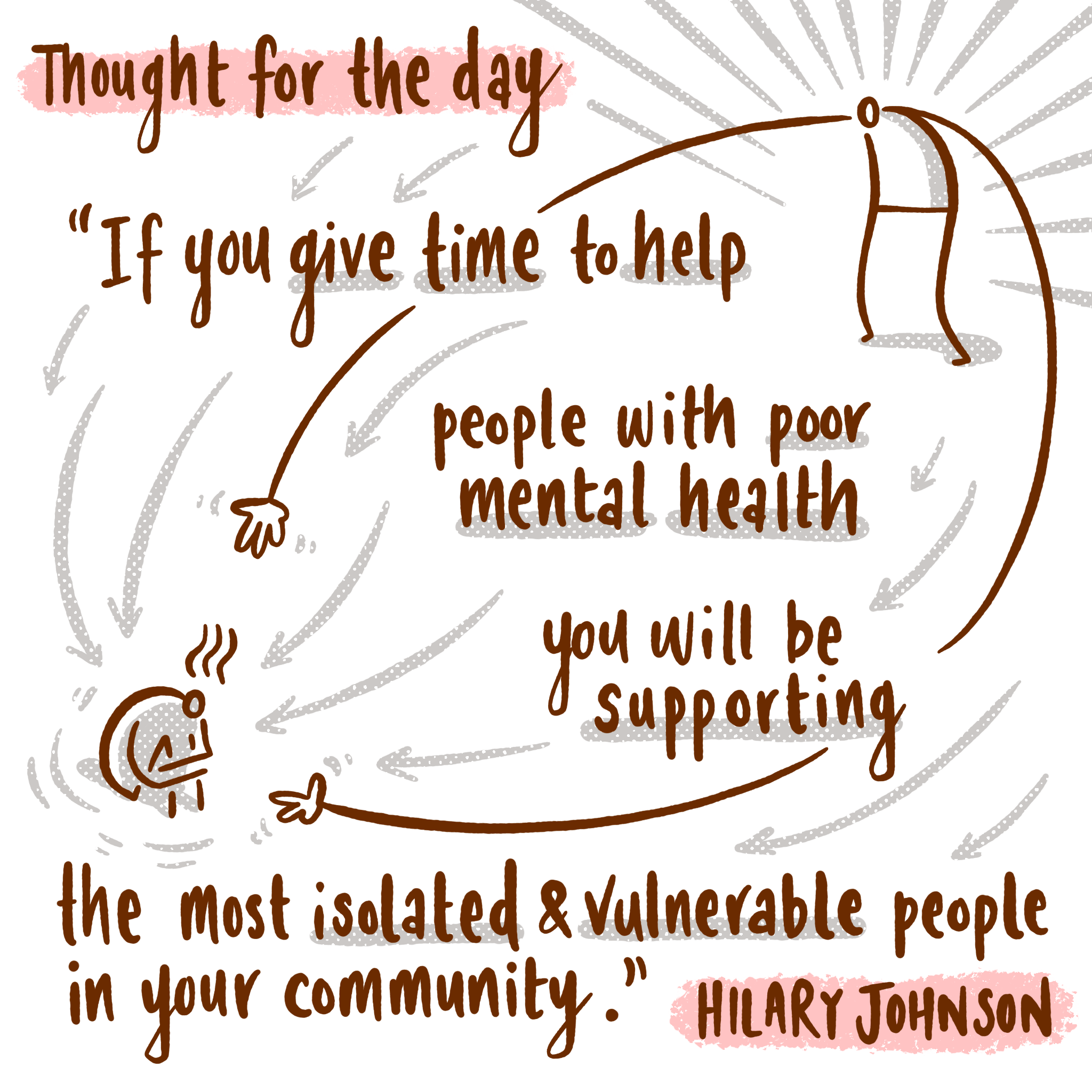
UPDATE: I changed the third image because the first one wasn’t good enough. How appropriate for an image about feedback loops…
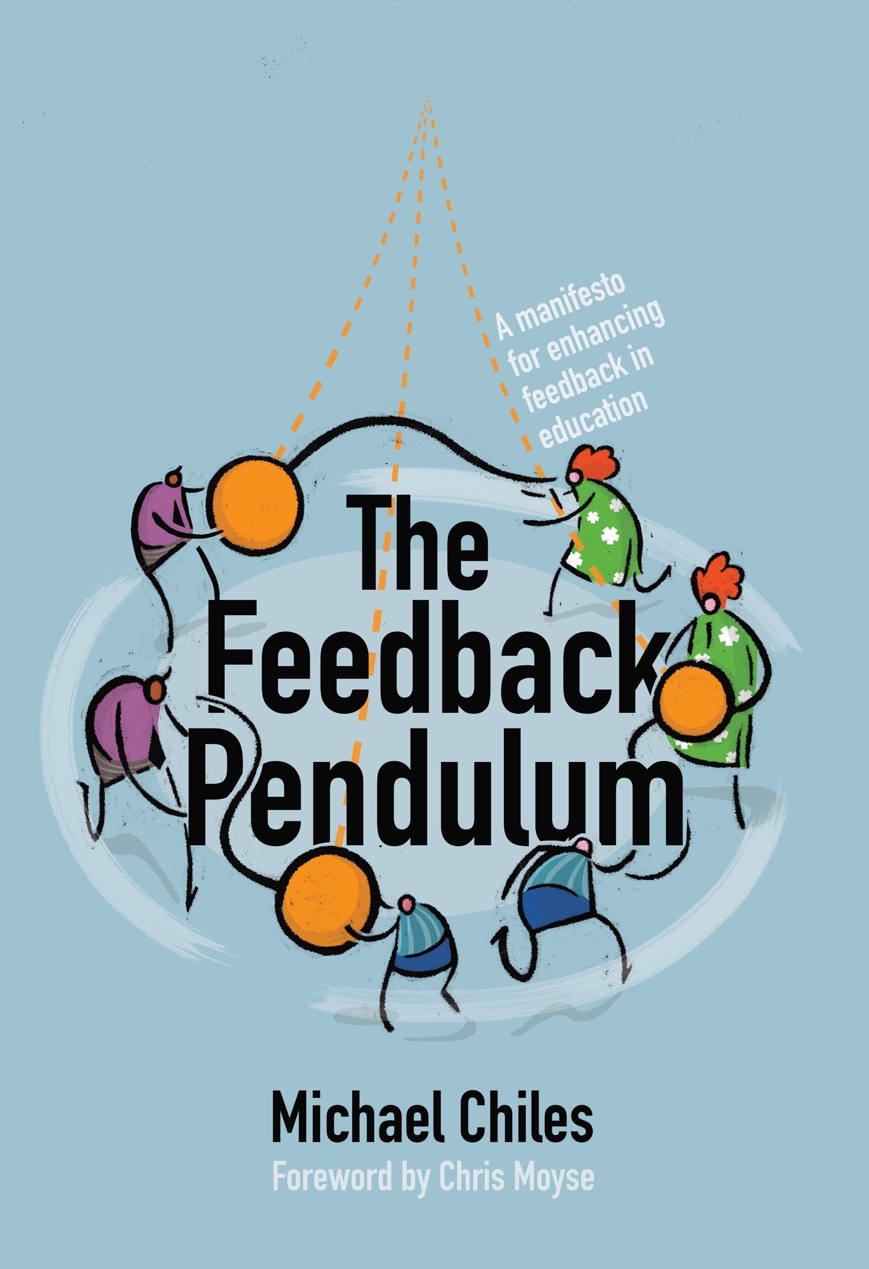
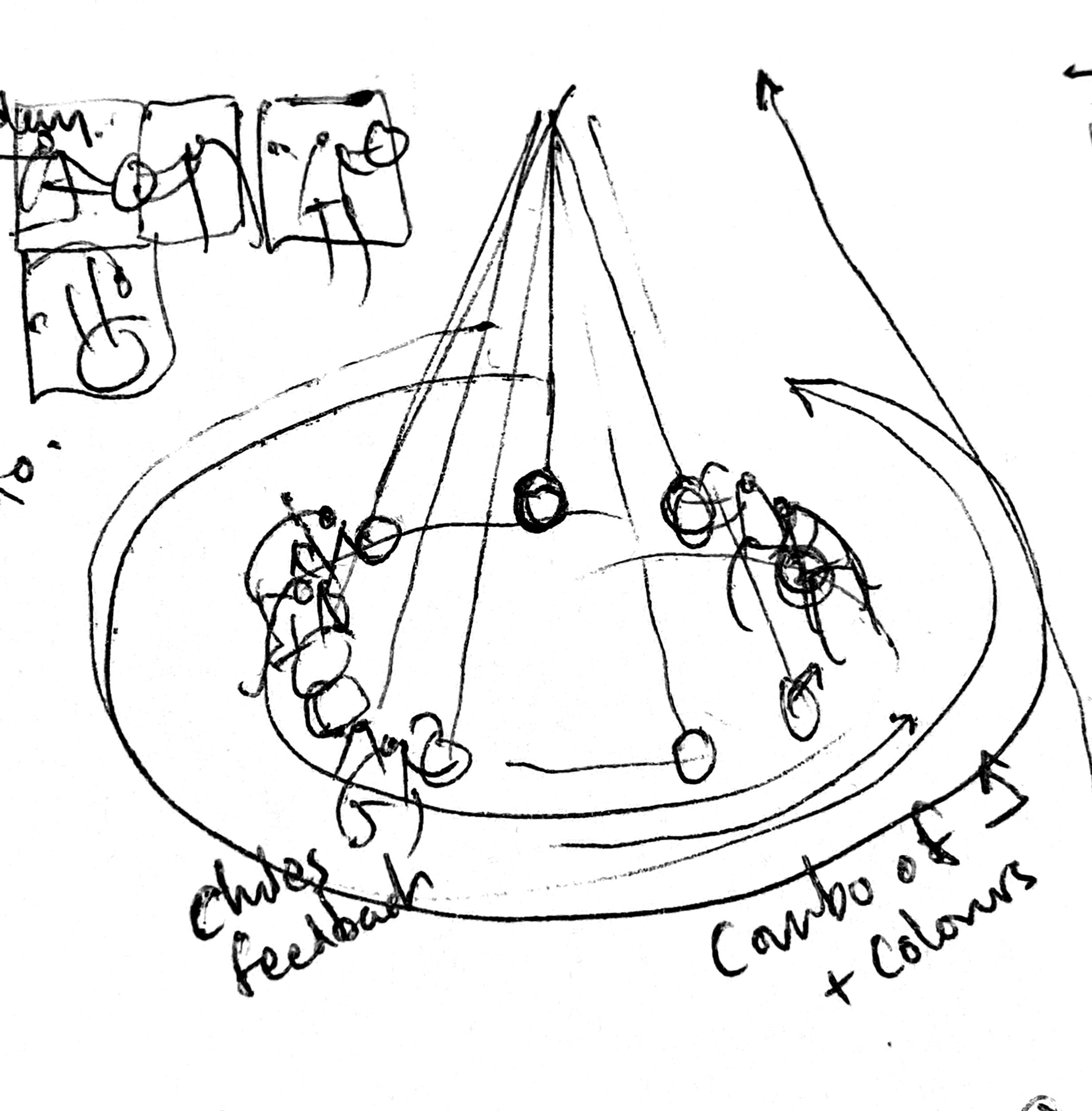
The Feedback Pendulum
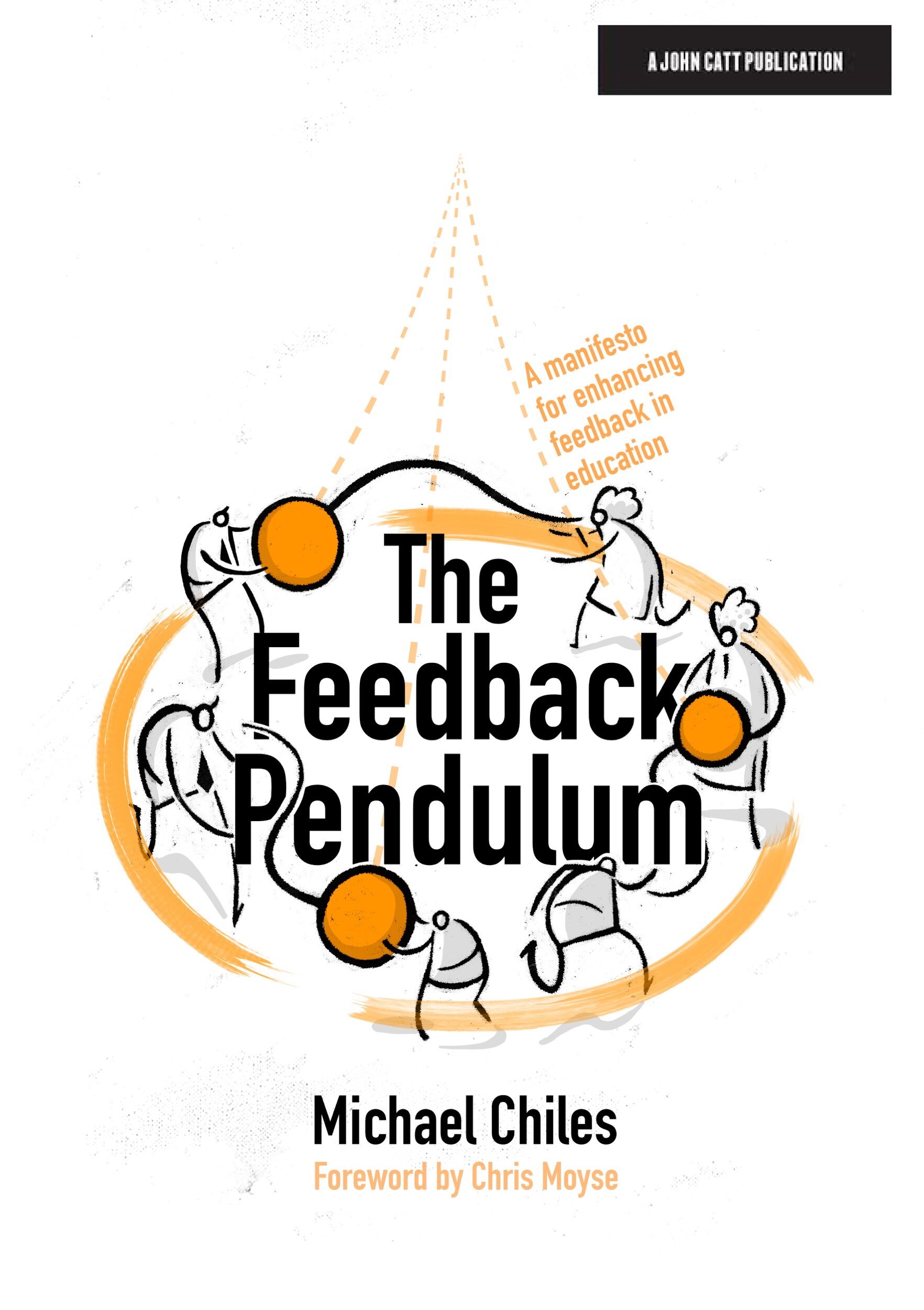
Just a quickie: here are some of the process moments from producing the cover for Michael Chiles’ new book.
The big idea here was that educational feedback is an organic, moving thing that makes meaningful connection between teacher, parent and student perspectives. Each one has a part to play and affects the other.
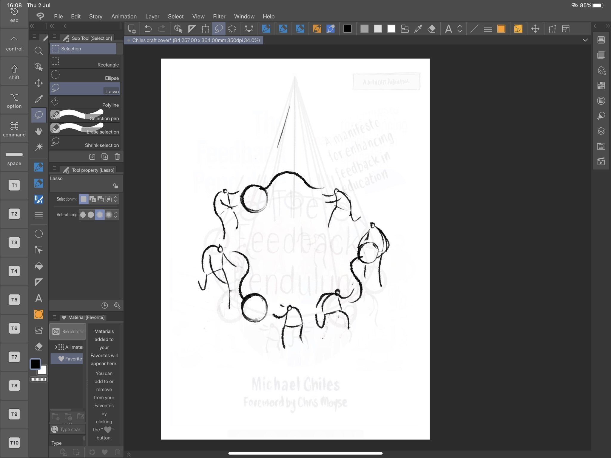
I don’t have time for a deep dive into the process (some would say this is a good thing) but it’s worth saying that my approach was to combine Clip Studio Paint and Affinity Designer. In the end producing flat vector colours is too hacky in CSP - it involves making balloons and then going through each one in a tedious fashion - waaaaay quicker to import a hi-res bitmap into Designer and work while you are thinking using a pencil tool with a fill in it.
Using a Reverse line
One other thing worth sharing is that in feeling mildly frustrated with clean flat lines I incorporated a little more of the reverse line style I have been dabbling a bit more with lately.

An example of the reverse line style from an editorial image I did a few weeks back.

Looking a bit closer…
This involves creating a rougher, less precise line (approaching linocutting in it’s approach) through drawing the inverse areas. It feels rougher somehow and brings a counterpoint to the cleaner stuff I make like this recent cover for Mark Enser’s new book.

In the end I am not sure it really notices - should I have gone a bit more all-out with it? I ran out time but the experimentation was fun.
(HT: thankyou Michael, Mark, Crown House and John Catt for involving me in your projects!)
Kinetic Infographics 2
This post is LONG! so I split it into two parts:
Part 1: learning from the Greats, not Aping them.
Part 2: Enhancing my sketchnotes using Motion
Part 2: Enhancing my sketchnotes using Motion
I wrote in an earlier blog post about how - in developing my own approach - I could either try and imitate what legends like Cognitive (and others) do, or I could learn from their example.
In my situation this means:
identifying the good that I already do - creating explainer-visuals
figure out ways to enhance this using Apple Motion
A simple slideshow
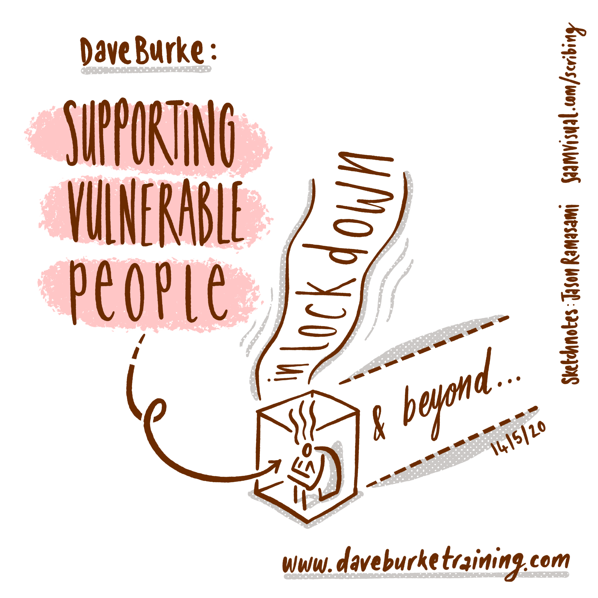
I mentioned in the first post how I converted my sketchnotes of Dave Burke’s seminar into a static slideshow that would work on Instagram as a series of panels. The feedback on this was very positive but I decided to press this further into a basic animation using the video-export function in Keynote:
This is a route I have taken many times. The tools in Keynote make it easy to create something great quickly.
Drawing everything is pretty, but can be exhausting
Over the last few years I have been developing a method for capturing drawings directly out of Procreate via the QuickTime movie capture method on my Mac. Cleaning up these assets via luma-keying in FCPX I composited the clips in Motion.
This is what I came up with:
Having produced this, I was swept up in the exciting possibility of endlessly-spiralling pen marks. In my mind something truly beautiful was appearing on the screen... so I thought I would go with it and attempt to recreate the whole of Dave’s seminar using this method. It felt like a dawn of something golden.
This is how far I got:
It took a lot longer than I anticipated and I ended up feeling bitterly resentful and tired(!) as I animated each letter being drawn (every gap between letters had to be removed to get them flowing right - yes it was tedious). To continue like this would be strategic error - I had to find a different way forwards that didn’t kill my spirit/time.
Meet Style A & Style B
Given the spiralling nature of this project, it made sense to restrict myself and define some clear styles with firm boundaries. These had to be unique to my own work and would work well with future explainer videos.
Here is what I settled on - I named them style A & B - including some of my own annotations:
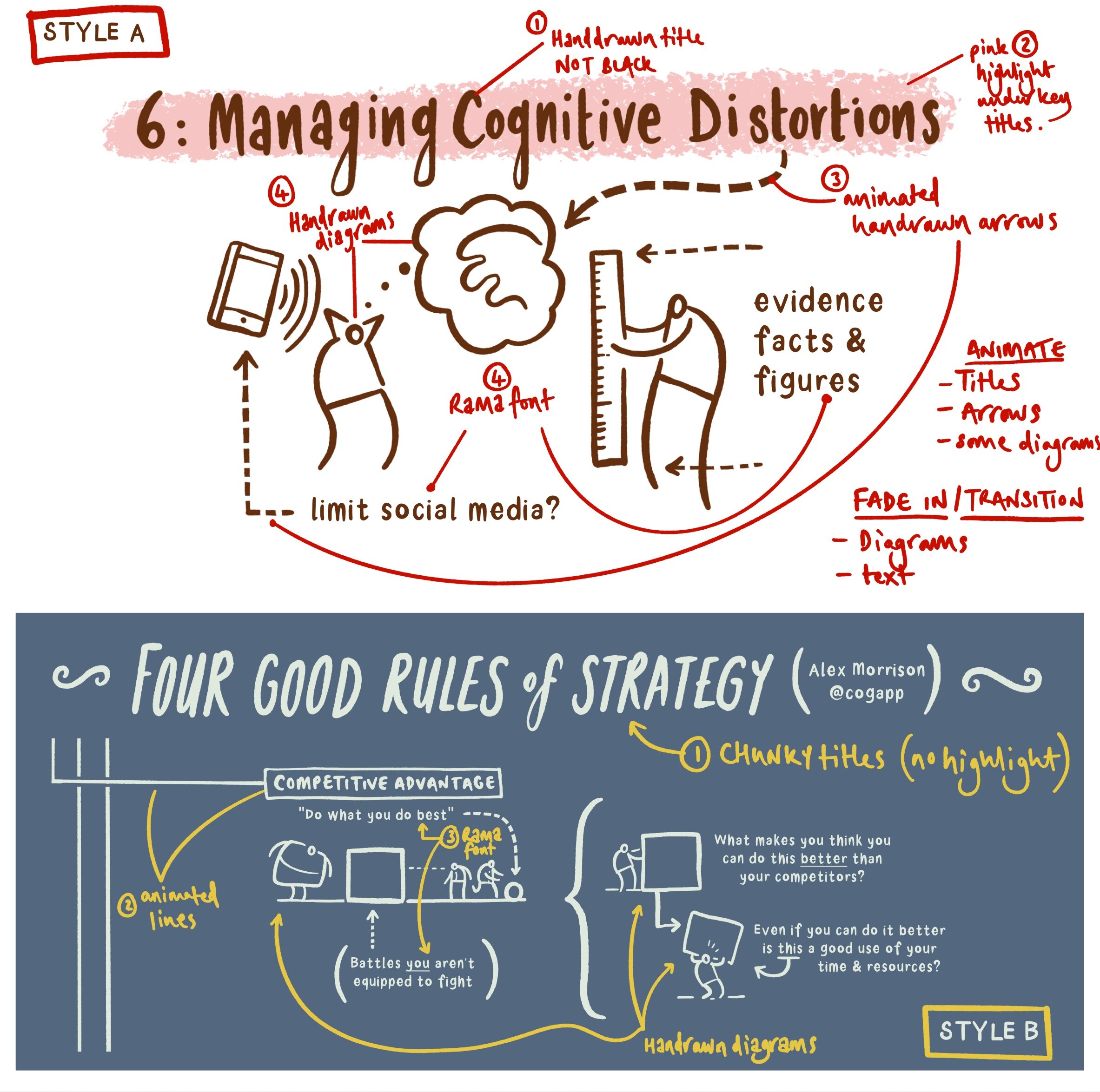
Style A is derived from the Dave Burke seminar, and style B is from an Alex Morrison blog post. From the outset I needed to agree some personal boundaries - hence using my own hand-drawn font for the majority of the text instead of the tedious animate-everything approach from before.
So I started with style B.
Style B
I am delighted with how this ended up. Fixing some clear design boundaries was a good move and led me to a sustainable style of motion graphics.
It is worth noting here the variety of assets being used - my arrows and the main title use a similar technique to the prototype ‘draw-everything’ approach outlined above. The drawings are static transparent PNG files created in Affinity Designer. Most of the text is typed in directly using my own font (such a time saver - God Bless all of you at Glyphs). Moving lines and various movements were simple to accomplish.
I should say that the camera framing was a considerable pain. I tried to use the camera framing behaviour that was helpfully promoted to me by Simon Ubsdell - unfortunately for some reason it was producing erratic and confusing results that left me a bit weary. In the end my new-found AE knowledge of keyframing gave me the confidence to do it myself - yay me! I was amazed at how easy this process turned out to be.
I used some guide boxes to help myself throughout - here is a render without them switched off so you can see how I positioned the camera:
Style A: animating static (but well-organised) transparent pngs
The problem with my style ‘B’ experimentation was that it wasn’t optimised for smaller screens with the square social media frame. This time I wanted to make sure this was built in from the start.
I created a larger 5000 x 5000 px canvas in Affinity Photo. Arranging my material into sections I decided on a general direction for my virtual camera. Here is the general composition I was going for:

I exported this directly to Procreate as a .psd file (17 layer limit!). The redrawing process was painless and very quick. Notice below the clearly labelled layers:

The resulting transparent pngs We’re a breeze to import. I then worked my way (surprisingly quickly) through the 5 minutes of Dave’s presentation in Apple Motion.
To make the process a little simpler for myself I created coloured squares throughout the whole sequence (as per my style B approach above) that represented the position of the camera. It was organisationally waaay simpler to animate the png assets first and to key frame the camera at the end. The square frame guides were a huge help. I switched them off after I had finished.

Then I exported the whole thing (it took two hours! ...although to be fair - when I made a music video in After Effects 15 years ago it took 24 hours so I didn’t mind The wait as much this time around). This proved to be a wasted render due to blurring at various points.

“What is this!? My eyes! My eyes!”
I remedied this by switching off the depth of field setting:

Everything seemed to be working quickly and efficiently, so I added a colour filter and exported the final piece:

Style A is a resounding success - it is a pretty straightforward and sustainable method for producing motion graphics for social media. Taking it further, I would export those original PNGs as separate drawing/shading layers to achieve more colour range like the original graphic (see below). Also I might consider bringing in a few of those original hand drawn elements from my labour-intensive prototype. One or two well-placed drawings can make all the difference.
Kinetic Infographics 1
This post is too LONG! so I split it into two parts:
Part 1: learning from the Greats, not Aping them.
Part 2: Enhancing my sketchnotes using Motion
Part 1: learning from the Greats, not Aping them.
If you hadn’t figured this out yet I’ll say it again: I love making explainer-visuals - especially information-rich ones. It’s a chance to lose yourself wading into something deep (and often opaque) but then to emerge with an empowering solution. Herein lies the joy of schoolteaching for me - creating ladders into powerful material that might otherwise have been too remote.

One of the frustrations with social media (or screens in general) is that a dense chart doesn’t translate so easily. My Lost Box infographic is an example of this. It was originally designed as a huge poster for a national science conference (that we won!), but when you view it on an iPhone it doesn’t have the same kind of power.
So how do you convey something like this on a smaller format?
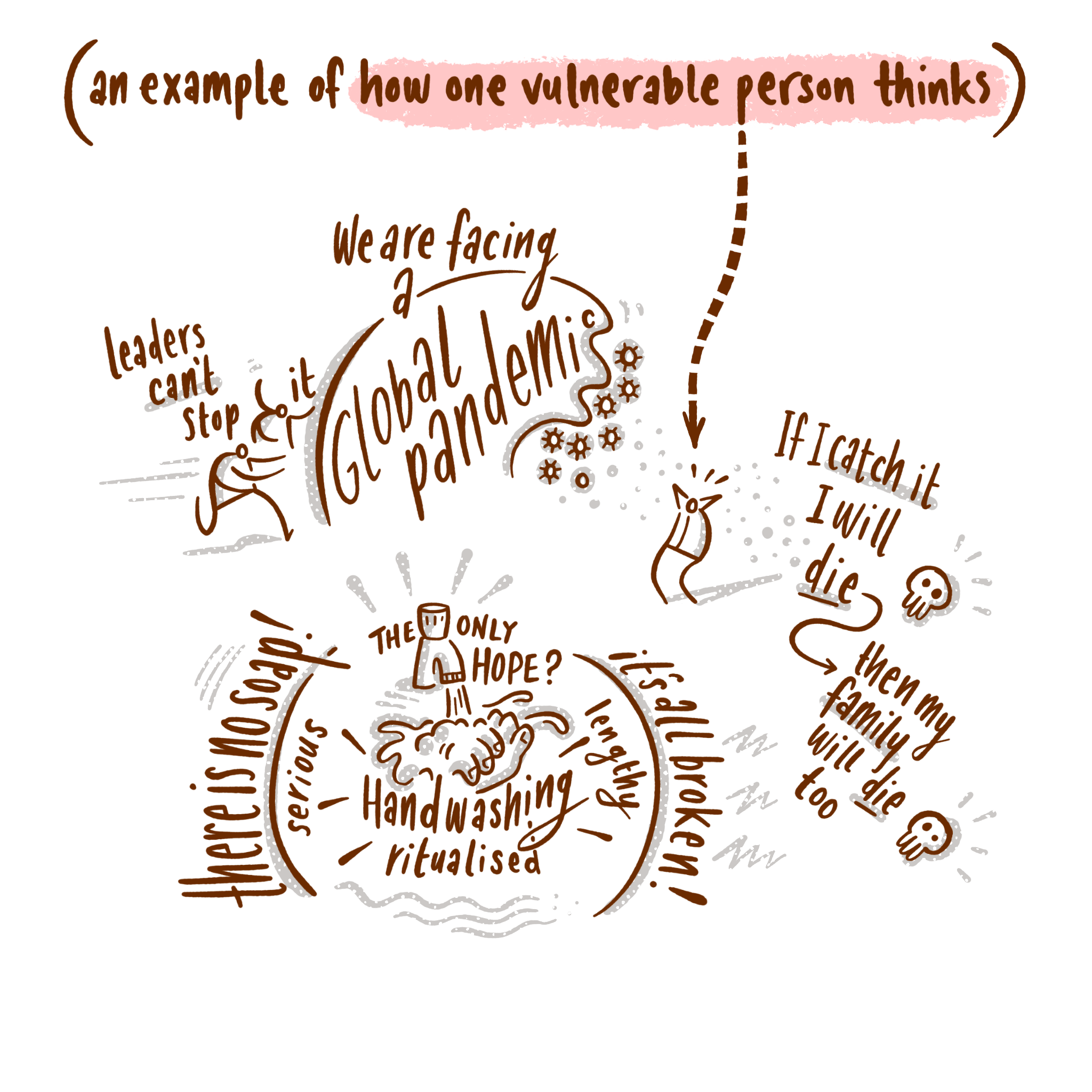
Recently I spent a couple of hours making some visual notes for an online seminar given by Dave Burke on supporting vulnerable people during lockdown. Initially I created a series of shareable ‘moments’ and sent these to Dave as a static slideshow that could be flicked through on the small screen - like so:

This is a quick solution to the problem of transforming material to a smaller format. Within the ten-image limit on Instagram these are great. But (and I think you can guess where I am going) I wanted to push this further into the realm of motions graphics and kinetic typography.
After (the) Effects of Instagram
During the COVID-19 home-exile-period™ I have been spending a chunk of my spare time familiarising myself with After Effects. Currently it’s not hard to be impressed by the boom of advertising agencies pushing smart animated sequences on Instagram by amazing artists like Magoz, Laurie Rowan, Ben Marriott and James Curran. In fact - it is easy to be swept up in envy when you see these seemingly effortless renderings.
The underlying truth is quite different of course - these are incredibly skilful, carefully constructed pieces of work that deserve their wide exposure. The fact that we can skim through so many for free is part of their addictive illusion. And there I was - scrolling through screen after screen - feeling the urge to change direction and copy what they do.
It took me a few weeks to realise that I was just being crushed with unrealistic fan-boy desires. Alex Morrison’s superb article on strategic thinking was really useful in refocusing my energies. It helped me to step away and ask myself what it was that I do well, and more importantly whether spending time dabbling in After Effects was going to be worth it.
What do I do well?
The answer for me was that I am good at explaining/arranging information visually, and that if I was going to devote hours to learning new tools, it would only be time well spent if it enhanced what I am already doing.

No point in using After Effects to become an imitator. I am sure there is a place for cover-bands, but I want to write my own hits.
This led me into several weeks of exploring After Effects. I took a few courses online and familiarised myself with those brilliant Ben Marriott tutorials on YouTube. In spite of this I couldn’t shake the nagging feeling that the Adobe CC ferryman¹ was going to be coming for me before I had reached the other side.
And then I re-discovered the joy of Apple Motion.
This little companion app to Final Cut Pro X had been sitting on my Mac for around ten years (a one-off £40 payment!). I had occasionally dipped into it, and then dashed out as I got frustrated with it’s lack of immediate magic. Little did I know...
It’s true that there seems to be a lot less support online for Motion - AE dominates partly because it is cross platform. Simon Ubsdell and Simple Video Making are two terrific channels that have loads of Motion stuff to dig into. Not all of it was relevant to me, but I found enough support to open up it’s usefulness. The other handy thing was that spending all of that time thinking through After Effects bridged whatever learning gap had previously been so difficult to get over.
To summarise my feelings on Apple Motion:
way cheaper than an ongoing CC subscription
does many similar things to AE (at least enough for me to enhance my own material)
has a more intuitive/visual interface
I know these won’t be true for others but there you go.
The rest of this post I am going to present the stages that I went through to arrive at my own animated Infographic style. I am aware that these posts can be a bit too long so I want to apologise in advance if you are put off by the length.
Making infographics that don’t ape others
For a number of years the wonderful whiteboard animations produced by Cognitive have permeated the consciousness of explainer media. They have often been copied but I’m not sure that they have ever been bettered.
It’s hard not to be captivated by this terrific example: the Trolley Problem narrated by Harry Shearer.
I took a brief analytical dive into the work that Cognitive have produced over the last ten years. It is interesting to see the way their technique has developed.
Example 1:
One of the first pieces I could find online consists of a live hand drawing notes on a white board in low resolution monotone video while someone gives a short lecture on economics.

Compared to their more refined recent work, one could be dismissive of such low-tech beginnings, but the thing that makes their later work great is what makes this great here - a skilled orator accompanied by clear visual notes. That’s it - two things that would work well in isolation being brought together to even greater effect.
Technology is at it’s best when it enhances.
Example 2:
Just look at the progression:
Colour, better video.
Example 3:
Much clearer drawings with some animated hand-drawn elements.

Example 4:
This final example is interesting because it demonstrates massive technical skill while still retaining the original qualities I mentioned above.

On the one hand, this animation makes my head spin with it’s sheer complexity - clearly there was a robust effects team working on this, but my point about technology being at it’s best when it enhances strong human characteristics still bears out. The writing and planning carefully retain the heart of this piece - and this is why Cognitive are so good at what they do - not just some flashy After Effects skills bunged in.
Summary: don’t become planet of the apes
Aping others (like Cognitive) is a second-best strategy. Learning from them is much better. The thing to take from Cognitive is not their visual style per se, but how they used technology to enhance an already-great human quality.
In part 2 of this process post I want to outline the journey of my recent prototypes.
¹Adobe have been very kind - thankyou - in offering people heavily subsidised CC set-ups during lockdown, but when you have improved one-off fee replacements like Affinity Designer it feels like you are buying into corporate membership rather than facilitating your own creative efforts