The Big Picture
January 2018
Shortly after I started working at Chatsmore Catholic High School, I got into a discussion with Pete Byrne, the Headteacher, about the values of the school and how important the idea of a 'meta-narrative' is in helping people understand their place and value within history.
We were both in agreement that it might be a good idea to create a mural of some description that reinforced the Christian values of the school. In this post I am going to risk giving too much information as I document the stages that this piece of artwork went through.
February 2018
Early drafting using abstract ideas, pencil sketches and a magic whiteboard.

An initial document where I mapped out the ideas of the Bible storyline.


This image was drawn on a magic whiteboard sheet and then processed in Prismo.

By now I had arrived at a visual solution and flow for the main ideas - now we had to decide an exact spot and dimensions.
March/April 2018
Choosing the spot, detailed drafting of the first wordless version.

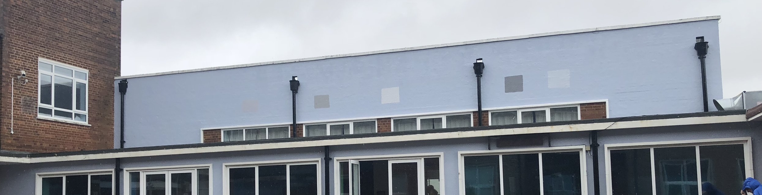
The spot that Pete Byrne chose is very high profile. I felt a little nervous and excited. Something might have to happen with that yellow though...Joe Fairburn measured up a useful first set of sizes for me to work with.

This is an example of one of my magic whiteboard sheets in action - they are awesome for drafting using the whiteboard pens I use every day.

Here it is - the cleaned up image I produced.

Clip Studio Paint - pencils. Clearly the left here is more developed than the right.

I began to dabble a little with some shading but eventually decided that wouldn't work like this. I said I was going to overcook this blog post.

Colour - first draft. I was trying to make some symbolic connections throughout. It semi-works.
June 2018
I parked the mural for about two months and got loads of feedback from various people. Thankyou all of you who contributed - students, friends, colleagues, family members. Apart from simplifying a few things and tightening the symbolism across the piece, one of the big changes was suggested by Pete Byrne - he was keen on a set of three Bible texts linked to the image.
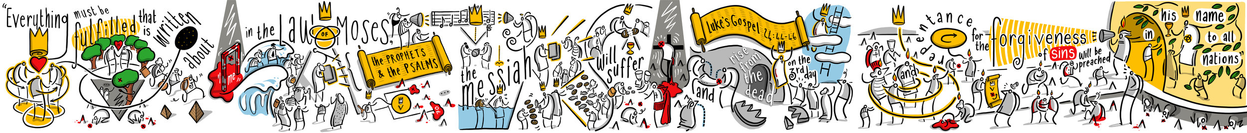
Initially he was looking for something from the Old Testament and maybe a couple from the New. I suggested that we use one unifying text - the conversation that Jesus has with the disciples on the Emmaus road after his resurrection is a great moment because it draws together the whole sweep of Bible history - from Creation, Fall, Promises, Sacrifice, Prophecy, Fulfilment in Christ, the giving of the Holy Spirit and End Times.

Pete was a little unsure of this move - was it too intricate/involved for a school mural? Would it lose people? My own wife had already made the point that the entire image was probably too complicated to begin with - and here I was adding something that not many people were that comfortable with or knowledgeable about.
In the end we decided to go with this idea - and were happily backed by the Governors. My own view is that this image follows in the tradition of stain-glass windows: something that is rich in detail and provides something to ponder and reflect on. While I can happily elaborate on every detail of this sequence and make it clear what I intended, not everyone will see it in the same way - but that doesn't mean you can't have some depth!
And so I began work on version two - combining Bible text and image - it meant redrafting the entire thing, but in these steps I think the whole thing was improved as I channelled several weeks of feedback and settled reflection.

Clip Studio Paint is the best drafting software I have ever used. As you can see here I have it set up in a particular way to suit my own approach.

Neat inking.
Colouring - this was still going to change - I wasn't happy with the golden scrolls.

This is a digital mock-up. The walls were still very very yellow, so I put together this image to get a sense of the scale/colour in that specific context. Having never worked to this scale before, I needed to do some pre-visualisation.

This is the penultimate version - there were still a few changes, but at this stage they were quite minimal.
The first undercoat of grey was too blue, here are some swatches that Callum and Farhun put up. Almost there...
August 2018
Final bits and pieces - oh and a radical overhaul using vectors...
I have written here extensively about my journey into using Affinity Designer. It is a long post that outlines my learning curve over the summer holidays. The upshot is that it was a good move and the end result is much much sharper.

This is a screenshot of the left-hand panel while using Affinity Designer. This has been converted into vectors.

Here is a zoomed-in section. All smooth and no rasterisation.

Here is the same section from the previous image - Clip Studio Paint is a bitmap raster tool and the blockiness is how it operates. Although I had designed this first bitmap version knowing that it would be blocky I was aware that from a distance it wouldn't matter.

Here is the first bit of printing being done at MotoFX in Littlehampton. The vectors are smoooooth. In fact, it is a little shocking how many of my mistakes can be seen up close.

Okay it's a bit of a rainy day but there we go.
Postscript
I cycled early to school in the rain to see what the end result is like. My honest conclusion at the moment is that I have no objective distance on this. I see all the tiny things which could be improved or didn't look as good as I thought... it didn't take long to realise that I am overthinking this, and just need to step back. I have to leave it to breathe for a few months and see what people make of it.
A sincere thanks to all of the staff, students, governors, parents, friends and family who had any input into this project. I hope that it blesses you in some way.