#thesocialdistancerun

How a reverse-idea sparked by awful COVID19 funeral arrangements led to our school community growing stronger
It was only to be expected: when the news that one of our students had lost her mum to COVID19, we all felt the wave of sadness. The funeral instructions didn’t help change the mood much either:
You could line the streets of the route but the church event itself is out of bounds.
Frustrated with things being the way they were, I had an idea - what if we could turn social isolation on its head and use it to enhance things?
Side note about spirituality
Teaching Religious Education is my full-time day-job, as part of the role I regularly tackle the concept of ‘spirituality' with both religious and non-religious students. The definition I find the most useful is this one:
Spirituality is when you connect with someone or something beyond yourself.
It is a non-material link that can be experienced in open-air concerts, national sporting events and especially within belief communities. It is an engagement with an invisible reality that is hard to quantify. It is something that can often be felt or sensed but is difficult to prove in strictly ‘scientific’ terms.

This idea was aiming to facilitate a truly spiritual event - just when lockdown measures were isolating our school we were daring to reverse the trend and remake a non-material connection.
#thesocialdistancerun

It didn’t take long for Joe Fairbairn (our IT manager at school) to input all of the school postcodes into google maps and arrive at a bewildering map spanning the distance between Barnham to the west and Shoreham in the east. Then, in conversation with Chris Sloggett (a maths-teaching, marathon-running colleague) we drew up a zig-zagging route that travelled within two to three roads of every student on roll.

It seemed good to break it into two routes - A and B for simplicity - which we then cycled to test it’s viability as an ultra marathon route. From here our amazing team at school got to work on creating a day that would involve everyone in the school:
Phil Dean: overview support & conjuring up numerous parallel activities to occupy everyone else!
Julie House: thinking through the ‘what-ifs’ of safety and support during the route
Chris Sloggett: arranging the chain of runners and a set of loom explainers to communicate stage breakdowns
We settled on two minibuses for A/B back-up along with two dedicated cyclists (Chris and Emma Hughes - thank you!) to guide the runners. Now we just needed to create some kind of visual media communications system that would draw it all together.
The YouTube Live Channel
This was going to be event ‘hub’. Members of the public had to be able to easily hop onto the broadcasts and get a sense of what was going on without too much fuss. We decided to go with YouTube early on rather than Google Meet, Vimeo, Facebook Live or even Instagram mainly from a UX perspective: this is the natural place for high-school students to watch live video.

From the ceiling webcam - Doug, Sam, Adam, Zoe, Ellena (leg only) and Molly (unseen). I look like an idiot in my Mexican Wrestling outfit.
It became clear quite early on that Doug Larkam was the perfect person as anchor for this part of the process. When you see my edit of the broadcast below you will know what I am talking about here. In thinking through our transmission material it seemed sensible to plan for half-hourly bulletins with a route map being updated constantly. In between the broadcasts we would prepare our in-coming material for the next slot.
Key to the technical success of the event were the combined efforts of Joe Fairbairn (IT manager - mentioned above) and Sam Reed (one of our pandemic-era Year 11 students). With Joe’s mentoring and support, Sam pretty much ran the entire broadcast single handedly - someone give him a job soon - he is amazing.
I asked Sam to feedback on the precise technical arrangement:
“We had three inputs into OBS (Open Broadcast Software):
- a main 4k camera (with a lovely 20x optical zoom and xlr microphone input) plugged into our Elgato HD60 Pro capture card
- a ceiling-mounted USB webcam
- Google Meet
OBS is very versatile - we were able to combine all of the inputs with ease, add scrolling text and images into our live feed. To ease the load on the central GPU we had to incorporate a second computer for sifting through the material that was being sent in from various phones across West Sussex. One of the key improvements for a future event would be to bypass the confusing OBS audio controls with some kind of sound-deck.”

Relaying information throughout the day
One of the most satisfying elements of the day for me was the chance to be able to design some graphics that would solve some of our communication problems. Having a fully operational studio two days in advance was immensely useful because we were able to judge how effective the existing graphics were in situ. It became apparent to me that we needed something better than a conceptual illustration stretched across a 1080p area. In the end I arrived at the following the design solution:
The TV infographics would employ two ‘modes’
1. An interactive/explainer route map.

This is Doug Larkam the main presenter, a maths teacher and generally great person. I love it when he regales me with tales of his helicopter missions in Vietnam. You should ask him about Oliver Stone who once dated his mum.

Sam had figured out a way of taking bespoke images and enabling us to drag our own markers across a map rather like an interactive weather map. I loved this idea and thought that it provided a really good entry point into the event. With hindsight it might have been better to stick with the second map mode.
2. The live-update map.

The idea with this graphic was that it would be shown in between our half-hourly bulletins. It needed to give a more detailed sense of the route without overwhelming the viewers. I included a handful of details like the A27/rail links and followed the precise map as a guide when I was putting it together. I created a bunch of highlighted zones that give an at-a-glance sense of the stage, timing and people involved. I also went with two simple colours that indicated route A/B immediately.
Below is my proof-of-concept video for the team:
Other features worth noting: we had a ticker function running throughout the day and some clear ’next transmission’ signs that could be easily placed between sessions for clarity. It is a source of personal pride that my own font was used.
How did it go?
In the end we had very few hiccups. Testing things proved to be a wise move (when isn’t it?), but even so I think the media team were surprised how smooth it all turned out. Maybe one of the biggest things for me on the day was the sense that we were doing something original and that everyone present made a huge difference to the overall result. Having students in such key roles is a sweet thing - in particular I want to thank Molly, Ellena and Zoe for being so helpful. Adam was brilliant on camera and of course Sam had big capable hands. The YouTube analytics told us that there were 1800 impressions on the live stream.
As a treat for those of you have come this far: here is a one hour edit of the whole day - it gives a good sense of us monkeying about.
What does it all mean?
While the final analysis is yet to come, there have been many indications that we came together to make something very special.
I wanted to make contact again to say just how impressed we were with the ultra-marathon event yesterday. What a unique and fabulous way to reach out to all of the students and such commitment and enthusiasm from the staff.
Parent email.
My personal impression - which lets face it is entirely subjective - is that the school became bigger somehow during that day. I can’t prove that but it felt as though the very act of reaching out enabled us to become something more than the sum of our parts. To meet a pandemic head-on with this level of community participation is very special. I am convinced that the ‘spiritual’ event I had originally anticipated had happened.
Finally - to everyone who took part (however small - it all added up) thank you for engaging with our very strange event. And to Pete Byrne - thanks for the buy-in. Your trust makes all the difference.
Kinetic Infographics 2
This post is LONG! so I split it into two parts:
Part 1: learning from the Greats, not Aping them.
Part 2: Enhancing my sketchnotes using Motion
Part 2: Enhancing my sketchnotes using Motion
I wrote in an earlier blog post about how - in developing my own approach - I could either try and imitate what legends like Cognitive (and others) do, or I could learn from their example.
In my situation this means:
identifying the good that I already do - creating explainer-visuals
figure out ways to enhance this using Apple Motion
A simple slideshow
I mentioned in the first post how I converted my sketchnotes of Dave Burke’s seminar into a static slideshow that would work on Instagram as a series of panels. The feedback on this was very positive but I decided to press this further into a basic animation using the video-export function in Keynote:
This is a route I have taken many times. The tools in Keynote make it easy to create something great quickly.
Drawing everything is pretty, but can be exhausting
Over the last few years I have been developing a method for capturing drawings directly out of Procreate via the QuickTime movie capture method on my Mac. Cleaning up these assets via luma-keying in FCPX I composited the clips in Motion.
This is what I came up with:
Having produced this, I was swept up in the exciting possibility of endlessly-spiralling pen marks. In my mind something truly beautiful was appearing on the screen... so I thought I would go with it and attempt to recreate the whole of Dave’s seminar using this method. It felt like a dawn of something golden.
This is how far I got:
It took a lot longer than I anticipated and I ended up feeling bitterly resentful and tired(!) as I animated each letter being drawn (every gap between letters had to be removed to get them flowing right - yes it was tedious). To continue like this would be strategic error - I had to find a different way forwards that didn’t kill my spirit/time.
Meet Style A & Style B
Given the spiralling nature of this project, it made sense to restrict myself and define some clear styles with firm boundaries. These had to be unique to my own work and would work well with future explainer videos.
Here is what I settled on - I named them style A & B - including some of my own annotations:
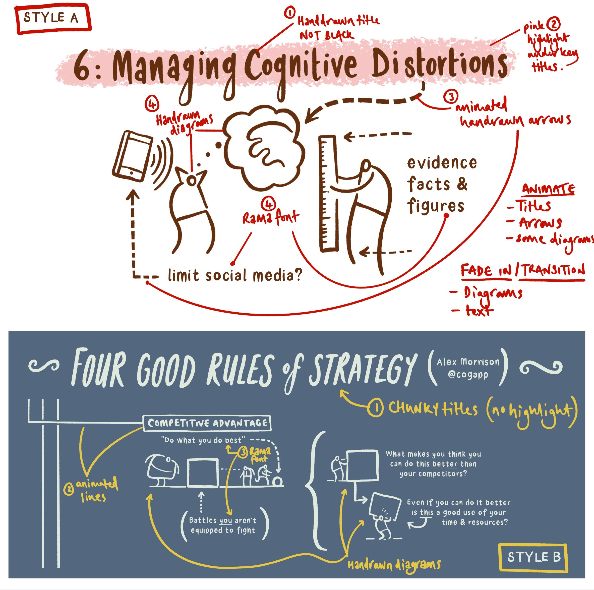
Style A is derived from the Dave Burke seminar, and style B is from an Alex Morrison blog post. From the outset I needed to agree some personal boundaries - hence using my own hand-drawn font for the majority of the text instead of the tedious animate-everything approach from before.
So I started with style B.
Style B
I am delighted with how this ended up. Fixing some clear design boundaries was a good move and led me to a sustainable style of motion graphics.
It is worth noting here the variety of assets being used - my arrows and the main title use a similar technique to the prototype ‘draw-everything’ approach outlined above. The drawings are static transparent PNG files created in Affinity Designer. Most of the text is typed in directly using my own font (such a time saver - God Bless all of you at Glyphs). Moving lines and various movements were simple to accomplish.
I should say that the camera framing was a considerable pain. I tried to use the camera framing behaviour that was helpfully promoted to me by Simon Ubsdell - unfortunately for some reason it was producing erratic and confusing results that left me a bit weary. In the end my new-found AE knowledge of keyframing gave me the confidence to do it myself - yay me! I was amazed at how easy this process turned out to be.
I used some guide boxes to help myself throughout - here is a render without them switched off so you can see how I positioned the camera:
Style A: animating static (but well-organised) transparent pngs
The problem with my style ‘B’ experimentation was that it wasn’t optimised for smaller screens with the square social media frame. This time I wanted to make sure this was built in from the start.
I created a larger 5000 x 5000 px canvas in Affinity Photo. Arranging my material into sections I decided on a general direction for my virtual camera. Here is the general composition I was going for:

I exported this directly to Procreate as a .psd file (17 layer limit!). The redrawing process was painless and very quick. Notice below the clearly labelled layers:

The resulting transparent pngs We’re a breeze to import. I then worked my way (surprisingly quickly) through the 5 minutes of Dave’s presentation in Apple Motion.
To make the process a little simpler for myself I created coloured squares throughout the whole sequence (as per my style B approach above) that represented the position of the camera. It was organisationally waaay simpler to animate the png assets first and to key frame the camera at the end. The square frame guides were a huge help. I switched them off after I had finished.

Then I exported the whole thing (it took two hours! ...although to be fair - when I made a music video in After Effects 15 years ago it took 24 hours so I didn’t mind The wait as much this time around). This proved to be a wasted render due to blurring at various points.

“What is this!? My eyes! My eyes!”
I remedied this by switching off the depth of field setting:

Everything seemed to be working quickly and efficiently, so I added a colour filter and exported the final piece:

Style A is a resounding success - it is a pretty straightforward and sustainable method for producing motion graphics for social media. Taking it further, I would export those original PNGs as separate drawing/shading layers to achieve more colour range like the original graphic (see below). Also I might consider bringing in a few of those original hand drawn elements from my labour-intensive prototype. One or two well-placed drawings can make all the difference.