CycleNotes: The Isle of Wight
I was excited about taking a couple of days to cycle round the Isle of Wight in late October 2022 with my old mate Gareth. As I’d been enjoying making the RunNotes films I decided to try and develop my filmmaking technique with this particular trip.
Here’s how it turned out:
I was keen to avoid making one of those many ‘me and my GoPro’ films that are so prevalent on YouTube. Just because you can now film yourself anywhere, it just doesn’t translate into an inviting and accessible experience for the viewer. I wanted to work hard at making something that would share a great experience, invite the audience into my friendship with Gareth and leave people with a sense of adventure and enthusiasm for doing something similar. Whether this was the case is something I look forward to hearing about.
The end project seeks to combine a bunch of elements. Here are some brief process notes in no particular order:
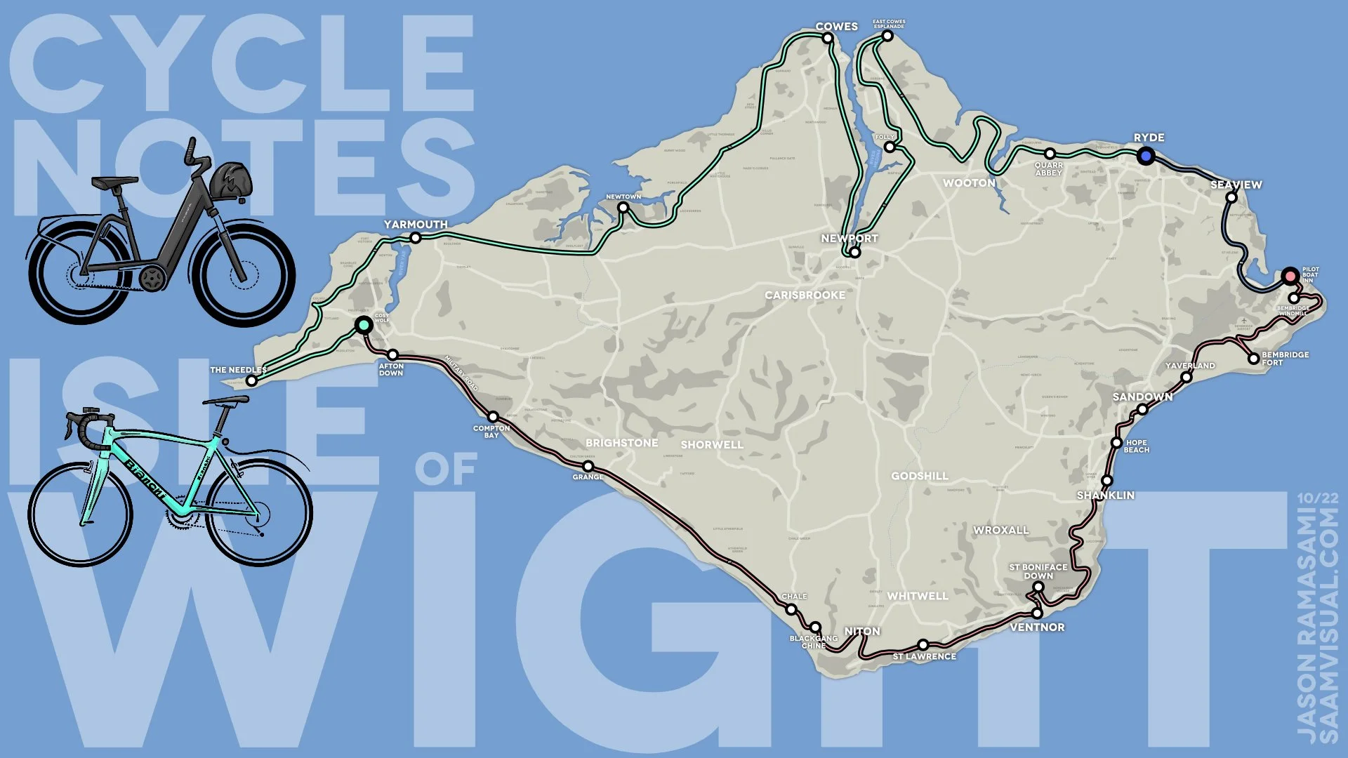
The animated map(s)
I made the main detailed map before we took the trip - after finding my way with the 3 Forts film I had a clearer idea of what did and didn’t work on the screen, so I spent some time creating a vector-based design using the excellent Affinity Designer as my drawing tool.
Planning (and then adjusting) the route
The cycle route itself was planned using the Footpath app. It is worth the annual subscription because you can do quite a lot with it. Here is a part of the original plan for our cycle:

We were going to head inland and take in all sorts of magical delights.
I recorded the GPS data as we rode and then used this to adjust the map afterwards - like so:

Notice how things shifted to the coastline once the weather and hills had their say…
When to be accurate and when to simplify
Once of the things to emerge from my creation of the 3Forts film was a sense that you don’t need to be ruthlessly accurate with your map on a screen. The general idea is fine. I took this and adapted the actual route into something that roughly follows the route. One of the important aspects of working with an audience is that you have to know when you have done enough with your editing and explaining - too little and they won’t get it, too much and they will grow tired. For this project I erred on the side of simplifying things.

The Bikes and my mobile filming approach
I also took a bit of time to create some sweet illustrations of our two bikes - this wasn’t particularly necessary but I wanted to do it anyway.

Guess which one was the weight of three baby elephants.
It might be interesting to have a discussion at some point about how different these two vehicles are. Gareth’s bike can be lifted with one hand. Mine cannot be carried easily over anything more than a kerb. My bike was purchased with touring and filming in mind - to this end it was fantastic. I used special extender handles and combined that with a GoPro lightweight clamp for various shooting positions.
I needed to find a solution for filming on the go without risking a serious traffic accident - I purchased numerous clamps and extender thingies until I settled on the end result.

This was something I considered for a while - I am so glad I did my research and testing in advance.

Here was the end set-up. A lightweight and very useful clamp arrangement.
The main thing for me was to be able to capture something quickly - being confident I could change the angle and not have to be distracted from staying safe in awkward conditions. The end solution proved to be just the right thing - I was very happy.
Creating a simple access point for the viewer
When it came to editing the film I did the usual stuff - whittling everything down to usable material and then forming sequences. This then led to me finalising the map and I created a series of moments that I knew we would be passing through. At this point I decided to try and create a short intro film - something lasting a couple of minutes that would be a quicker summary for people who don’t feel like the commitment of a longer film.
The shorter intro I created does this with an even simpler map - based around the Isle of Wight flag:

The split in the middle is the River Medina - something I didn’t realise until I started paying attention to the details.
I was really applying the old truism ‘repetition is the mother of memory’ to my editing - something that streamed shows have as a fundamental structuring device (“previously on…”). Assuming that people only watch this film once I wanted to give them a bit of enthusiasm for the full experience, and - having won them over - would give it to them AGAIN.
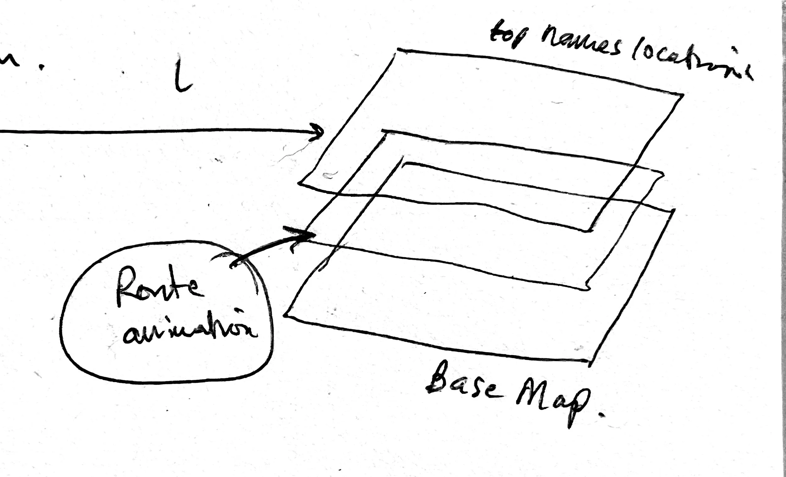
Transparent map routes
In the 3Forts film I was switching back and forth between an animated map in the background and run snapshots in the foreground like so:

On this piece I started doing something a little more sophisticated - having the video appear sandwiched between two map layers - like so:

This was achieved by producing the map assets in the usual way:
vectors in Affinity Designer
export selectively to both SVG and (transparent) PNG layers
SVG assets exported to a Motion project (via Pixelmator Pro)
Keyframing using a custom setting with the
a. the WriteOn behaviour and
b. a framing camera.
exporting two versions of the map
one with the full base-layer and
one route-only layer (using the animation-transparency 4444 codec)
My original post-it scribbles no less.
At this stage it was a matter of carefully editing sequences to get a balance between map information and filmed material.

The original great-map-sequence from Raiders of the Lost Ark - my 12 year old self salutes you, Steve.

Raiders of the Yar Mouth
In the end I am so glad to be able to put this piece of work out there. I really like how the different elements combine. If you have any thoughts please leave a comment on the YouTube page or get in touch.
My first year as a Learning Designer¹
Today is a special day for me.
It marks one year of working full time as a Learning Designer. I wanted to write something to celebrate this milestone and explain a bit about what I have been doing with my time.
Some background context
I worked as a teacher in seven schools, totting up 26 years of experience. About six years into my first job I started a design company and spent the rest of my time developing a range of skills across numerous disciplines. Throughout this time my design and educational skills converged until I discovered that there was a Real Job out there that was a perfect synthesis of both. At one point in my journey I almost stepped into a generalist role - developing resources for any and every paying client - but to my delight something better happened: I got a job at Crosslands. I am now a specialist in probably the most bespoke² role one could ask for.
My job in one diagram

On the left are the six overarching principles taken from the 'Making Every Lesson Count' series by Shaun Allison and Andy Tharby. On the right are Scott Berkun's four foundational design questions. Learning design is a synthesis of these two disciplines.
Learning design - when successful - is the creation of a compelling and satisfying journey of discovery. My intention is for learners to be drawn in and find delight in the experience of tackling something of value. I see this experience as a 'learning tunnel', constructed by combining the best educational and design principles.
Six Learning Principles

Everyone working in education ends up developing personal convictions about what is important if you are going to do the job well - you need some kind of framework to cope with the sheer pressure of surviving the job. The MELC series of books (created/edited by Shaun Allison and Andy Tharby) clarify many of the key ideas in a helpful list of six overarching principles.
Challenge - high expectations that stretch learners. Embedding struggle and reward.
Explanation - clear, concrete conveyance of concepts and ideas.
Modelling - walking through problems, procedures and processes as required.
Practice - focused deliberation, developing personal thinking and conviction.
Feedback - two-way instructor/learner insight leading to mutual improvement.
Questioning - testing for misconceptions, enabling deeper insight.
These principles promote balance. They aren't prescriptive in a lesson-by-lesson sense; they operate as a checklist for a sequence of material. My favourite thing about this list is that they are rooted firmly in an 'anti-gimmick' approach. They draw on time-tested approaches that don't rely on seasonal trends or TED-talk personalities - good solid fibre for healthy learning! (If you are involved in any kind of educational programme you would benefit from a few moments comparing your existing diet against these.)
Four Key Design Questions

In addition to these, Scott Berkun's foundational design questions have had immense value in refining and focussing my thinking whenever I work on a design problem. These are a brilliant starting point and general framework.
What are you trying to improve?
Who are you trying to improve it for?
How do you ensure you are successful?
Who might be hurt by your work?
Great learning design is a combination of these two worlds: learning and design. In my first year at Crosslands it has been a joy to simultaneously flex both sets of disciplines.
So what have I been doing exactly?
I have been working on a series of 'foundation' courses intended for members of grass-roots Church communities who want to deepen their understanding of theology and practice in a convenient and accessible way. Crosslands already provides successful seminary-level accredited courses for current (or aspiring) Church staff workers. They took the decision to expand their range of courses for 'non-professionals' who might want to grow in their faith without it being a huge deal. The foundation offering is something that individuals or small groups can participate in - it functions beautifully on mobile devices - enabling flexibility and ease for the user. As we hit September ‘22 (tomorrow!) ten of these have been successfully launched with more in the pipeline.
In managing such a large project I have developed a systematic process defined by approximately 6 phases:
Phase 1: Initial development
Crosslands works with established and trusted writers and teachers within the Christian community to produce material across a number of relevant topics. Where appropriate, I might bring suggestions to table discussions at this draft stage for how the content could develop and finally be delivered. Personally it is important to retain a focus on what will really work for the learner at the point of delivery - a connection with personable, expert insight - a sense of humour and humanity... qualities which make a massive difference to user engagement. The phrase 'death by powerpoint' is something we are all well aware of.
Phase 2: Initial design response
Once the material has been written and delivered - it might help to think of it as a freshly baked cake - I set about devising how best to decorate and slice it up into an appealing, accessible end product.
I spend some time absorbing the finished course materials, making visual notes and jotting down any ideas I am getting as I go. Occasionally I will have ideas about how to present key concepts: giving a sense of an overview (to help the student to make sense of where they are). I also think about how to assist learners to retain the material (aiding its 'stickiness') plus any other inspiration about using and adapting multimedia materials where appropriate.

My initial notes compared to a more rendered overview diagram.
Referring back to Allison and Tharby's 6 learning principles, here are some of the thoughts that go through my mind during phase 2:
Challenge: are we providing enough (or too much...)?
Explanation: is there enough pacing? Does anything need slowing down or speeding up? Does the structure get in the way of the learning? Should we be using more or less video sections?
Modelling: are we providing enough opportunity for demonstration - either through worked out examples, local-leader discussion notes (and support where needed), or some other way that fits with the course direction?
Practice: is there enough opportunity for guided reflection, thinking, writing, and/or discussion? Do we need to emphasise private reflection or guided group discussion?
Feedback: how do the instructors and learners get insight (and so develop more effectively)?
Questioning: most of the courses have both quiz and reflective components built in - these are usually focussed on enabling the learner to mark the territory covered with their own personal stamp, or recapping particular chunks of knowledge. As we move across a unit of work - which key ideas do we want students to retain when it's all over?
Phase 3: design materials
I usually begin with placing the content into formatted sections that communicate clearly to the user the kind of activity being covered. A large part of my work has been defining a common visual language or feel so that regular users will know where they are on the learning journey.
After this I move on to creating final illustrations - it doesn't make sense to do this any earlier because a key function of an image is to assist with the meaning - so the context is really crucial. Generally I will make somewhere between 70 and 150 images for each foundation course. (To date I have produced approximately 1000 images since I started the course).
The final part of phase 3 is to take a look at the overview and create my own personal 'cheat sheet' - or a set of notes that show at-a-glance what has been covered. I will use this to assist me in making a set of quiz sections and also double back to make some interleaving recap quiz sections. The main point with these quizzes is not to set a tough examination or assessment that can be passed or failed - they are relatively light-touch exercises that draw learners back into the material for extra reflection.

This was created in Waitrose Cafe, Worthing.
Phase 4: first release
One of the main revelations for me in reflecting on Berkun's principles was the need for building in space for feedback and iterative improvements. Phase 4 is the first release version which has been checked by the team and usually results in a few key corrections. It has been a fascinating experience to see how different writers and teachers have responded to the material in its ‘Phase 3’ form. Mostly this has been positive, but there is always a bit of tightening to be done so I try not to be too precious about my work!
Phase 5 (and onwards)
So far we have a couple of modules which are on Phase 5 - meaning that they have been evaluated and improved after feedback from active users. I love the idea that we are improving something that is already good.
This post doesn’t tell you everything about what I have been doing but hopefully it gives an idea of some of my work. I am deeply grateful to the team at Crosslands for this opportunity and I love what we are making and sending out into the world.
Special easter egg - this post is dedicated DP and WS who are both very talented ex-students who no doubt will make good use of this material to inspire and direct others into amazing learning experiences.
¹This title isn’t really true though, is it? I started teaching and planning Sunday School lessons in a church when I was 18 or 19, so this is maybe my 30th year as a learning designer… the reality is that every time you think and plan to teach something you are a learning designer. Titles are a nonsense to be honest - people who do stuff are already doing it before they get that title.
²For those who don’t know, it is worth sharing at this point that the Christian faith, exploring the Bible, applying theological issues and basically anything to do with Jesus Christ are among the most important things in my life. Throughout my time as a teacher I had a role as an RE teacher which I loved! Exploring different perspectives, engaging with contemporary issues and seeking to frame difficult theological ideas in helpful ways was something I excelled at. My work at Crosslands is quite similar in many ways, except I work with adults within a niche Christian context and don’t have to deal with gum under desks quite as much.