I am making some exciting steps into the world of animation and I’m not sure I want to look back.
And when I say animation I mean indie-animation: where I have been involved in my own idiosyncratic way with local tools. There is something quite wonderful about being able to make something move and live on the screen. Yes it takes ages and yes I sometimes hate it, but there is an undeniable magic when you see life reflected in those moving lines.
For me the steps have been threefold:
1: being aware of the classic principles
2: getting into how animators think
3: figuring out software and hardware hacks that work
I have tried to outline a few of my steps below - sorry it’s brief but better that I capture some kind of a trail than not at all.
1: Awareness of the classic principles
There is actually quite a lot of material about this online - and a few decent books on how Disney developed the basics in the early days. I love how these principles crop up everywhere. This video is perhaps the most beautiful I have seen, although Alan Becker also did a great job of explaining them. The big takeaway for me is that there are well-established conventions that are a helpful starting point.
2: Getting into the thinking process of an animator
Some examples that I have found really really helpful:
Alex Grigg - some of the most helpful and beautifully designed learning videos on animation I have seen. These gave me a lot of confidence and helped me to eventually evaluate my software and hardware needs against the kind of things he models.
Ben Marriott - although he focusses a lot on the use of Adobe products, I have found his step by step process videos really helpful. I studied him make this house jump, and this illustration walk many times - often replaying and rewatching until I can get the gist of how he is planning and framing things.
Gabriel Gareso - he’s not just a really great animator but he created a bunch of painstaking workflow videos that give a realistic sense of what it takes to get something across the line. I have watched them a lot.
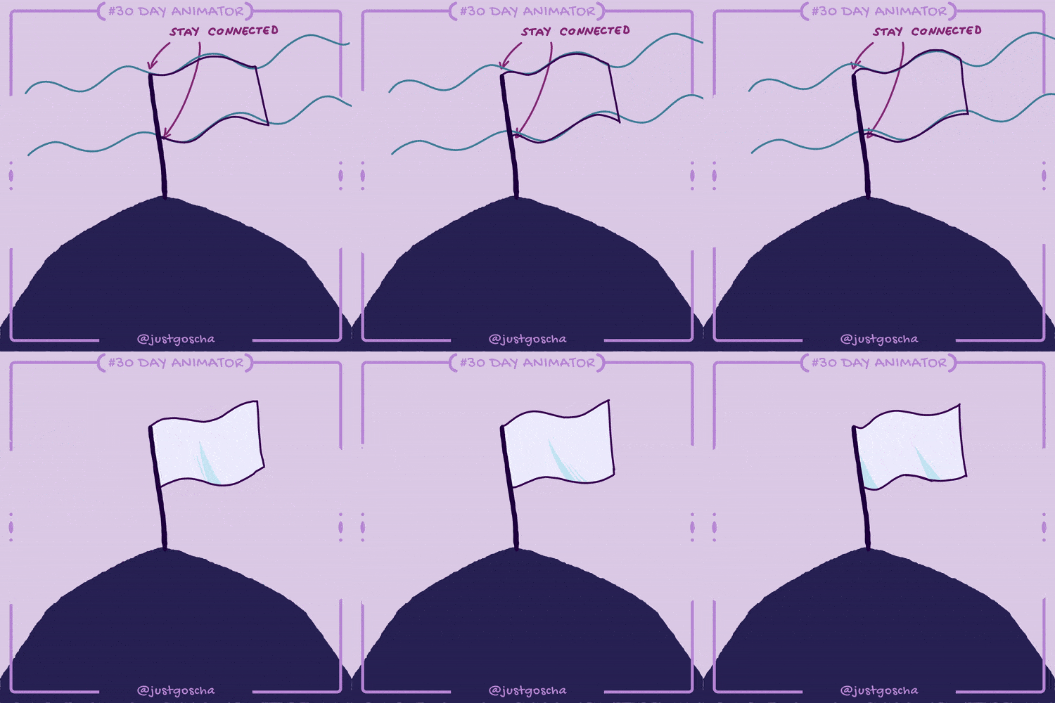
JustGoscha’s #30dayanimator course - this was well worth the money. I still haven’t covered everything but to have someone spend a bit of time documenting how they create the illusion of life is invaluable. It was a scaffolding experience that I am hugely grateful for. When you first see how to animate a flag waving it can be quite special.
3: Figuring out software and hardware hacks that work
The options that I considered were - Rough Animator, Toon Squid and Clip Studio Paint. In the end I went with CSP because it is such a brilliant drawing tool and has pretty good animation functionality built into it. I know it can feel a bit fiddly - but if you start with a strong idea of what you need there is hope in an endless tunnel!
On that point Reuben Lara has a terrific paid course leading on from his free YouTube videos that was exactly right for me in getting a better intentional grasp of CSP. His course is a really useful insight into using bespoke recorded actions and (hardware) keyboard shortcuts to speed up and benefit the whole activity.
So this is where I ended up for the listening film:
Hardware - an iPad Pro with the Apple Pencil 2 and a Logitech K811 Bluetooth Keyboard. For compositing I have gotten used to exporting assets out and bringing them into Motion on a mac.
Software - Clip Studio Paint specifically on an iPad Pro for the bulk of my work - for some reason it’s not as quick on an M1 MacBook Pro (I know, right!? No idea why but hey). I will use it on the Mac when I want to set up complicated timelines or edit and tweak particularly tricksy edits that need better screen space. Nothing beats the iPad set up though - it has all of my favourite tools and a superior drawing feel. I get a little anxious about how invested I am in this particular product - hopefully Elon won’t buy it.
For me the essential thing was having a reliable workflow pattern in place. Reuben Lara was very helpful in encouraging me to think about how to get those things sorted out in CSP. Animation is such a painful thing to think about you want to have your process ironed out before you step into more involved projects - the cognitive load is just too great once it all gets going - a handful of times I’ve tried to fix a problem and it got so depressingly complicated that all my animating mojo was gone - these are things that a reliable set up solves.
A streamlined and reliable approach that spotlights creative thinking has to be the priority.
Dedicated to Declan - you are uniquely talented and I hope this helps a lot.


