The Big Picture
January 2018
Shortly after I started working at Chatsmore Catholic High School, I got into a discussion with Pete Byrne, the Headteacher, about the values of the school and how important the idea of a 'meta-narrative' is in helping people understand their place and value within history.
We were both in agreement that it might be a good idea to create a mural of some description that reinforced the Christian values of the school. In this post I am going to risk giving too much information as I document the stages that this piece of artwork went through.
February 2018
Early drafting using abstract ideas, pencil sketches and a magic whiteboard.

An initial document where I mapped out the ideas of the Bible storyline.


This image was drawn on a magic whiteboard sheet and then processed in Prismo.

By now I had arrived at a visual solution and flow for the main ideas - now we had to decide an exact spot and dimensions.
March/April 2018
Choosing the spot, detailed drafting of the first wordless version.

The spot that Pete Byrne chose is very high profile. I felt a little nervous and excited. Something might have to happen with that yellow though...Joe Fairburn measured up a useful first set of sizes for me to work with.

This is an example of one of my magic whiteboard sheets in action - they are awesome for drafting using the whiteboard pens I use every day.

Here it is - the cleaned up image I produced.

Clip Studio Paint - pencils. Clearly the left here is more developed than the right.

I began to dabble a little with some shading but eventually decided that wouldn't work like this. I said I was going to overcook this blog post.

Colour - first draft. I was trying to make some symbolic connections throughout. It semi-works.
June 2018
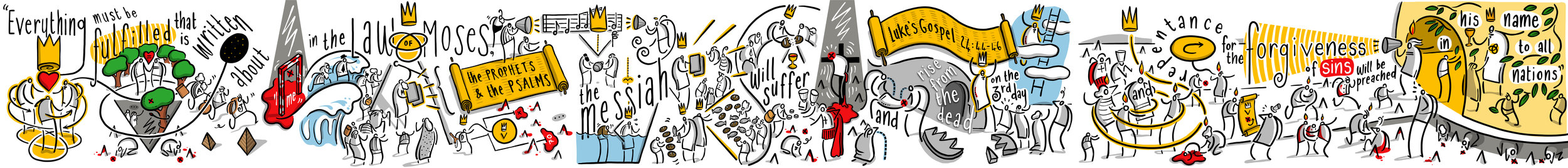
I parked the mural for about two months and got loads of feedback from various people. Thankyou all of you who contributed - students, friends, colleagues, family members. Apart from simplifying a few things and tightening the symbolism across the piece, one of the big changes was suggested by Pete Byrne - he was keen on a set of three Bible texts linked to the image.
Initially he was looking for something from the Old Testament and maybe a couple from the New. I suggested that we use one unifying text - the conversation that Jesus has with the disciples on the Emmaus road after his resurrection is a great moment because it draws together the whole sweep of Bible history - from Creation, Fall, Promises, Sacrifice, Prophecy, Fulfilment in Christ, the giving of the Holy Spirit and End Times.

Pete was a little unsure of this move - was it too intricate/involved for a school mural? Would it lose people? My own wife had already made the point that the entire image was probably too complicated to begin with - and here I was adding something that not many people were that comfortable with or knowledgeable about.
In the end we decided to go with this idea - and were happily backed by the Governors. My own view is that this image follows in the tradition of stain-glass windows: something that is rich in detail and provides something to ponder and reflect on. While I can happily elaborate on every detail of this sequence and make it clear what I intended, not everyone will see it in the same way - but that doesn't mean you can't have some depth!
And so I began work on version two - combining Bible text and image - it meant redrafting the entire thing, but in these steps I think the whole thing was improved as I channelled several weeks of feedback and settled reflection.

Clip Studio Paint is the best drafting software I have ever used. As you can see here I have it set up in a particular way to suit my own approach.

Neat inking.
Colouring - this was still going to change - I wasn't happy with the golden scrolls.

This is a digital mock-up. The walls were still very very yellow, so I put together this image to get a sense of the scale/colour in that specific context. Having never worked to this scale before, I needed to do some pre-visualisation.

This is the penultimate version - there were still a few changes, but at this stage they were quite minimal.
The first undercoat of grey was too blue, here are some swatches that Callum and Farhun put up. Almost there...
August 2018
Final bits and pieces - oh and a radical overhaul using vectors...
I have written here extensively about my journey into using Affinity Designer. It is a long post that outlines my learning curve over the summer holidays. The upshot is that it was a good move and the end result is much much sharper.

This is a screenshot of the left-hand panel while using Affinity Designer. This has been converted into vectors.

Here is a zoomed-in section. All smooth and no rasterisation.

Here is the same section from the previous image - Clip Studio Paint is a bitmap raster tool and the blockiness is how it operates. Although I had designed this first bitmap version knowing that it would be blocky I was aware that from a distance it wouldn't matter.

Here is the first bit of printing being done at MotoFX in Littlehampton. The vectors are smoooooth. In fact, it is a little shocking how many of my mistakes can be seen up close.

Okay it's a bit of a rainy day but there we go.
Postscript
I cycled early to school in the rain to see what the end result is like. My honest conclusion at the moment is that I have no objective distance on this. I see all the tiny things which could be improved or didn't look as good as I thought... it didn't take long to realise that I am overthinking this, and just need to step back. I have to leave it to breathe for a few months and see what people make of it.
A sincere thanks to all of the staff, students, governors, parents, friends and family who had any input into this project. I hope that it blesses you in some way.
Affinity Designer on the iPad: Taming Vectors
Travelling to that Far Horizon
This summer I took a break from paid jobs and spent a solid chunk of time sharpening my skills with vector graphics. Affinity Designer for the iPad was released just before the school holidays arrived and I felt it was worth taking the time to get to grips with it. This blog post is a crude attempt to document what I have been doing. I hope that this is of use to others out there who have similar leanings. Apologies for any over-baked verbiage.
Affinity is a great alternative to Adobe
When Affinity Designer/Photo came out on the Mac a few years ago, I bought them without hesitation - an Illustrator/Photoshop replacement suite of tools that side steps cloud-subscription fees. It was a no-brainer - I now had something I could use to open and edit all of my legacy .psd files without the same kind of frustrating commitment.
But... I wasn’t using it to create much stuff
I have blogged a few times on this site that Clip Studio Paint and Procreate are superior bitmap drawing tools. I had no need to use Affinity - partly because vector drawing often gets in the way of the creative process¹ .
And then they brought out the iPad version of Designer
This software has a number of terrific qualities that will permanently change my illustration practice. Here are a few of my tips, observations and conclusions:
Vectors are confusing and difficult.
They are not spontaneous expressions. You have to be organised and put in the foundational prep work to get decent results. Whenever you see some fantastic vector-based artwork remember that this didn’t just appear one day because the sun started shining - the person creating it took the work through a very careful journey.
It might help to think of vector art as existing at the end of a carefully staggered journey - a bit like this:

Vectors are largely unforgiving and unintuitive. Yes the end results can be spectacular, but it takes a lot of hard work get there². I think I have managed to find my way somewhere across that horizon this summer. Here are the steps I took towards taming the vector beast:
A. I watched all of the official videos. Tip: have the app open while you are watching and try to do something parallel. These baby steps are really useful for getting around the interface and will open up your brain what is possible. Even seasoned pros usually miss something.

They really are a superb introduction.
I would also highly recommend purchasing the Frankentoon tutorials. They are really well produced and give you a clear idea of how an excellent vector-practitioner might approach the creation of gorgeous imagery. You can trawl around on youtube (I did) but in the end the paid stuff is worth it. I think I spent about two hours studying something I paid £20 for, but it guided me in lots of valuable ways.
B. I took something that I had previously produced adapted it using my new knowledge.
<BRIEF DETOUR KLAXON>
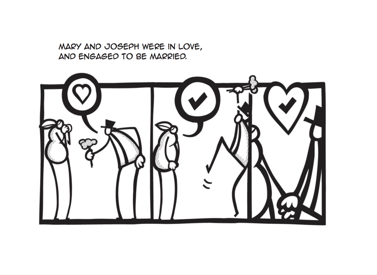
A couple of months ago I constructed an infographic to support a course I currently teach in my day job. This is the initial sketched out plan (created on a whiteboard and then photographed/bleached using Prismo:

I used the Mac version of Affinity Designer³ to add editable text to the image:

Then I inked a careful set of drawings over that exported image using Clip Studio Paint. In the image below you can see three layers: a fainter draft set of lines, and two final artwork layers - black ink and grey shading:

I then brought it back into Affinity and combined/adjusted the two pieces so that they worked smoothly together:

Finally I made a final colour pass to emphasise different areas of taught content:

This final image is a combination of vector (text) layers produced in Affinity Designer, and bitmap/raster drawn layers produced in Clip Studio Paint.
<DETOUR OVER>
I took this infographic and attempted to draw the entire thing in the same style with the pressure pen capabilities of Affinity Designer on an iPad Pro. Here is the end result:

I was really pleased with this - vectors feel a lot less threatening once you get stuck in, and it took less time than expected.
Here is a closer detail of the image.

Trust me - those edges are all really smooth and there is no bitmap rasterisation going on anywhere!
These are the brush tool settings I used. Firstly, the controller needs to be set to ‘pressure’ (for some reason this has to be done every time I open the app - quite annoying) - it gives you the lovely variable width using the Apple Pencil.
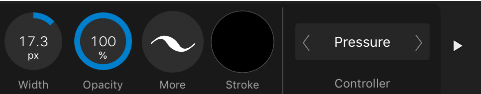
I set the windows stabiliser to 30. It feels just about right when I am using it.

Clicking on the 'more' button takes you to the 'size variance' setting. I stick it onto 100% as so:

Something else that I did early on was to delete all of the existing brushes and stick with one basic brush⁴:

I renamed it as you can see, but it's the basic default solid brush.
C. I went further and converted a huge mural into vector format.
Here is a mini snapshot of the finished mural design in question:

Originally drawn as a bitmap raster piece in Clip Studio Paint. It was big enough to work at scale, but vectors would be waaaaay better.
And here is a detail from it:

And an even closer detail:

Look: rasterisation!
Once I had completed the re-inking the vectorised result was sent to the printers as a CMYK hi-res PDF. The result was a very clean super-sharp image:

Trust me - it looks terrific.
Working through this was surprisingly straight forward - and I discovered a couple of extra techniques along the way that are going to be useful going forward:
Creating a 'parent' blank vector layer first will mean that all of your strokes end up automatically grouped from that point on. Arranging and keeping a grip of all of your layers is really hard to do once you have thousands of layers knocking about. (I also noticed that if you nest everything in this way, the brush pen responds more quickly).
An eraser layer. This is a HUGE thing. After creating a parent group for all of my ink marks to be dumped into, I then figured out that if you create a similar blank group WITHIN the parent inking group like so...

...and change the mode to ‘erase’ you effectively get a layer that can be used to carve out and erase/sharpen up any messily inked lines.

I usually change the name of the layer to 'erase' just to keep everything clear while I am working.
I’m not entirely sure that this screenshot does this justice, but the principle is a very powerful one - to be able to carve out aspects of your inking with an editable erase tool is a hugely powerful feature.
So after this I decided to have a go at creating something from scratch.
D. A meditation on Psalm 63
Taking some notes I had scribbled into my sketchbook from a church meeting I started to doodle and create some visual ideas. If you look carefully at this image you will see an initial attempt to structure the image around some geometric shapes.

Sketchbooks are the best.
I then created a similar layout using shapes and the alignment/layout tools in Affinity Designer on my Mac:

I exported this as a jpeg and began to draft some ideas in Clip Studio Paint (I prefer the way the pencils work here and am able to lose myself in the drafting/erasing/thinking process).

Then I applied all of the above and created a final piece:

There's a typo here somewhere.
E. Using a Mac and an iPad are the best of both worlds
As was said before - the taming of the vector beast on that far horizon requires considerable resolve and energy. If you are fortunate enough to possess both a big-screen Mac and an iPad you have the opportunity to muscle-in from both directions.
The weakness of the Mac - it’s input method is more than compensated for with the iPad Pro/Apple Pencil. The weakness of the iPad - it’s interface and organisation of huge numbers of layers - is very ably dealt with on the Mac. For this reason I have been using the 'open from Cloud’ function throughout.

Each time you save it, you can just pick up where you left off on the other platform. Simples.
Each platform in isolation can be frustrating, but taken together you have a brilliant context for making some gorgeous artwork.
F. Finally a few thoughts about Artboards
The Artboards function is another aspect of the software that I almost missed - to my loss. Two projects I completed in the last week or so (yes I have been busy) have made good use of the Artboard feature.
The first was for a series of images for an educational blog that I contribute to. If you look at the screenshot here you can see the ‘all art in one go’ Artboard at the top left. I used this for laying out the material in a logical arrangement once I had drawn it.

Then I broke the panels into moments and gave each a discrete Artboard. I applied final presets to each and did a batch export. It was both useful for arranging the material and creating a final set of shareable results simply.
The final example is from a series of tweets I illustrated last week. In a similar way to the example above, I used the Artboard function to create a spread of pages in a way that was meaningfully laid out. I was able to make something easily and export in the same way.

One of the great benefits of using Clip Studio Paint is the ‘story’ multi-page creation feature. If I am illustrating a book with 40+ images I usually give up on something like Procreate because it becomes such a chore churning out pages one by one. Multi-page creation is the way to go, and CSP has it sorted.
The Artboard feature on Affinity Designer goes one further than this by allowing you to arrange the pages however you want on the same screen. I love this feature and have already used it to save lots of time arranging an upcoming book project.
My main anxiety with using software like this is that when I am investing so much time into it - will it be dependable? Will it output reliably? The answer so far is pretty good - this will change the way I work permanently.
(Edited 13/1/2020 - this post is toooo long by half)
¹ I think about this quite a lot - there is a sweet spot for all great artists where expression is effectively minimal - doing just enough without overworking things. The best tools go at the speed of your decision making - if something occurs to you, ideally you should be able to change it there and then RAPIDLY. If the tools slow you down or snuff out those sparks of creativity then something is probably wrong. Perhaps you need to spend more time with a biro and scraps of paper and less time on a computer?
² This is probably why Procreate is so (rightly) popular as an app - you can just get stuck in. Vectors on the other hand usually take some thinking - how you organise your material, how you manage the tools etc. It can feel quite the opposite of creativity at times, so somehow you need to build those more fluid stages in BEFORE you get there.
³ This was about a month before the iPad version was released.
⁴ Yeah man I am badass. Actually I honestly think that limiting your choices is probably a better thing long term. "Creativity thrives within intelligent constraints" - John Maeda.
Clip Studio Paint - on an iPad
A few months back I posted a few notes on using Astropad Studio to link an iPad to a Mac running Clip Studio Paint. I used this set up to create finished artwork for the MELC books.
The great benefit of Clip Studio Paint is that with the right tweaking¹ you can produce digital illustrations that ‘feel’ like natural media in a way that I don’t think Procreate can. At the time the added bonus of Astropad Studio meant tremendous advantages for the final artwork.
Around November last year, Clip Studio Paint was released natively on the iPad and I have been using it ever since.

When it originally surfaced there were a couple of excited discussions bouncing around the social interwebs:
It is too expensive.
Can it handle ‘big’ files?
Both of these discussions are now redundant in my view.
It isn’t too expensive.
If you are making professional quality art these tools are worth it.
Just a few years ago we were in the era of hundreds (and in some cases tens of hundreds) of pounds for software. Now the pendulum has swung wildly the other way with incredibly powerful apps costing under £10. Anything costing above that is easily written off, but let me just remind you that if you are living in a weird goldfish-memory mindset if you consider CSP as too expensive. It is worth every penny.

Sorry dudes.

As far as I understand, the Pro version doesn’t handle multi page creation.
And it can handle ‘big’ files.
The iPad version of CSP is bizarrely as good/better than the desktop Mac version. It easily handles multi-page creation². The Apple Pencil translates immediately into a better-than-Wacom experience and the ability to import/modify custom brushes means that this app just stole the lunch money of a lot of crying competitors. So far I have seen nothing to undermine this, and if you add in the point made by Frenden that an iPad Pro is a form of away-from-your-desk freedom, the cost savings become clear.
My current set up.
I took ages adjusting the CSP user interface to reflect how I actually work. It was worth taking the time³. The brushes are all carefully imported ones that are limited to what I find useful⁴ .
The artwork then gets exported via airdrop or directly through iTunes to my 5k iMac which gets used as a final layout platform. Affinity photo and my desktop copy of CSP exist for the sole purpose of being a big glossy compositional screen. Although this makes me a little sad about great tech becoming redundant, the big screen is great for seeing the work put together.
What could be better?
The myriad opaque UI choices are frankly bizarre (but don’t change anything yet because I have only just got things how I like them!).
The file management system is horrible - so many steps for exporting artwork. SO hard to navigate afterwards. In this regard Procreate is the Boss. Looking through completed artwork is way better - with CSP it is like pulling teeth and I tend to avoid it.
If you want to make it cheaper I won’t complain.
¹ Using a variety of imported brushes from people like Frenden and DAUB.
² Something I missed sorely while using Procreate for the 100+ images for the Dear Theo project - reordering and finding files in their folder system was quite tricky when I had to swap iPads mid-process. It also means that Astropad Studio is now going bye bye. The £60.99 annual subscription is now heading to the pockets of CSP. Sorry and thankyou guys - I made some of my best art using your terrific stuff.
³ This is something that Procreate doesn’t try to do for good reason. CSP has an unintuitive opaque UI that would leave you airless in a mineshaft if you weren’t too careful. There are a few places on YouTube where a simple search will give you tips. Don’t be too put off by all this fiddling about - once you get this baby set up right it is amazing.
⁴ I was pretty deliberate about limiting this - too many choices will overwhelm and drown those visual ideas. And we don’t want that to happen do we? We want that little dude to live and become a hairy beast all on his own.
Dear Theo
Dear Theo is a book I illustrated last year for Biblica¹. A full print run and release is scheduled during 2018. It is a combined volume of the gospel of Luke and the Acts of the Apostles. The ‘Dear Theo’ title comes from the opening paragraph in each volume where Luke is explicit about wanting the ‘most excellent Theophilus’ to know that just how certain the foundations of the Christian faith are.

Dear Theo comes with the incredible ability to balance like this in public spaces.
Here are some background/process notes:
The Jesus Comic


A few years back, I had the idea of creating a visual version of the story of Jesus to reinforce and supplement material I was delivering in the classroom. I didn’t intend it as a replacement for the Bible text, but as a kind of complement or alternative way of reflecting on the taught material (fancy-pants educational theorists call this ‘dual coding’). I worked through this project and eventually self-published it as ‘The Jesus Comic’. I was so proud to have Dave’s Comics in Brighton support me in selling copies of my first book!

I can't tell you how excited I was about this.
Then, working with a couple of kind friends², we also released an iOS app version. It was very exciting. We didn’t turn the world upside down but it did sell a few hundred copies.

Look at that: an iPad3 displaying our £2.39 app in an Apple Store no less.
Life Changer
After this I was approached by The Goodbook Company³ and the material was edited into a more streamlined version which was titled ‘Life Changer’. Lots changed⁴, but I was delighted to be published and contribute to a wider audience.


TAOTA
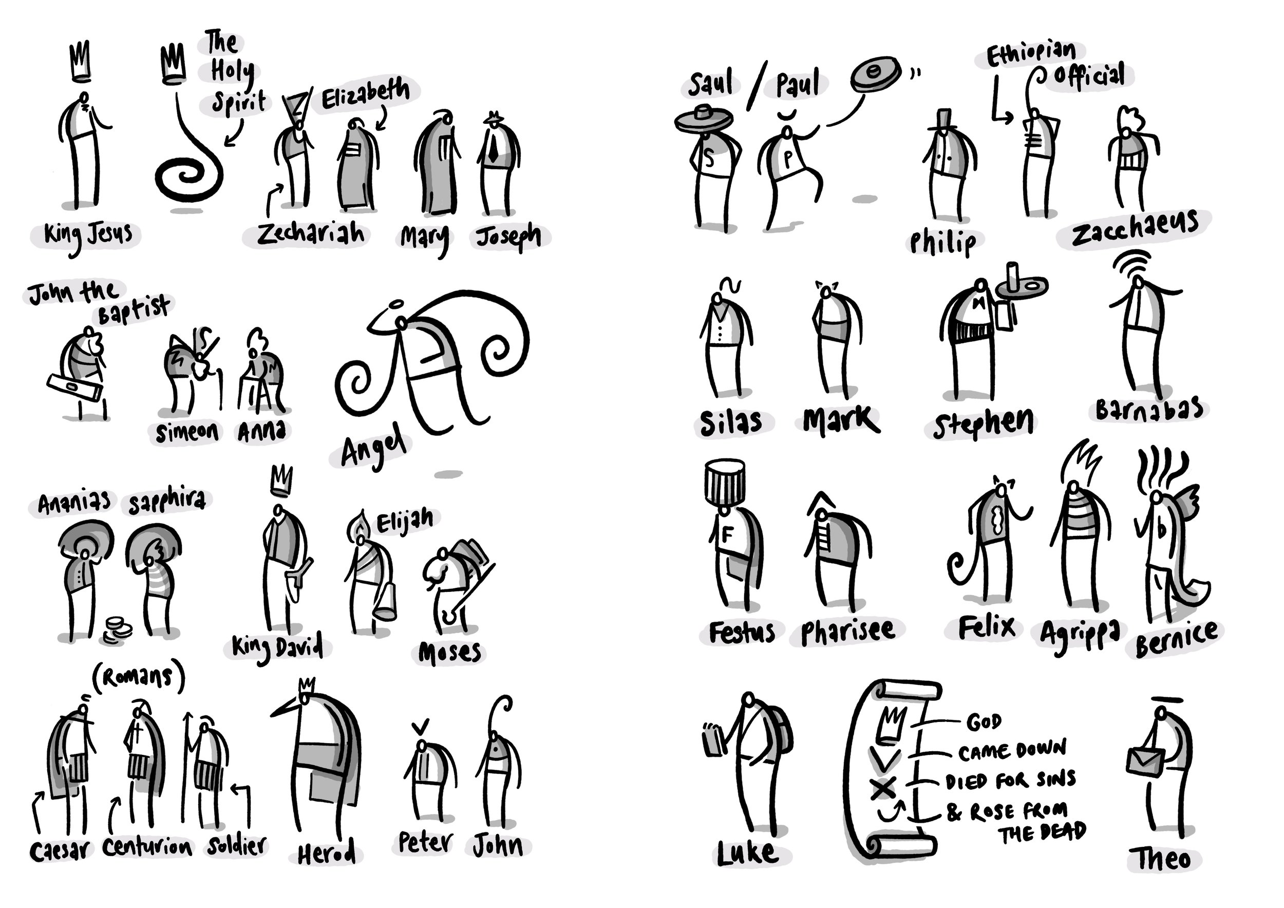
Just after I started selling ‘The Jesus Comic’ there, the manager of Dave’s Comics had made a throwaway comment to me about my ‘next’ project that wormed it’s way deeply into my mind. He suggested doing something about the book of Acts (for those who aren’t clued into the BIble, this is the account of the early adventures of Jesus’ followers after he had died, resurrected and ascended).
Eventually I succumbed to this prompt and spent a number of weeks working my way through the narrative in the Acts of the Apostles . Taking a blank sketchbook, I printed out the entire text and pasted each of the 28 chapters onto double pages with lots of space for scribbling as I went.

I worked through each section intensively for a number of weeks. In the end I had a lot of unrefined imagery and ideas bouncing around. It was provisionally named ‘TAOTA’ (The Acts of the Apostles) and then stored away for a couple of years.
Biblica
After a few false starts and pauses I was eventually signed up with Biblica⁵ in 2016 to produce a 100+ images to accompany a volume of Luke/Acts combined. I was able to take a lot of my prior thinking and adapt it to something useful.

The process at this stage was typical of my work at the time - working with an iPad Pro and Apple Pencil, I used Notability to draft quick roughs on a multi-page PDF before completing the finals in Procreate.
Final thoughts
In the end I have been delighted with this project - Trevor Wilson and John Dunham were a pleasure to work with. The NIrV translation text works really well alongside the images. Here is a link if you are interested in purchasing a copy.
¹ Formerly known as the Bible Society.
² Tony Waghorn and David Butler no less.
³ Thankyou Tim Thornborough.
⁴ The American market associated ‘Comic’ with something less serious so they changed it. The cover had a different orange - more fluorescent. Production-wise I used a iPad3, a Maglus Stylus and Adobe Ideas to draw the vector images. One other huge change was the impact of being edited - the result is tightly focused and has a greater clarity to it. I learnt loads about working through the editorial process and letting go of those sacred little darlings (thanks, Carl Laferton).
⁵ Thankyou Trevor Wilson.