Clip Studio Paint - on an iPad
A few months back I posted a few notes on using Astropad Studio to link an iPad to a Mac running Clip Studio Paint. I used this set up to create finished artwork for the MELC books.
The great benefit of Clip Studio Paint is that with the right tweaking¹ you can produce digital illustrations that ‘feel’ like natural media in a way that I don’t think Procreate can. At the time the added bonus of Astropad Studio meant tremendous advantages for the final artwork.
Around November last year, Clip Studio Paint was released natively on the iPad and I have been using it ever since.

When it originally surfaced there were a couple of excited discussions bouncing around the social interwebs:
It is too expensive.
Can it handle ‘big’ files?
Both of these discussions are now redundant in my view.
It isn’t too expensive.
If you are making professional quality art these tools are worth it.
Just a few years ago we were in the era of hundreds (and in some cases tens of hundreds) of pounds for software. Now the pendulum has swung wildly the other way with incredibly powerful apps costing under £10. Anything costing above that is easily written off, but let me just remind you that if you are living in a weird goldfish-memory mindset if you consider CSP as too expensive. It is worth every penny.

Sorry dudes.

As far as I understand, the Pro version doesn’t handle multi page creation.
And it can handle ‘big’ files.
The iPad version of CSP is bizarrely as good/better than the desktop Mac version. It easily handles multi-page creation². The Apple Pencil translates immediately into a better-than-Wacom experience and the ability to import/modify custom brushes means that this app just stole the lunch money of a lot of crying competitors. So far I have seen nothing to undermine this, and if you add in the point made by Frenden that an iPad Pro is a form of away-from-your-desk freedom, the cost savings become clear.
My current set up.
I took ages adjusting the CSP user interface to reflect how I actually work. It was worth taking the time³. The brushes are all carefully imported ones that are limited to what I find useful⁴ .
The artwork then gets exported via airdrop or directly through iTunes to my 5k iMac which gets used as a final layout platform. Affinity photo and my desktop copy of CSP exist for the sole purpose of being a big glossy compositional screen. Although this makes me a little sad about great tech becoming redundant, the big screen is great for seeing the work put together.
What could be better?
The myriad opaque UI choices are frankly bizarre (but don’t change anything yet because I have only just got things how I like them!).
The file management system is horrible - so many steps for exporting artwork. SO hard to navigate afterwards. In this regard Procreate is the Boss. Looking through completed artwork is way better - with CSP it is like pulling teeth and I tend to avoid it.
If you want to make it cheaper I won’t complain.
¹ Using a variety of imported brushes from people like Frenden and DAUB.
² Something I missed sorely while using Procreate for the 100+ images for the Dear Theo project - reordering and finding files in their folder system was quite tricky when I had to swap iPads mid-process. It also means that Astropad Studio is now going bye bye. The £60.99 annual subscription is now heading to the pockets of CSP. Sorry and thankyou guys - I made some of my best art using your terrific stuff.
³ This is something that Procreate doesn’t try to do for good reason. CSP has an unintuitive opaque UI that would leave you airless in a mineshaft if you weren’t too careful. There are a few places on YouTube where a simple search will give you tips. Don’t be too put off by all this fiddling about - once you get this baby set up right it is amazing.
⁴ I was pretty deliberate about limiting this - too many choices will overwhelm and drown those visual ideas. And we don’t want that to happen do we? We want that little dude to live and become a hairy beast all on his own.
Dear Theo
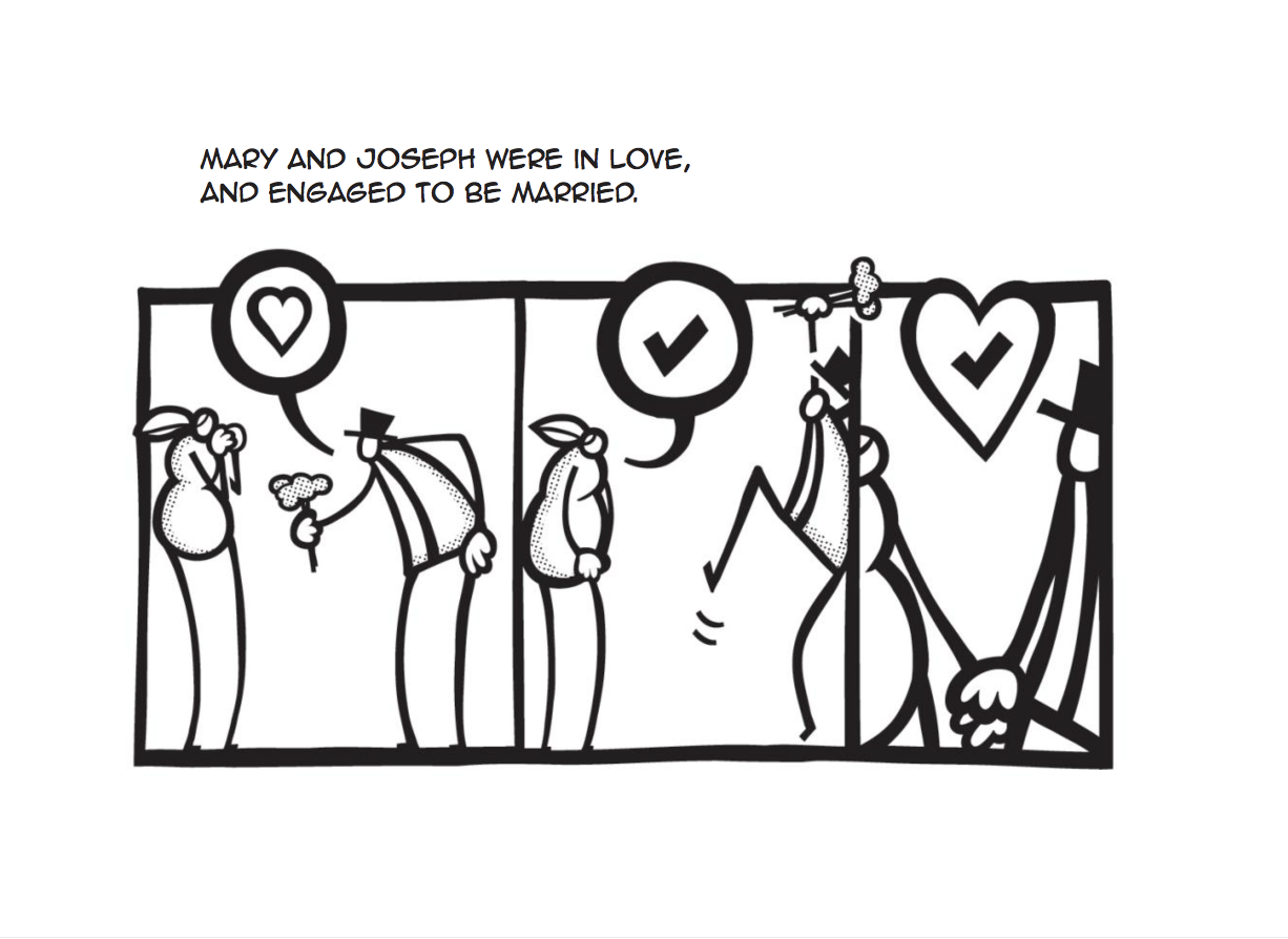
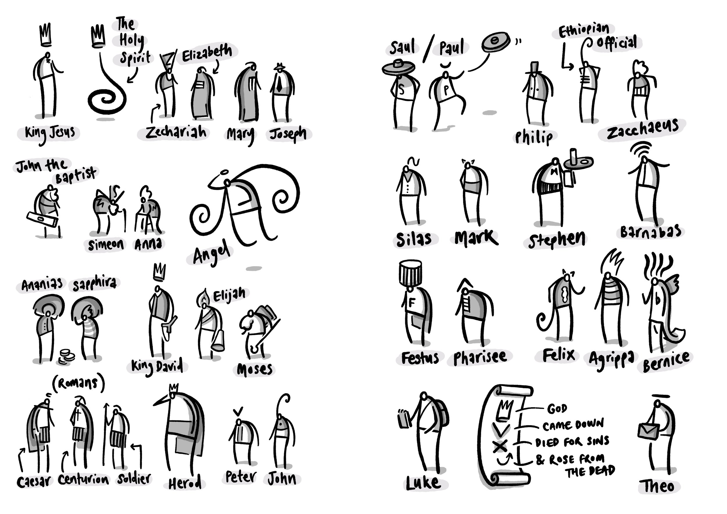
Dear Theo is a book I illustrated last year for Biblica¹. A full print run and release is scheduled during 2018. It is a combined volume of the gospel of Luke and the Acts of the Apostles. The ‘Dear Theo’ title comes from the opening paragraph in each volume where Luke is explicit about wanting the ‘most excellent Theophilus’ to know that just how certain the foundations of the Christian faith are.

Dear Theo comes with the incredible ability to balance like this in public spaces.
Here are some background/process notes:
The Jesus Comic


A few years back, I had the idea of creating a visual version of the story of Jesus to reinforce and supplement material I was delivering in the classroom. I didn’t intend it as a replacement for the Bible text, but as a kind of complement or alternative way of reflecting on the taught material (fancy-pants educational theorists call this ‘dual coding’). I worked through this project and eventually self-published it as ‘The Jesus Comic’. I was so proud to have Dave’s Comics in Brighton support me in selling copies of my first book!

I can't tell you how excited I was about this.
Then, working with a couple of kind friends², we also released an iOS app version. It was very exciting. We didn’t turn the world upside down but it did sell a few hundred copies.

Look at that: an iPad3 displaying our £2.39 app in an Apple Store no less.
Life Changer
After this I was approached by The Goodbook Company³ and the material was edited into a more streamlined version which was titled ‘Life Changer’. Lots changed⁴, but I was delighted to be published and contribute to a wider audience.


TAOTA
Just after I started selling ‘The Jesus Comic’ there, the manager of Dave’s Comics had made a throwaway comment to me about my ‘next’ project that wormed it’s way deeply into my mind. He suggested doing something about the book of Acts (for those who aren’t clued into the BIble, this is the account of the early adventures of Jesus’ followers after he had died, resurrected and ascended).
Eventually I succumbed to this prompt and spent a number of weeks working my way through the narrative in the Acts of the Apostles . Taking a blank sketchbook, I printed out the entire text and pasted each of the 28 chapters onto double pages with lots of space for scribbling as I went.

I worked through each section intensively for a number of weeks. In the end I had a lot of unrefined imagery and ideas bouncing around. It was provisionally named ‘TAOTA’ (The Acts of the Apostles) and then stored away for a couple of years.
Biblica
After a few false starts and pauses I was eventually signed up with Biblica⁵ in 2016 to produce a 100+ images to accompany a volume of Luke/Acts combined. I was able to take a lot of my prior thinking and adapt it to something useful.

The process at this stage was typical of my work at the time - working with an iPad Pro and Apple Pencil, I used Notability to draft quick roughs on a multi-page PDF before completing the finals in Procreate.
Final thoughts
In the end I have been delighted with this project - Trevor Wilson and John Dunham were a pleasure to work with. The NIrV translation text works really well alongside the images. Here is a link if you are interested in purchasing a copy.
¹ Formerly known as the Bible Society.
² Tony Waghorn and David Butler no less.
³ Thankyou Tim Thornborough.
⁴ The American market associated ‘Comic’ with something less serious so they changed it. The cover had a different orange - more fluorescent. Production-wise I used a iPad3, a Maglus Stylus and Adobe Ideas to draw the vector images. One other huge change was the impact of being edited - the result is tightly focused and has a greater clarity to it. I learnt loads about working through the editorial process and letting go of those sacred little darlings (thanks, Carl Laferton).
⁵ Thankyou Trevor Wilson.
#draw365 retirement
(UPDATE - 5/2/19) After some reflection I decided to permanently retire my Instagram account. It was great while it lasted but I think there are times for cutting back and achieving simplicity/focus. This is such a time.

So, part way through my third year of the #draw365 project (791 posts!) I have decided to give it a rest in favour of diving into deeper¹ material. The last three years has seen a lot of stuff happening and I have enjoyed the discipline of drawing something every day.
So was it worth doing?
Definitely. Here are some (personal) thoughts:
As a space for personal reflection I have found the discipline of #draw365 invaluable - I have developed a set of visual-reflective muscles that feel restless without the exercise of reaching for my sketchbook. While I don’t intend to stop reflecting - I won’t be posting them online every day. Every artist needs the space to reflect, and this has been a huge help to me.
As a means of interaction and discussion with my students it has been terrific. Beyond the online ‘likes’ I have often used these pictures in class to discuss something currently going on in the culture².
Drawing things quickly and not fussing about the results. There is something wonderful about doing something from a deeper, instant conviction and not spending too long on it. I continue to find it frustrating and wonderful that my best stuff didn’t take that long to craft.

My electric dutch bike was always a source of hilarious banter with the year 9 '8.08 crew' boy-racers.
What are the down-sides?
Occasionally my observations are too frank for public consumption. I then find myself caught between the need to keep my #draw365 routine or relationships(!). Not having to post daily means I can still think/reflect while reserving a protective barrier.
The pressure to keep it going - this is a tricky one that comes back to a whole bunch of factors - the quality of the imagery (is it good enough? Am I overdoing it?), how you feel it reflects on you (and whether narcissistic crowd-pleasing tendencies matter), maintaining a natural organic feel (vs refined/artificial production).
I hope that these are useful thoughts for anyone who is thinking of doing something similar. I will certainly continue to post material on there but the hashtag is going into retirement from today.
¹ Lots of artists and writers make the observation that their best work is cheapened by the daily energy being donated to social media. Instead of seven half decent images - why not one each week with six discarded drafts?
² It’s worth mentioning here that in the age of despicable online grooming and horrific child protection scandals, teachers are rightly required to follow strict professional codes of conduct online. This is why I never post personal photos or follow student accounts. Any communication always stays out in the open. This stuff matters.
#draw365
I started a daily drawing routine about two years ago, and am pleased to say it is still going.
The process
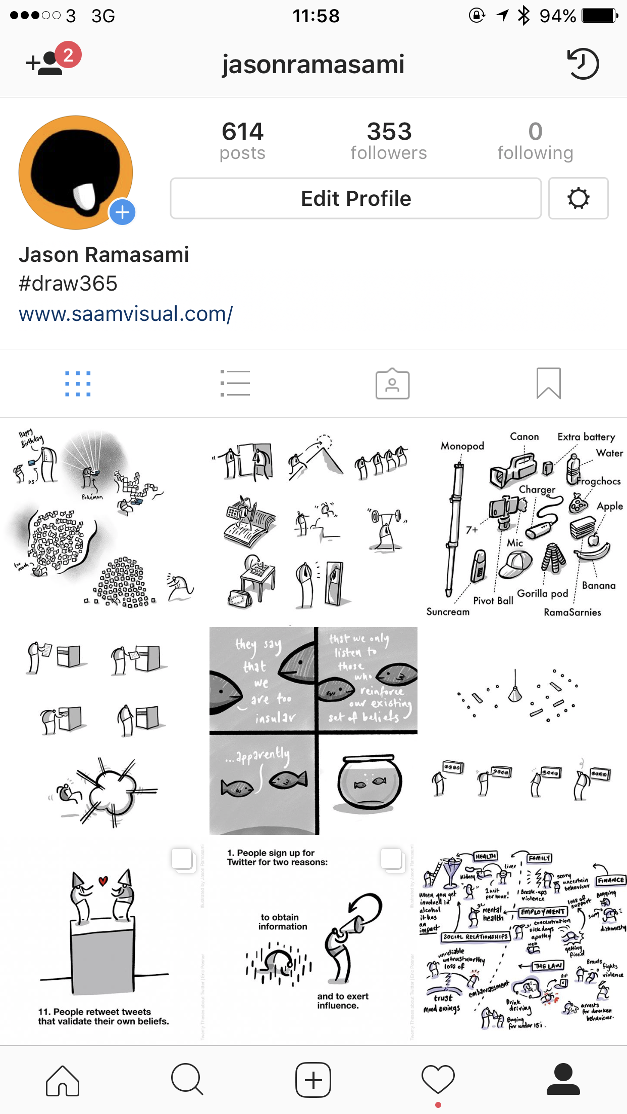
I usually scribble something quickly into my sketchbook¹ using a biro, photograph it with my iPad and compose/ink it in the excellent Procreate app. From here I post it to Instagram. You can find a dump of my most recent images on this page.
The weirdness of audiences
When I had just finished my A levels² I took a trip to Paris to stay with my Uncle and do a bit of painting and drawing. It was a kind of lead-up to doing my Foundation Art Diploma and I was raring to be an artist! I took some acrylic painting materials, borrowed a portable easel from my girlfriend and prepared some canvases. I was all set. When I got to a monument (somewhere or other) I set up my stuff and began to make some Art™.
And then it all crashed - I felt utterly paralysed by
a. tourists who kept taking their photo next to me
b. people looking at what I was doing and
c. the inner knowledge that I wasn’t actually that good. Other artists around me were way more impressive. I was a fraud.
It was such a weird experience. I came away not wanting to do it again. Bizarrely, this event illustrates what happens whenever we post material online - purely because there is an audience watching.
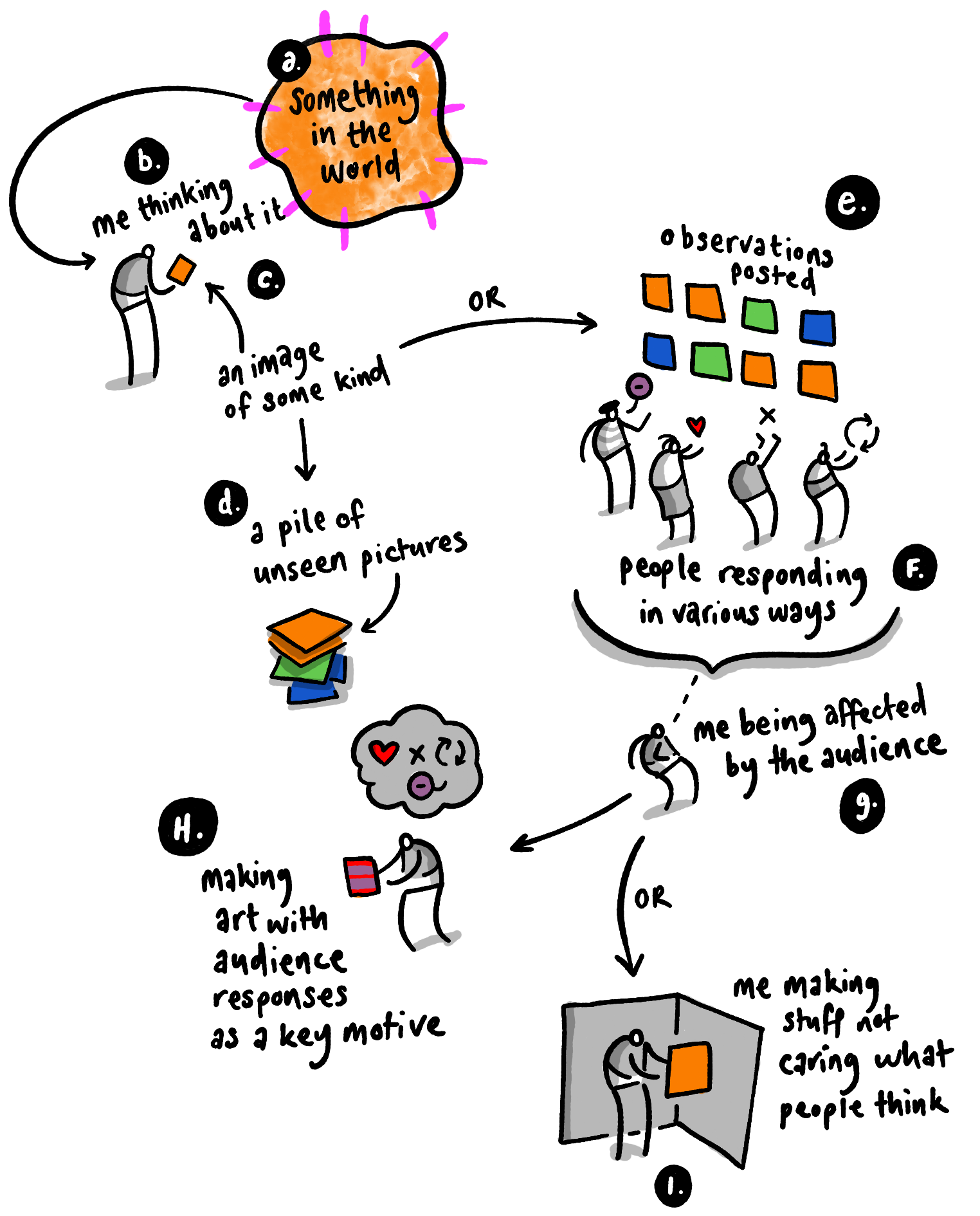
As I post these daily pictures I try to keep in mind that Discipline and Play are important to creativity³:
Discipline means doing it every day (or at east regularly enough for it to be a deliberate habit)
Play means that I just make things which are literally that: not done with any audience or crowd in mind
So why bother posting them online?
Good question. If you post stuff where there's an audience, aren't you just trying to market yourself? Isn't it somehow a bit cheap, broadcasting yourself in this way? Maybe I shouldn’t⁴.
But then maybe there is value in simply sharing things just because.
¹I usually draw stuff related to what I have been thinking about in the last few days
²in 1863, just before the Post-impressionists took hold
³you are probably different to me, I am just saying how I do things
⁴I know I'm probably over thinking this