A quick glance into my sketchnote/scribing process
I thought it would be worth sharing an example of how I produce sketchnotes/scribe material.
I thought it would be fun to share my scribing process. Thanks to the guys at Scriberia I took a look at this excellent Ted Talk by Shawn Achor:
They recommended a two hour timescale so I watched the video through and made these notes in my sketchbook:

Then I picked up Procreate on my iPad and organised my initial thoughts into something more accessible. Here is a timelapse of the process:
For me the process is often more interesting than the finished result. I hope you find it useful having a look at the image develop. Procreate is very useful for capturing this kind of thing.

“I like what I am seeing - could it be useful for my organisation?”
Consider some of the following possibilities as ways that scribing might benefit you:
live events - processing spontaneous and unexpected material
repurposing existing content for greater usefulness
summarising key ideas in distinctive ways
grasping and making underlying connections explicit
aiding the retention of key messages when it most counts
For more information have a look at my dedicated scribing page.
Get in touch if you have any questions.
-
March 2026
- Mar 22, 2026 IRL and URL? Mar 22, 2026
-
February 2026
- Feb 10, 2026 Scaffolding Learner Expectations Feb 10, 2026
-
November 2025
- Nov 6, 2025 Apple Fitness: a personal feedback loop that bridges the virtual divide Nov 6, 2025
- Nov 6, 2025 The National Speed Awareness Course: an example of mostly great learning design. Nov 6, 2025
- Nov 6, 2025 Scott’s Bass Lessons: hanging out with positive older bass-brothers. Nov 6, 2025
- Nov 6, 2025 Using Audio Extracts to support Critical Thinking Nov 6, 2025
- Nov 6, 2025 Illustrating for learning Nov 6, 2025
- Nov 6, 2025 Learners can feel the difference Nov 6, 2025
-
March 2025
- Mar 21, 2025 The story of Joseph - compressed into one image Mar 21, 2025
-
July 2024
- Jul 15, 2024 ResearchED Warrington Sketch-notes Jul 15, 2024
-
April 2024
- Apr 3, 2024 RunNotes: increments with the format and process Apr 3, 2024
- Apr 3, 2024 The Durrington Journey Apr 3, 2024
-
November 2023
- Nov 5, 2023 Faster workflow for bespoke animated maps Nov 5, 2023
-
June 2023
- Jun 30, 2023 Adventures in animation Jun 30, 2023
-
April 2023
- Apr 30, 2023 Deactivating Twitter Apr 30, 2023
-
February 2023
- Feb 18, 2023 Towards an 'Animated-Sketchnotes' Toolkit Feb 18, 2023
-
November 2022
- Nov 9, 2022 CycleNotes: The Isle of Wight Nov 9, 2022
-
August 2022
- Aug 31, 2022 My first year as a Learning Designer¹ Aug 31, 2022
-
May 2022
- May 17, 2022 "Making Biryani" 2 May 17, 2022
- May 15, 2022 "Making Biryani" May 15, 2022
- May 5, 2022 The Three Forts Challenge film May 5, 2022
-
April 2022
- Apr 30, 2022 Embedding contextual information into a 3D tracked clip Apr 30, 2022
- Apr 29, 2022 Combining video with a timeline/map Apr 29, 2022
- Apr 29, 2022 The Three Forts Animated Map - proof of concept Apr 29, 2022
- Apr 27, 2022 More Animation Tests Apr 27, 2022
- Apr 27, 2022 More Map/Timeline developments Apr 27, 2022
- Apr 22, 2022 Run Notes 2 Apr 22, 2022
- Apr 20, 2022 Career Journey Map Apr 20, 2022
- Apr 19, 2022 Run Notes Apr 19, 2022
- Apr 19, 2022 The Three Forts Challenge T Shirt Design 2022 Apr 19, 2022
- Apr 19, 2022 A religion and worldviews approach Apr 19, 2022
- Apr 19, 2022 Paul's Letter to the Ephesians Apr 19, 2022
-
June 2021
- Jun 27, 2021 Joseph and the Triumph of Grace Jun 27, 2021
-
March 2021
- Mar 1, 2021 Telling Emma's Story Mar 1, 2021
-
February 2021
- Feb 26, 2021 More Than Robots Sketch-notes Feb 26, 2021
- Feb 25, 2021 The St Wilfrids School Film Feb 25, 2021
-
September 2020
- Sep 28, 2020 The St. Oscar Romero Promotional Video 2020 Sep 28, 2020
-
August 2020
- Aug 16, 2020 Cardinal Newman Campus Map Aug 16, 2020
-
July 2020
- Jul 21, 2020 Cal Newport's Digital Minimalism Jul 21, 2020
- Jul 15, 2020 #thesocialdistancerun Jul 15, 2020
- Jul 4, 2020 Four Key Design Questions - Scott Berkun Jul 4, 2020
- Jul 4, 2020 The Feedback Pendulum Jul 4, 2020
-
June 2020
- Jun 13, 2020 Kinetic Infographics 2 Jun 13, 2020
- Jun 13, 2020 Kinetic Infographics 1 Jun 13, 2020
- Jun 7, 2020 The Teacher's Wellbeing Cycle Jun 7, 2020
-
May 2020
- May 18, 2020 Non-fussy and frictionless: Loom as a useful teaching tool May 18, 2020
- May 15, 2020 Supporting Vulnerable People May 15, 2020
- May 8, 2020 Managing an Organisation Through a Crisis May 8, 2020
- May 3, 2020 Sketchnoting for More Than Robots May 3, 2020
-
April 2020
- Apr 8, 2020 Loom: Redressing the Swing To Flipped E-Learning Apr 8, 2020
-
February 2020
- Feb 9, 2020 How to make a 'simple' origami pyramid Feb 9, 2020
- Feb 4, 2020 Alex Morrison: Four Good Rules of Strategy Feb 4, 2020
- Feb 3, 2020 Andy Budd and Jason Ogle: how to get your foot in the door Feb 3, 2020
- Feb 3, 2020 Clearleft: what makes a high-performing Design Team? Feb 3, 2020
- Feb 2, 2020 Dealing With Differences: AKT Feb 2, 2020
-
January 2020
- Jan 24, 2020 I have/had some questions about the Science of Puking Jan 24, 2020
- Jan 22, 2020 StreetMogs! Jan 22, 2020
- Jan 15, 2020 Vector Process - folding Scissors Jan 15, 2020
- Jan 13, 2020 The Big Picture published Jan 13, 2020
- Jan 12, 2020 A quick glance into my sketchnote/scribing process Jan 12, 2020
-
December 2019
- Dec 24, 2019 The Lost Box Film & Infographic Dec 24, 2019
-
October 2019
- Oct 20, 2019 October led me back into Instagram Oct 20, 2019
-
August 2018
- Aug 23, 2018 The Big Picture Aug 23, 2018
- Aug 23, 2018 Affinity Designer on the iPad: Taming Vectors Aug 23, 2018
-
April 2018
- Apr 14, 2018 Clip Studio Paint - on an iPad Apr 14, 2018
- Apr 14, 2018 Dear Theo Apr 14, 2018
- Apr 14, 2018 #draw365 retirement Apr 14, 2018
-
August 2017
- Aug 12, 2017 #draw365 Aug 12, 2017
-
June 2017
- Jun 7, 2017 #TeachingTalk & MOJO Jun 7, 2017
-
April 2017
- Apr 23, 2017 My workflow on the second MELC job Apr 23, 2017
-
August 2016
- Aug 3, 2016 Paper-Digital Workflow Aug 3, 2016
The Lost Box Film & Infographic

18 months ago a friend of mine mentioned that he was working on a school space project with some ambitious and talented Year 11 students. The principal idea was that they were sending a weather balloon up into the stratosphere with a bunch of devices that would capture data and beam it back down.
I had the opportunity to capture the amazing story in a couple of short films. Here is a YouTube playlist that brings together all of the clips.
My ongoing fascination with creating infographic material led me to begin constructing a diagram that summarises/commemorates the journey of the first Lost Box.
Roughs

Biro on a notebook. Some quick thoughts summarising my general approach. Remember tat I had spent a lot of time absorbing the material at this stage, so I wasn’t coming ‘cold’ to the event.
Provisional Mock-Ups: exploded diagram and characters

This image was a combination of biro on paper, clip studio paint and some rudimentary colouring. I labelled all of the parts and used it to enquire with Pete Clarke (the lead teacher on the project) what each item was.

I began playing about with some humorous renditions of the main figures involved. One of the 16 year old students is quite literally like a Wookie, so this was particularly satisfying.
Exploded Diagram 2

This time I took the material into Affinity Designer - my favourite vector app ever, complete with the ability to bring hand-drawn strokes. I love that app.
The Flight Path - some early messing about

The main benefit of making mistakes is that you can clear the way to something far better - this early attempt at combining dates with the flight of the box has a few issues with it that became immediately obvious on producing the image.
Exploded Box further annotations


You can see where this was going.
Data-crunching the old fashioned way
I asked the team to produce some detailed (and date-specific) notes on the stages. I think it was interesting reflective exercise for them to undertake. I then processed these into a shorter version that would translate well into a poster format.


Here is my first attempt to try and understand how it might look graphically spread out across a page. I think this was the first time I properly understood what had been going on all that time with my mate Pete.
I then produced this outline with the possible idea of illustrating each of the dates. I particularly liked the bit where Vella and the 360 camera go skiing together but this was dumped later on because the overall poster was in danger of losing it’s focus.

Scale of ascent - solving it visually
The problems identified with the early diagram led me to do some extra homework and thinking about how to picture the ascent in a way that was simple to grasp. What was meaningful to the audience? How could you communicate this journey?

First Proper Compositions
For the first time I felt I could bring all the different elements together. It takes a while to understand complicated bits of information and how they link up - I now had the confidence to create an all0in-one summary. The project was beginning to fly.


After sleeping on it, I adjusted the shape of the diagram to reflect the height of the ascent. I like that this rough was done in red biro.
Timeline - first vectors
And so I began the long slow shuffle between biro scribbles and actual legible text/image in vector format. Everything was shifting as I knitted the bits together.

A more detailed composition

A step closer
This is a screenshot from Clip Studio Paint - I am taking a vector timeline (see above) and mashing it up in a bitmap format. CSP is my favourite drafting app - I just like the pencils set up I use. I can work quickly with it and move things around in ways that feel natural to my thought process.
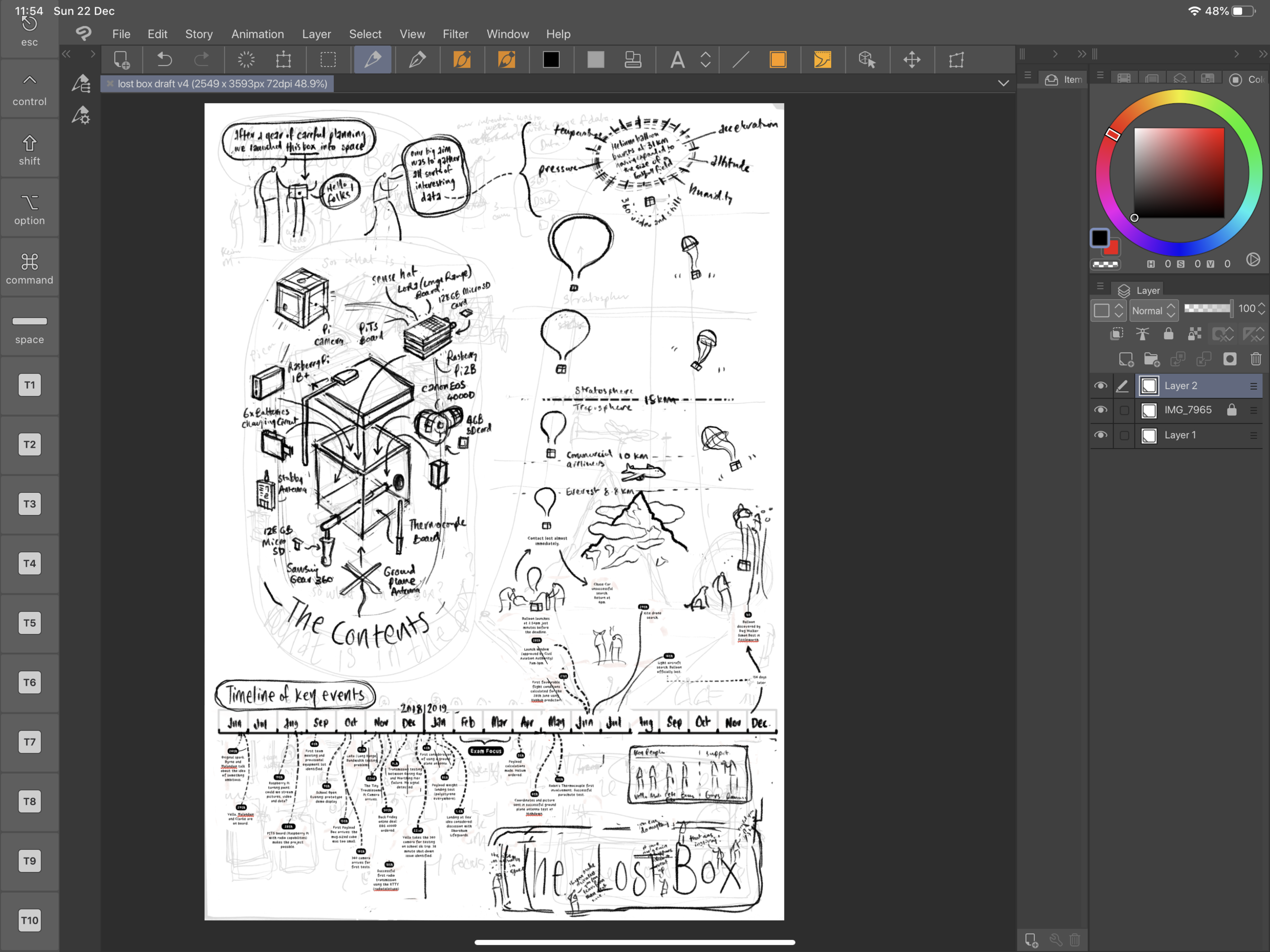
Inking (AKA vectoring!) the final version

This is my favourite stage - most of the underlying thinking has been done and so I can listen to some music while enjoying drawing carefully. I could spend days in this state. Affinity Designer I love you (although I should add that it is essential to have it on both Mac and iPad because organising thousands of vector layers can be a royal pain on a tablet).

This page was generated using my previously posted process shots on this page.
POSTCRIPT
Just a week before the end of term we received news that the project had been given a finalist place in the Big Bang fair in March. This event is very well attended, so I am delighted to say that both the film(s) and infographic will get the opportunity to reach lots of people with this inspirational tale.
October led me back into Instagram

So I felt the need to get back into the daily/regular discipline of drawing things and posting them online after a bit of a break. Maybe it’s related to being in a stressful day job? Maybe something else?

Hopefully it won’t look like this.
Anyways, so I decided to get back into something regular and have found a nice little rhythm developing including some new ideas emerging.
Some of the usual notes on my process:
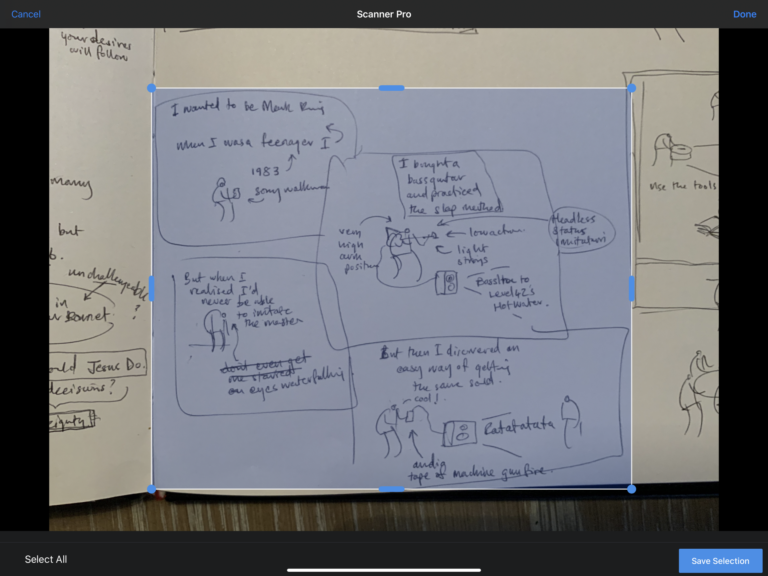

Scanner Pro - pops up nicely in the top right corner when you go to edit any photos in iOS. I like it’s simple ability to bleach stuff.

I like these results - they are useful for taking things to the next level.
scribbles in my square tiger-purchased blank sketchbook that I also happen to use as my daily teacher planner. I use an orange bic biro. I love the nib on it. Even with a decent iPad Pro knocking about, this is by far the best way to get my thoughts out quickly.
I take a photo with my iPad camera and then I process the imagery in Scanner Pro (unfortunately the track record for Prizmo has recently gone down the toilet so I gave it a shove - Scanner Pro has almost the same functionality).
this gets dragged into Procreate where I have set up some templates for Instagram/Twitter-friendly image creation. Essentially I produce a square image with four smaller squares. This gets posted to Instagram and my twitter feed gets the first image.


I use my own smooth brush with bobbly bits for line work and a non-smoothing brush for grey colouring.

the great thing to come out of this (so far) is that the use of a four panel structure forces me to create three or four distinct ‘beats’ which takes a bit of pressure off. One or two of the posts so far use a single larger box, but that’s because I am just messing about (and seriously who cares).

Palindromes

Playing about usually gets other things going. I was chatting to my son recently about Palindromes and then did a bit of research online. I was amazed how many there are and how complex! I noted a bunch down and have so far illustrated ten with an eye on keeping it up in my spare time. I like how you can take a really weird sentence and create some bizarre mini-narrative out of it. I posted them here.

The Big Picture
January 2018
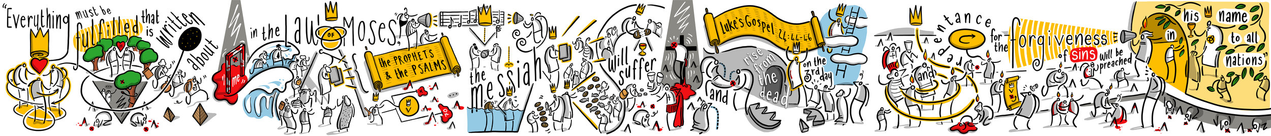
Shortly after I started working at Chatsmore Catholic High School, I got into a discussion with Pete Byrne, the Headteacher, about the values of the school and how important the idea of a 'meta-narrative' is in helping people understand their place and value within history.
We were both in agreement that it might be a good idea to create a mural of some description that reinforced the Christian values of the school. In this post I am going to risk giving too much information as I document the stages that this piece of artwork went through.
February 2018
Early drafting using abstract ideas, pencil sketches and a magic whiteboard.

An initial document where I mapped out the ideas of the Bible storyline.


This image was drawn on a magic whiteboard sheet and then processed in Prismo.

By now I had arrived at a visual solution and flow for the main ideas - now we had to decide an exact spot and dimensions.
March/April 2018
Choosing the spot, detailed drafting of the first wordless version.

The spot that Pete Byrne chose is very high profile. I felt a little nervous and excited. Something might have to happen with that yellow though...Joe Fairburn measured up a useful first set of sizes for me to work with.

This is an example of one of my magic whiteboard sheets in action - they are awesome for drafting using the whiteboard pens I use every day.

Here it is - the cleaned up image I produced.

Clip Studio Paint - pencils. Clearly the left here is more developed than the right.

I began to dabble a little with some shading but eventually decided that wouldn't work like this. I said I was going to overcook this blog post.

Colour - first draft. I was trying to make some symbolic connections throughout. It semi-works.
June 2018
I parked the mural for about two months and got loads of feedback from various people. Thankyou all of you who contributed - students, friends, colleagues, family members. Apart from simplifying a few things and tightening the symbolism across the piece, one of the big changes was suggested by Pete Byrne - he was keen on a set of three Bible texts linked to the image.
Initially he was looking for something from the Old Testament and maybe a couple from the New. I suggested that we use one unifying text - the conversation that Jesus has with the disciples on the Emmaus road after his resurrection is a great moment because it draws together the whole sweep of Bible history - from Creation, Fall, Promises, Sacrifice, Prophecy, Fulfilment in Christ, the giving of the Holy Spirit and End Times.

Pete was a little unsure of this move - was it too intricate/involved for a school mural? Would it lose people? My own wife had already made the point that the entire image was probably too complicated to begin with - and here I was adding something that not many people were that comfortable with or knowledgeable about.
In the end we decided to go with this idea - and were happily backed by the Governors. My own view is that this image follows in the tradition of stain-glass windows: something that is rich in detail and provides something to ponder and reflect on. While I can happily elaborate on every detail of this sequence and make it clear what I intended, not everyone will see it in the same way - but that doesn't mean you can't have some depth!
And so I began work on version two - combining Bible text and image - it meant redrafting the entire thing, but in these steps I think the whole thing was improved as I channelled several weeks of feedback and settled reflection.

Clip Studio Paint is the best drafting software I have ever used. As you can see here I have it set up in a particular way to suit my own approach.

Neat inking.
Colouring - this was still going to change - I wasn't happy with the golden scrolls.

This is a digital mock-up. The walls were still very very yellow, so I put together this image to get a sense of the scale/colour in that specific context. Having never worked to this scale before, I needed to do some pre-visualisation.

This is the penultimate version - there were still a few changes, but at this stage they were quite minimal.
The first undercoat of grey was too blue, here are some swatches that Callum and Farhun put up. Almost there...
August 2018
Final bits and pieces - oh and a radical overhaul using vectors...
I have written here extensively about my journey into using Affinity Designer. It is a long post that outlines my learning curve over the summer holidays. The upshot is that it was a good move and the end result is much much sharper.

This is a screenshot of the left-hand panel while using Affinity Designer. This has been converted into vectors.

Here is a zoomed-in section. All smooth and no rasterisation.

Here is the same section from the previous image - Clip Studio Paint is a bitmap raster tool and the blockiness is how it operates. Although I had designed this first bitmap version knowing that it would be blocky I was aware that from a distance it wouldn't matter.

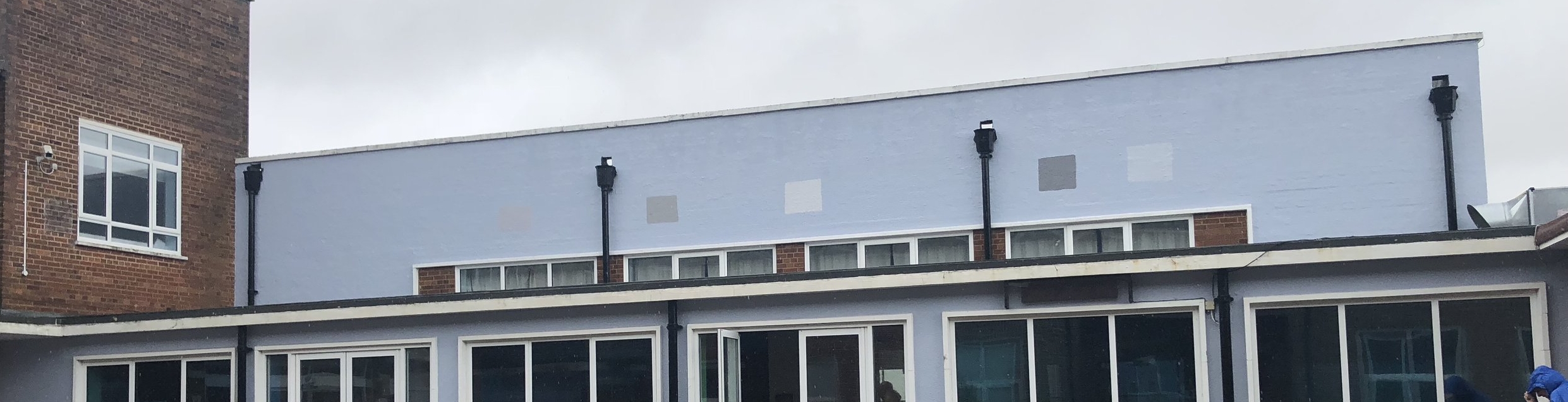
Here is the first bit of printing being done at MotoFX in Littlehampton. The vectors are smoooooth. In fact, it is a little shocking how many of my mistakes can be seen up close.

Okay it's a bit of a rainy day but there we go.
Postscript
I cycled early to school in the rain to see what the end result is like. My honest conclusion at the moment is that I have no objective distance on this. I see all the tiny things which could be improved or didn't look as good as I thought... it didn't take long to realise that I am overthinking this, and just need to step back. I have to leave it to breathe for a few months and see what people make of it.
A sincere thanks to all of the staff, students, governors, parents, friends and family who had any input into this project. I hope that it blesses you in some way.