"Making Biryani" 2
This is the second part. Here is the first bit.
Let’s just cut to the chase before diving into a few relevant process details. Here is the final piece:
In total there were a further two more sessions.
Let’s just say that it was a long weekend…
Thinking clearly is essential
Just like marshalling an army, creating an animated infographic really requires a lot of clear thinking and coordination. For anything approaching this size it has to have some kind of logic or it becomes unwieldy and the confusion really compromises the progress.
I started by creating a better overall shape and look.
I know you’ve seen this already but it’s so pretty (thankyou LN for your super valuable input).
After a bit of reflection, I ended up on this organisational schematic:
1. A 2D flat orange layer to frame everything.
2. A general guide layer to line things up and remember the overall picture.
3. The drawn bits separated as a large transparent png layer.
4. SVG layer of masks which draw-off to reveal layer 3.
5. All textual elements - same transparency format to layer 3.
6. SVG layer of boxes which fade out - same method as layer 4.
7. A container group with all of the pop-up images (see below for more on slicing it up).
To animate things as I’d begun (see the first part) was just too exhausting (I honestly didn't have the time), so I decided on having three modes of delivery for greater efficiency:
text sections that fade in as and when
images which (mostly) pop up
swirls and lines which draw/extend onto the canvas
In the end I varied this a little as the mood took me - it felt appropriate in some cases to fade on or have things already on screen. The pop-in images worked a lot better with certain enunciated bits. With hindsight, if I had the time to rehang or redesign this entire piece I would work a lot more closely reviewing the soundtrack as a priority rather than as an afterthought - due to pressures on my spare time I rushed this and it turned out to be more of an afterthought unfortunately.
In the end this piece ended up way too busy. As an exercise in developing visual language I am really pleased, but as a piece of clear learning communication it doesn’t work as well as it might - there is too much force-feeding and cognitive overload (cardinal educational sins!), and I think listening to the soundtrack is key to getting a feel for what is or isn’t paced right. Anyways FWIW - glad to have invited you to my funeral.
Using the slice/export tools in Affinity Photo (pictured here on the iPad but later transferred to the Mac desktop version) saved me a lot of time. By doing them in order and then quickly naming each slice you can organise a lot of material very quickly.
Some gains worth mentioning
In no particular order here are some of the gains from this project:
Using Affinity Photo to slice up the pop-up images (see note on the gif above). Such a useful organisational timesaver and so instinctive on the iPad.
Working with Motion shortcuts and creating my own custom behaviours saved a lot of clicks. Using Motion via the file menu and trackpad is incredibly slow, but I sped things up a lot using keyboard shortcuts and making my own versions of behaviours.
Frustrations and things to change ‘next’ time
If you look closely enough you will see that some of the swirly drawn-off bits have a weird stumpy ending. This, it turns out, is because the lines being drawn originally are too thick. If you want a precise draw-off you have to create a more precise masking line. This is something that stands out - the extra time taken to carefully draw these things and plan them out makes a difference.
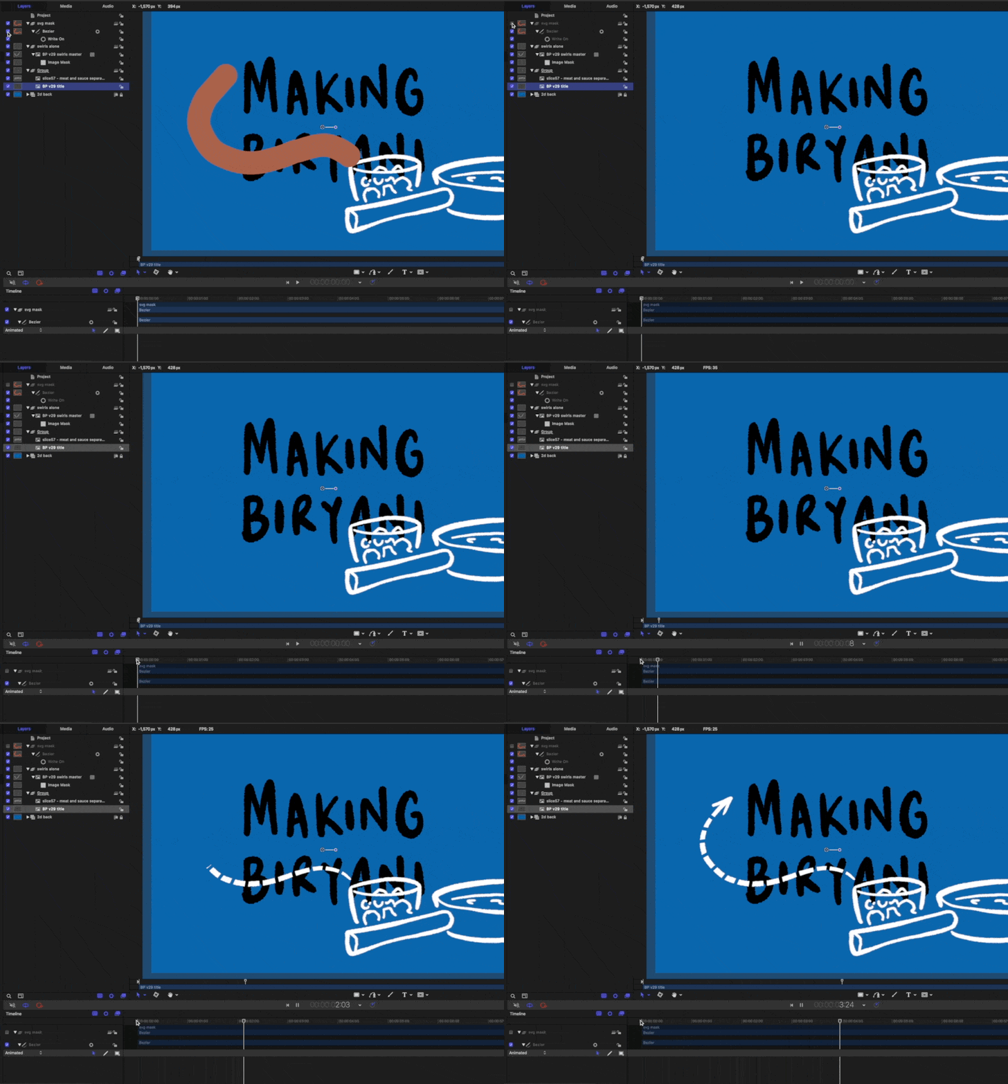
I struggled with the masking technique in Motion. Originally I was using a very lengthy (and limited) workaround where I was using the ‘colorize’ filter to make the SVG swirls the same as the orange background, but these occasionally had to be edited so that they didn’t overlap with the other drawings. In the end I should have used a (relatively) simple masking technique like so:
There is an image layer below the swirl layer - this is linked to the (switched off) brown drawn SVG swirl mask above.
This would have allowed greater flexibility with lines being properly clipped and allow for overlapping to occur. Anyways you live and learn.
The massive gain here is that I am now confident in developing much more complex infographic explainers. When I first started out I depended on resolution-limited screen captures as I drew on Procreate on an iPad. Now I can transfer (supposedly) infinite hand-drawn vectors from CSP into Affinity - then out through PP - and into the Motion/FCPX workhorse.


