My first year as a Learning Designer¹
Today is a special day for me.
It marks one year of working full time as a Learning Designer. I wanted to write something to celebrate this milestone and explain a bit about what I have been doing with my time.
Some background context
I worked as a teacher in seven schools, totting up 26 years of experience. About six years into my first job I started a design company and spent the rest of my time developing a range of skills across numerous disciplines. Throughout this time my design and educational skills converged until I discovered that there was a Real Job out there that was a perfect synthesis of both. At one point in my journey I almost stepped into a generalist role - developing resources for any and every paying client - but to my delight something better happened: I got a job at Crosslands. I am now a specialist in probably the most bespoke² role one could ask for.
My job in one diagram

On the left are the six overarching principles taken from the 'Making Every Lesson Count' series by Shaun Allison and Andy Tharby. On the right are Scott Berkun's four foundational design questions. Learning design is a synthesis of these two disciplines.
Learning design - when successful - is the creation of a compelling and satisfying journey of discovery. My intention is for learners to be drawn in and find delight in the experience of tackling something of value. I see this experience as a 'learning tunnel', constructed by combining the best educational and design principles.
Six Learning Principles

Everyone working in education ends up developing personal convictions about what is important if you are going to do the job well - you need some kind of framework to cope with the sheer pressure of surviving the job. The MELC series of books (created/edited by Shaun Allison and Andy Tharby) clarify many of the key ideas in a helpful list of six overarching principles.
Challenge - high expectations that stretch learners. Embedding struggle and reward.
Explanation - clear, concrete conveyance of concepts and ideas.
Modelling - walking through problems, procedures and processes as required.
Practice - focused deliberation, developing personal thinking and conviction.
Feedback - two-way instructor/learner insight leading to mutual improvement.
Questioning - testing for misconceptions, enabling deeper insight.
These principles promote balance. They aren't prescriptive in a lesson-by-lesson sense; they operate as a checklist for a sequence of material. My favourite thing about this list is that they are rooted firmly in an 'anti-gimmick' approach. They draw on time-tested approaches that don't rely on seasonal trends or TED-talk personalities - good solid fibre for healthy learning! (If you are involved in any kind of educational programme you would benefit from a few moments comparing your existing diet against these.)
Four Key Design Questions

In addition to these, Scott Berkun's foundational design questions have had immense value in refining and focussing my thinking whenever I work on a design problem. These are a brilliant starting point and general framework.
What are you trying to improve?
Who are you trying to improve it for?
How do you ensure you are successful?
Who might be hurt by your work?
Great learning design is a combination of these two worlds: learning and design. In my first year at Crosslands it has been a joy to simultaneously flex both sets of disciplines.
So what have I been doing exactly?
I have been working on a series of 'foundation' courses intended for members of grass-roots Church communities who want to deepen their understanding of theology and practice in a convenient and accessible way. Crosslands already provides successful seminary-level accredited courses for current (or aspiring) Church staff workers. They took the decision to expand their range of courses for 'non-professionals' who might want to grow in their faith without it being a huge deal. The foundation offering is something that individuals or small groups can participate in - it functions beautifully on mobile devices - enabling flexibility and ease for the user. As we hit September ‘22 (tomorrow!) ten of these have been successfully launched with more in the pipeline.
In managing such a large project I have developed a systematic process defined by approximately 6 phases:
Phase 1: Initial development
Crosslands works with established and trusted writers and teachers within the Christian community to produce material across a number of relevant topics. Where appropriate, I might bring suggestions to table discussions at this draft stage for how the content could develop and finally be delivered. Personally it is important to retain a focus on what will really work for the learner at the point of delivery - a connection with personable, expert insight - a sense of humour and humanity... qualities which make a massive difference to user engagement. The phrase 'death by powerpoint' is something we are all well aware of.
Phase 2: Initial design response
Once the material has been written and delivered - it might help to think of it as a freshly baked cake - I set about devising how best to decorate and slice it up into an appealing, accessible end product.
I spend some time absorbing the finished course materials, making visual notes and jotting down any ideas I am getting as I go. Occasionally I will have ideas about how to present key concepts: giving a sense of an overview (to help the student to make sense of where they are). I also think about how to assist learners to retain the material (aiding its 'stickiness') plus any other inspiration about using and adapting multimedia materials where appropriate.

My initial notes compared to a more rendered overview diagram.
Referring back to Allison and Tharby's 6 learning principles, here are some of the thoughts that go through my mind during phase 2:
Challenge: are we providing enough (or too much...)?
Explanation: is there enough pacing? Does anything need slowing down or speeding up? Does the structure get in the way of the learning? Should we be using more or less video sections?
Modelling: are we providing enough opportunity for demonstration - either through worked out examples, local-leader discussion notes (and support where needed), or some other way that fits with the course direction?
Practice: is there enough opportunity for guided reflection, thinking, writing, and/or discussion? Do we need to emphasise private reflection or guided group discussion?
Feedback: how do the instructors and learners get insight (and so develop more effectively)?
Questioning: most of the courses have both quiz and reflective components built in - these are usually focussed on enabling the learner to mark the territory covered with their own personal stamp, or recapping particular chunks of knowledge. As we move across a unit of work - which key ideas do we want students to retain when it's all over?
Phase 3: design materials
I usually begin with placing the content into formatted sections that communicate clearly to the user the kind of activity being covered. A large part of my work has been defining a common visual language or feel so that regular users will know where they are on the learning journey.
After this I move on to creating final illustrations - it doesn't make sense to do this any earlier because a key function of an image is to assist with the meaning - so the context is really crucial. Generally I will make somewhere between 70 and 150 images for each foundation course. (To date I have produced approximately 1000 images since I started the course).
The final part of phase 3 is to take a look at the overview and create my own personal 'cheat sheet' - or a set of notes that show at-a-glance what has been covered. I will use this to assist me in making a set of quiz sections and also double back to make some interleaving recap quiz sections. The main point with these quizzes is not to set a tough examination or assessment that can be passed or failed - they are relatively light-touch exercises that draw learners back into the material for extra reflection.

This was created in Waitrose Cafe, Worthing.
Phase 4: first release
One of the main revelations for me in reflecting on Berkun's principles was the need for building in space for feedback and iterative improvements. Phase 4 is the first release version which has been checked by the team and usually results in a few key corrections. It has been a fascinating experience to see how different writers and teachers have responded to the material in its ‘Phase 3’ form. Mostly this has been positive, but there is always a bit of tightening to be done so I try not to be too precious about my work!
Phase 5 (and onwards)
So far we have a couple of modules which are on Phase 5 - meaning that they have been evaluated and improved after feedback from active users. I love the idea that we are improving something that is already good.
This post doesn’t tell you everything about what I have been doing but hopefully it gives an idea of some of my work. I am deeply grateful to the team at Crosslands for this opportunity and I love what we are making and sending out into the world.
Special easter egg - this post is dedicated DP and WS who are both very talented ex-students who no doubt will make good use of this material to inspire and direct others into amazing learning experiences.
¹This title isn’t really true though, is it? I started teaching and planning Sunday School lessons in a church when I was 18 or 19, so this is maybe my 30th year as a learning designer… the reality is that every time you think and plan to teach something you are a learning designer. Titles are a nonsense to be honest - people who do stuff are already doing it before they get that title.
²For those who don’t know, it is worth sharing at this point that the Christian faith, exploring the Bible, applying theological issues and basically anything to do with Jesus Christ are among the most important things in my life. Throughout my time as a teacher I had a role as an RE teacher which I loved! Exploring different perspectives, engaging with contemporary issues and seeking to frame difficult theological ideas in helpful ways was something I excelled at. My work at Crosslands is quite similar in many ways, except I work with adults within a niche Christian context and don’t have to deal with gum under desks quite as much.
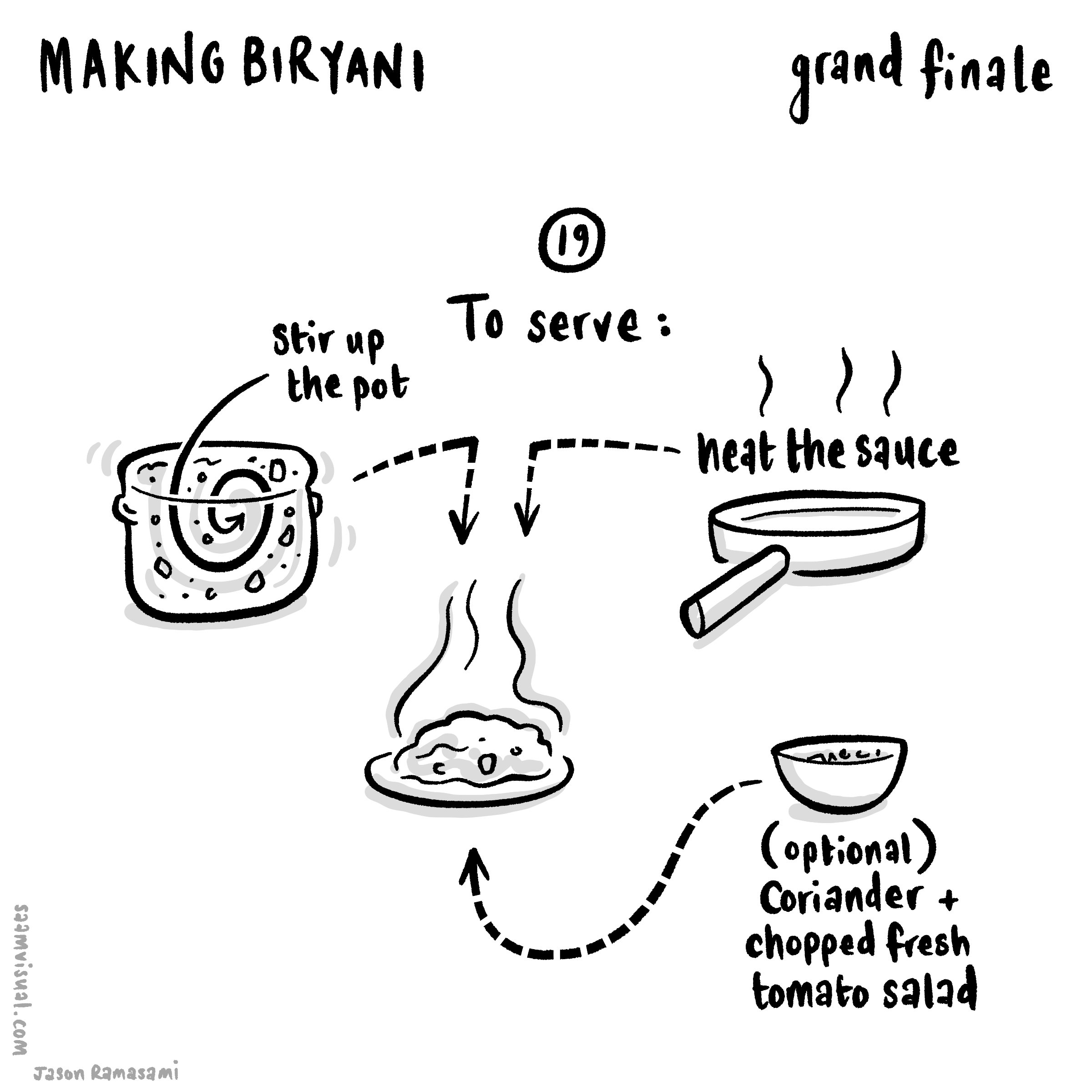
"Making Biryani" 2

This is the second part. Here is the first bit.
Let’s just cut to the chase before diving into a few relevant process details. Here is the final piece:
In total there were a further two more sessions.

Let’s just say that it was a long weekend…
Thinking clearly is essential
Just like marshalling an army, creating an animated infographic really requires a lot of clear thinking and coordination. For anything approaching this size it has to have some kind of logic or it becomes unwieldy and the confusion really compromises the progress.
I started by creating a better overall shape and look.

I know you’ve seen this already but it’s so pretty (thankyou LN for your super valuable input).
After a bit of reflection, I ended up on this organisational schematic:

1. A 2D flat orange layer to frame everything.
2. A general guide layer to line things up and remember the overall picture.
3. The drawn bits separated as a large transparent png layer.
4. SVG layer of masks which draw-off to reveal layer 3.
5. All textual elements - same transparency format to layer 3.
6. SVG layer of boxes which fade out - same method as layer 4.
7. A container group with all of the pop-up images (see below for more on slicing it up).
To animate things as I’d begun (see the first part) was just too exhausting (I honestly didn't have the time), so I decided on having three modes of delivery for greater efficiency:
text sections that fade in as and when
images which (mostly) pop up
swirls and lines which draw/extend onto the canvas
In the end I varied this a little as the mood took me - it felt appropriate in some cases to fade on or have things already on screen. The pop-in images worked a lot better with certain enunciated bits. With hindsight, if I had the time to rehang or redesign this entire piece I would work a lot more closely reviewing the soundtrack as a priority rather than as an afterthought - due to pressures on my spare time I rushed this and it turned out to be more of an afterthought unfortunately.
In the end this piece ended up way too busy. As an exercise in developing visual language I am really pleased, but as a piece of clear learning communication it doesn’t work as well as it might - there is too much force-feeding and cognitive overload (cardinal educational sins!), and I think listening to the soundtrack is key to getting a feel for what is or isn’t paced right. Anyways FWIW - glad to have invited you to my funeral.

Using the slice/export tools in Affinity Photo (pictured here on the iPad but later transferred to the Mac desktop version) saved me a lot of time. By doing them in order and then quickly naming each slice you can organise a lot of material very quickly.
Some gains worth mentioning
In no particular order here are some of the gains from this project:
Using Affinity Photo to slice up the pop-up images (see note on the gif above). Such a useful organisational timesaver and so instinctive on the iPad.
Working with Motion shortcuts and creating my own custom behaviours saved a lot of clicks. Using Motion via the file menu and trackpad is incredibly slow, but I sped things up a lot using keyboard shortcuts and making my own versions of behaviours.

Frustrations and things to change ‘next’ time
If you look closely enough you will see that some of the swirly drawn-off bits have a weird stumpy ending. This, it turns out, is because the lines being drawn originally are too thick. If you want a precise draw-off you have to create a more precise masking line. This is something that stands out - the extra time taken to carefully draw these things and plan them out makes a difference.
I struggled with the masking technique in Motion. Originally I was using a very lengthy (and limited) workaround where I was using the ‘colorize’ filter to make the SVG swirls the same as the orange background, but these occasionally had to be edited so that they didn’t overlap with the other drawings. In the end I should have used a (relatively) simple masking technique like so:
There is an image layer below the swirl layer - this is linked to the (switched off) brown drawn SVG swirl mask above.
This would have allowed greater flexibility with lines being properly clipped and allow for overlapping to occur. Anyways you live and learn.
The massive gain here is that I am now confident in developing much more complex infographic explainers. When I first started out I depended on resolution-limited screen captures as I drew on Procreate on an iPad. Now I can transfer (supposedly) infinite hand-drawn vectors from CSP into Affinity - then out through PP - and into the Motion/FCPX workhorse.
"Making Biryani"
This is the first part. Part two is here.
Since starting as a learning designer last September there have been plenty of opportunities to develop my design thinking and practice in real-world situations. Instead of squeezing the odd project in here and there between tectonic school pressures, I get to devote decent stretches of time to solving really interesting learning challenges with design. I love it. Having said that, I still spend a fair amount of time in the evenings and weekends developing my skills through personal side-projects (the 3 Forts video was a recent example).
I wanted to document a little about another of these that has been chugging away at the moment: “Making Biryani”.
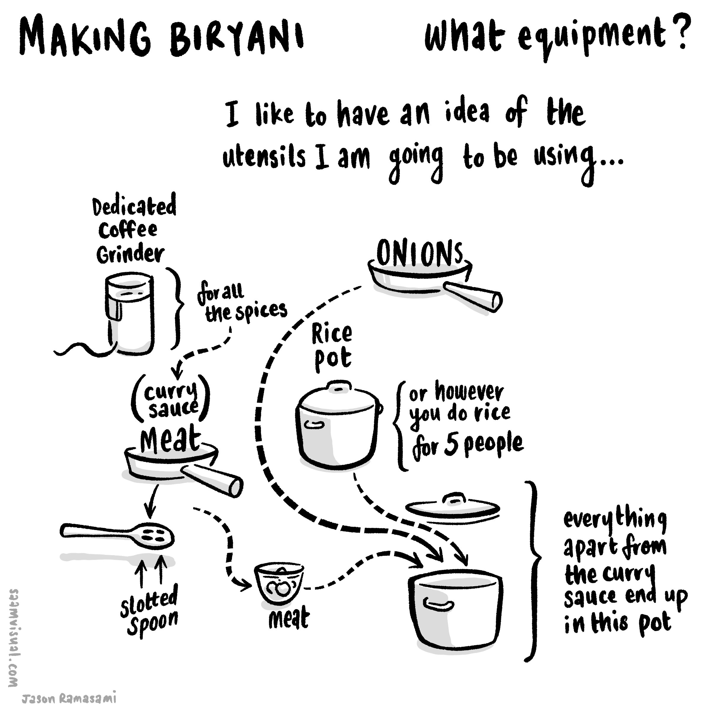
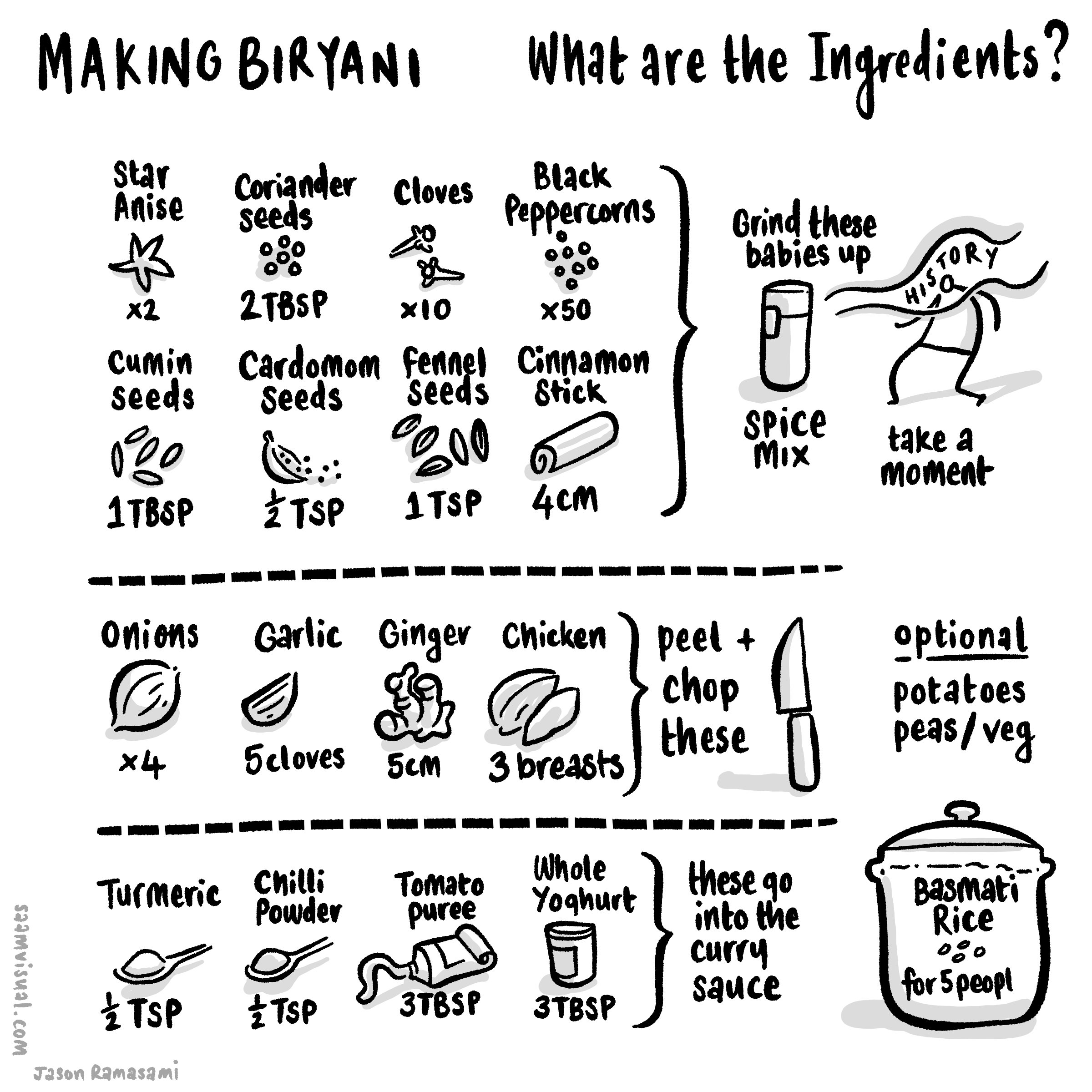
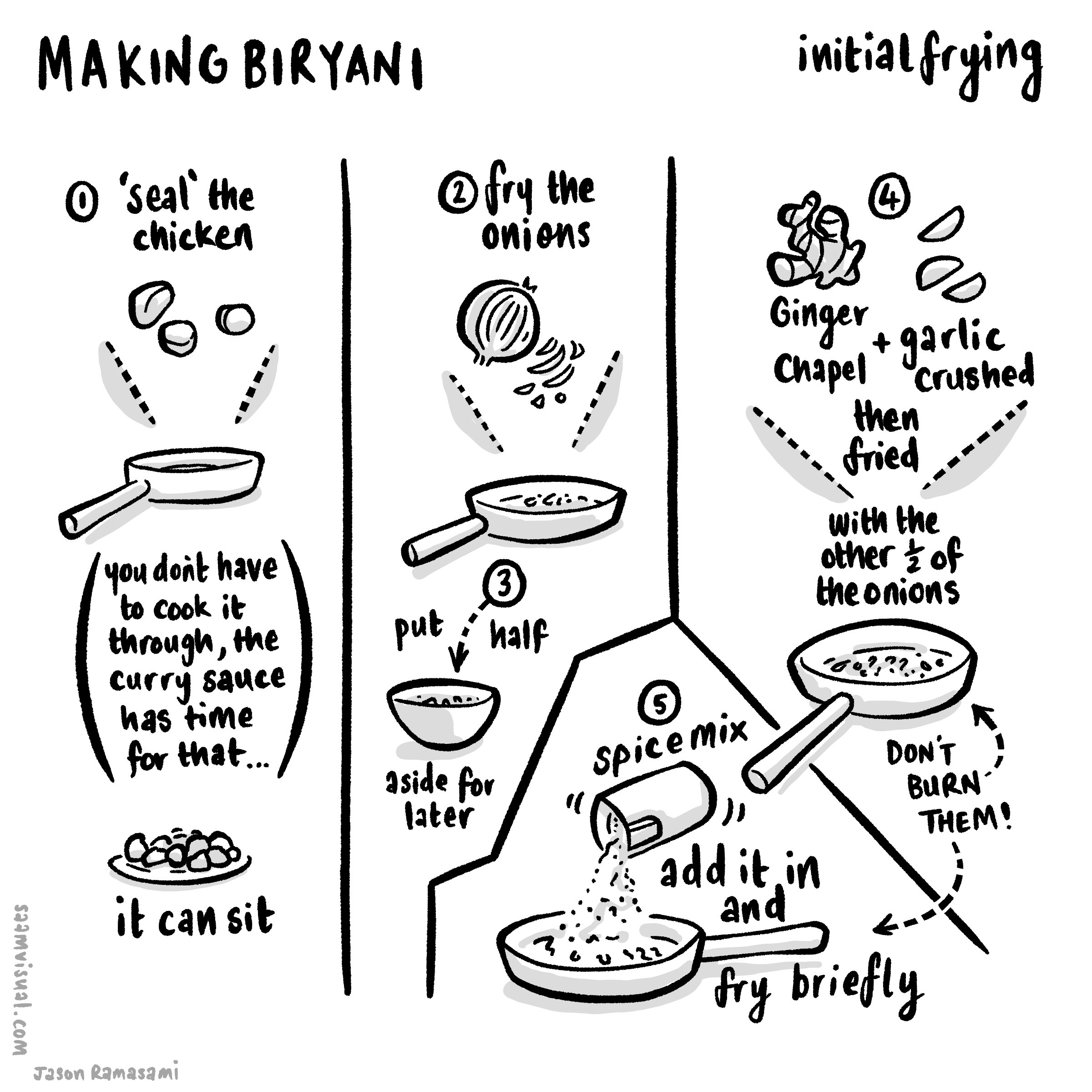
Cooking proper food
For a long time, my cooking skills have largely consisted of sauce jars and ready-meals but with the recent change in circumstance I have been doing a lot more proper cooking. When Guy Lodge tweeted about a biryani he was making I asked for some details. He sent me a really good recipe to start with. I have made it a few times now and each time it feels like an event to invite people round for. Thanks Guy for the link. And yes I really need to start inviting people round.
Explaining the making
I will say it outright: explainer projects either need to be paid well or have deep personal meaning because they require so much effort. If you ever you see one online, try to spot which of those it is because they are gruelling as you wrestle with the details. This is, of course, the joy of them as well - seeing a bunch of important details etch themselves on a huge virtual canvas in an understandable way is a lovely thing.
The 3 Forts video was meaningful for me (my first marathon across amazing scenery combined with learning how to draw and animate maps): it merited the time and I don’t regret it (much).
“Making Biryani” is similar - to be able to make something this tasty from all of these delicious ingredients is a kind of turning point in my own growth as a person (honestly I’m not over-egging this: I have an immigrant, working-class background and this is a huge thing). Also, I have been chipping away at the RSA/Animate whiteboard-style explainer format for a while. The Religion and Worldviews Paradigm piece I did last year for the RE council was a big step in that direction but there’s still room to travel - and this project is how I intend to make those steps.
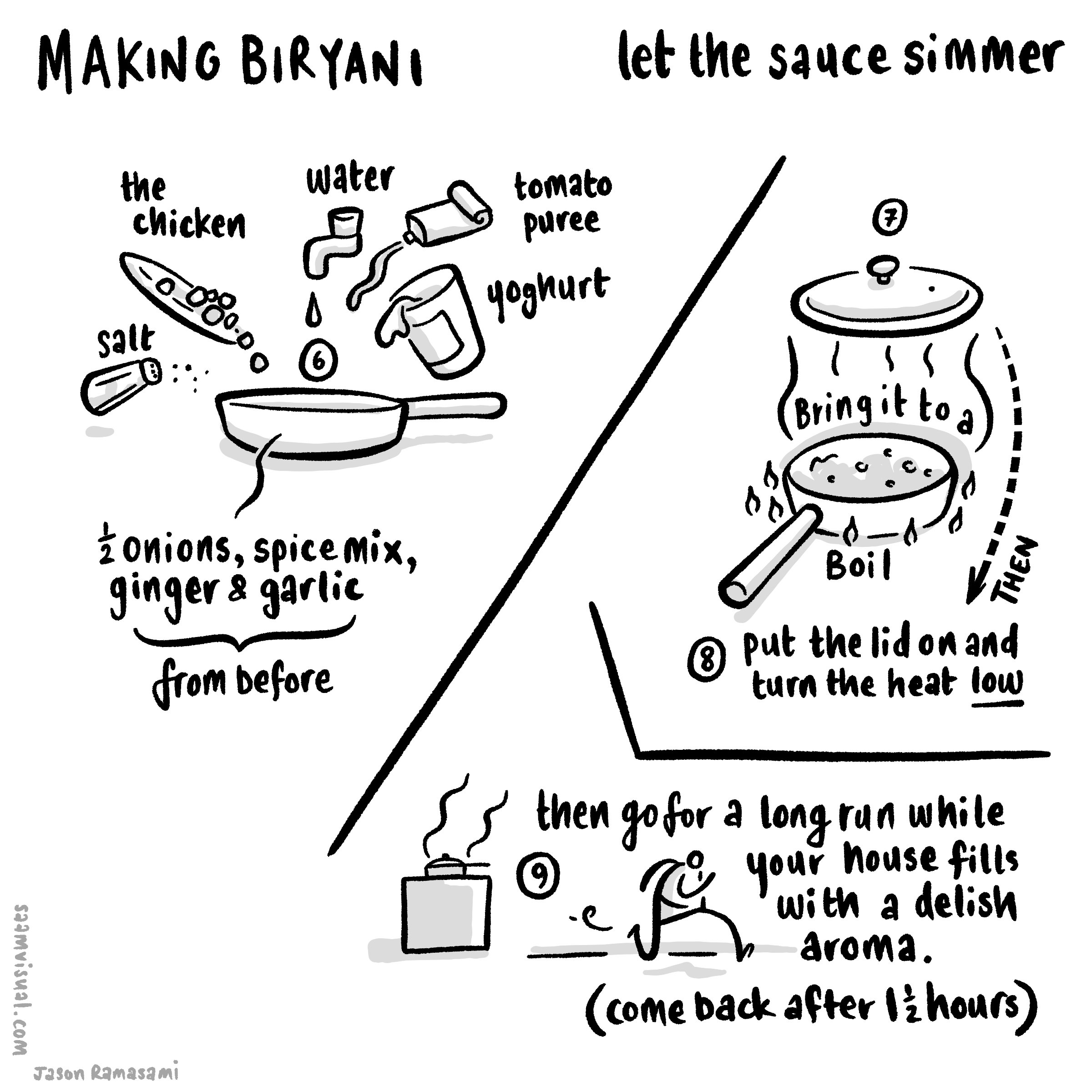
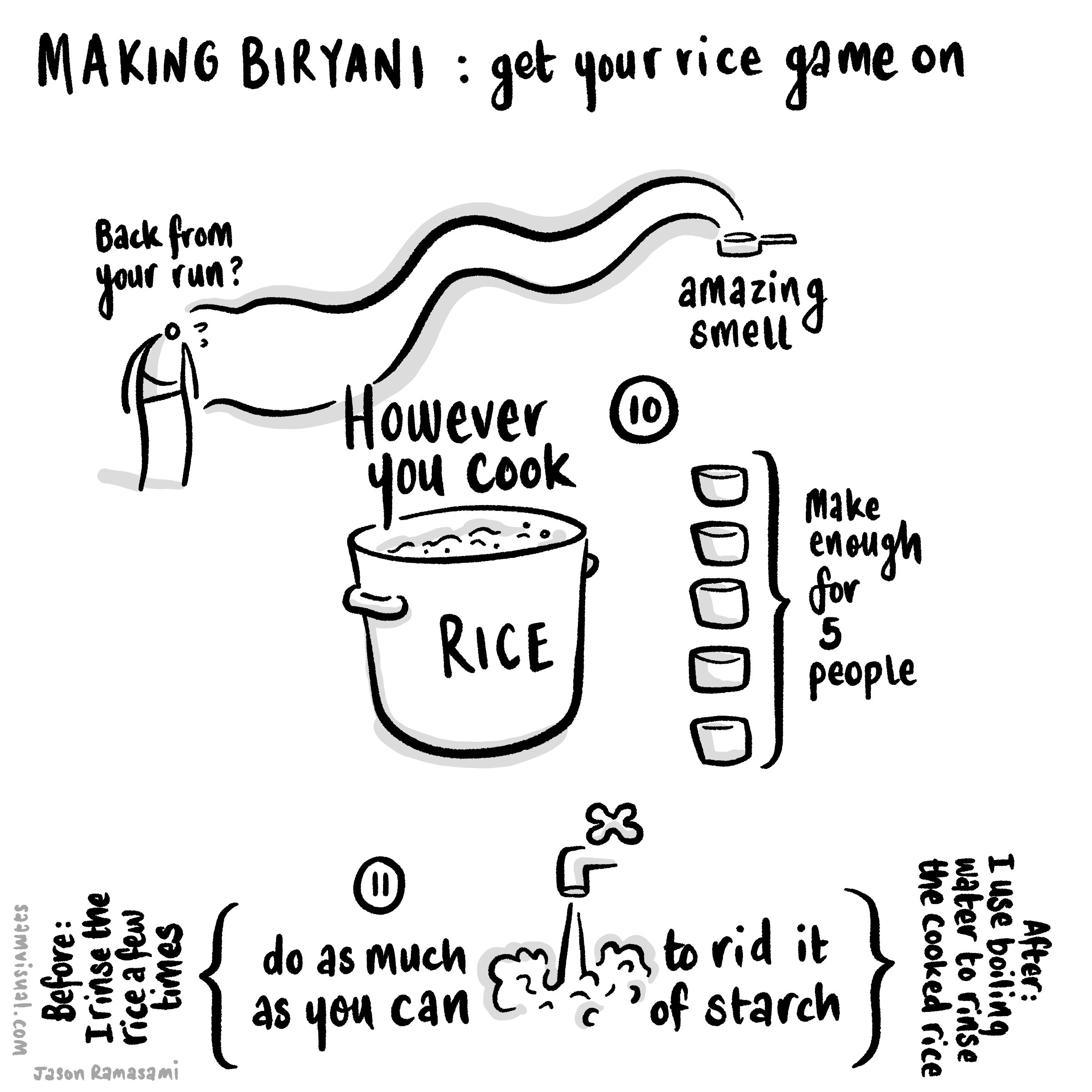
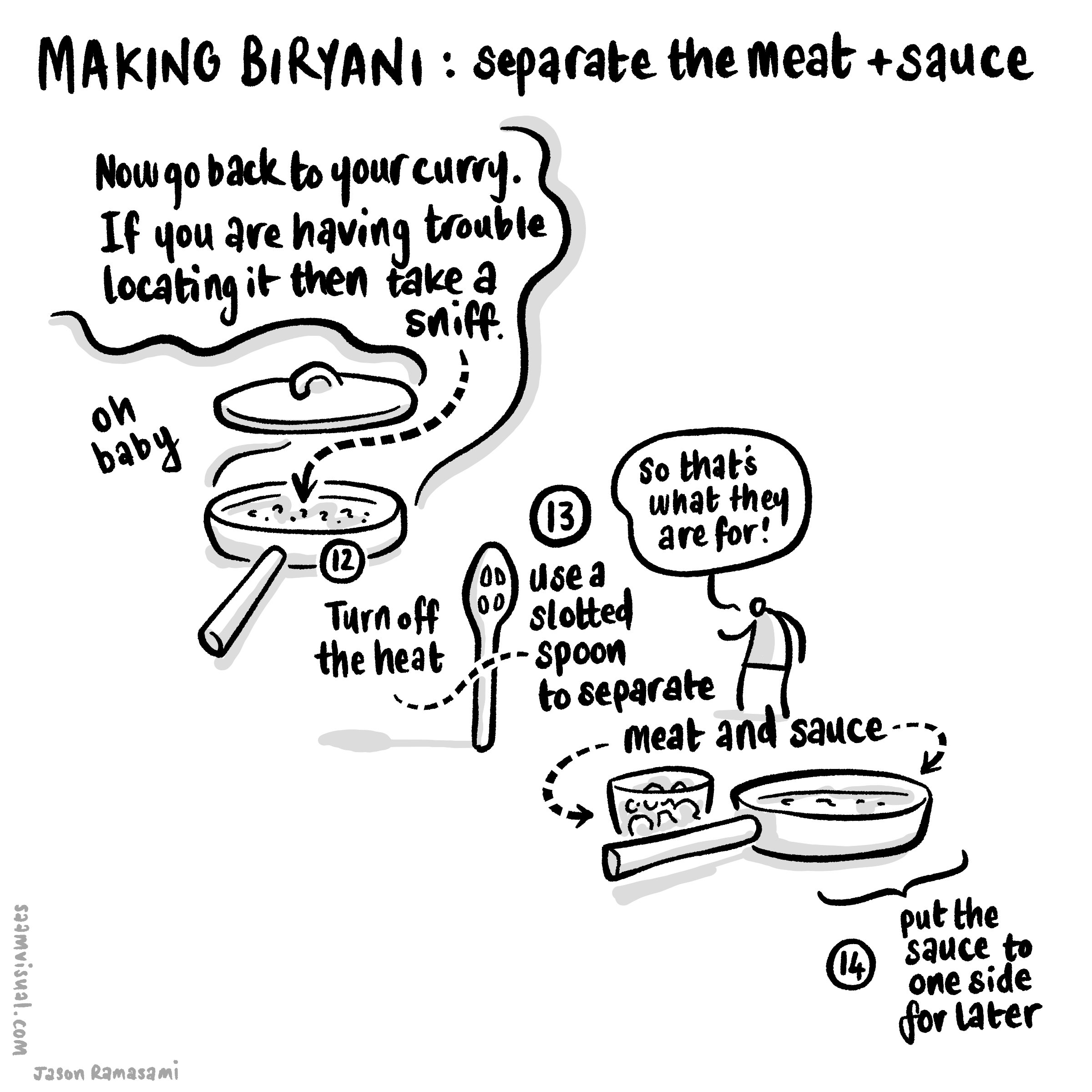
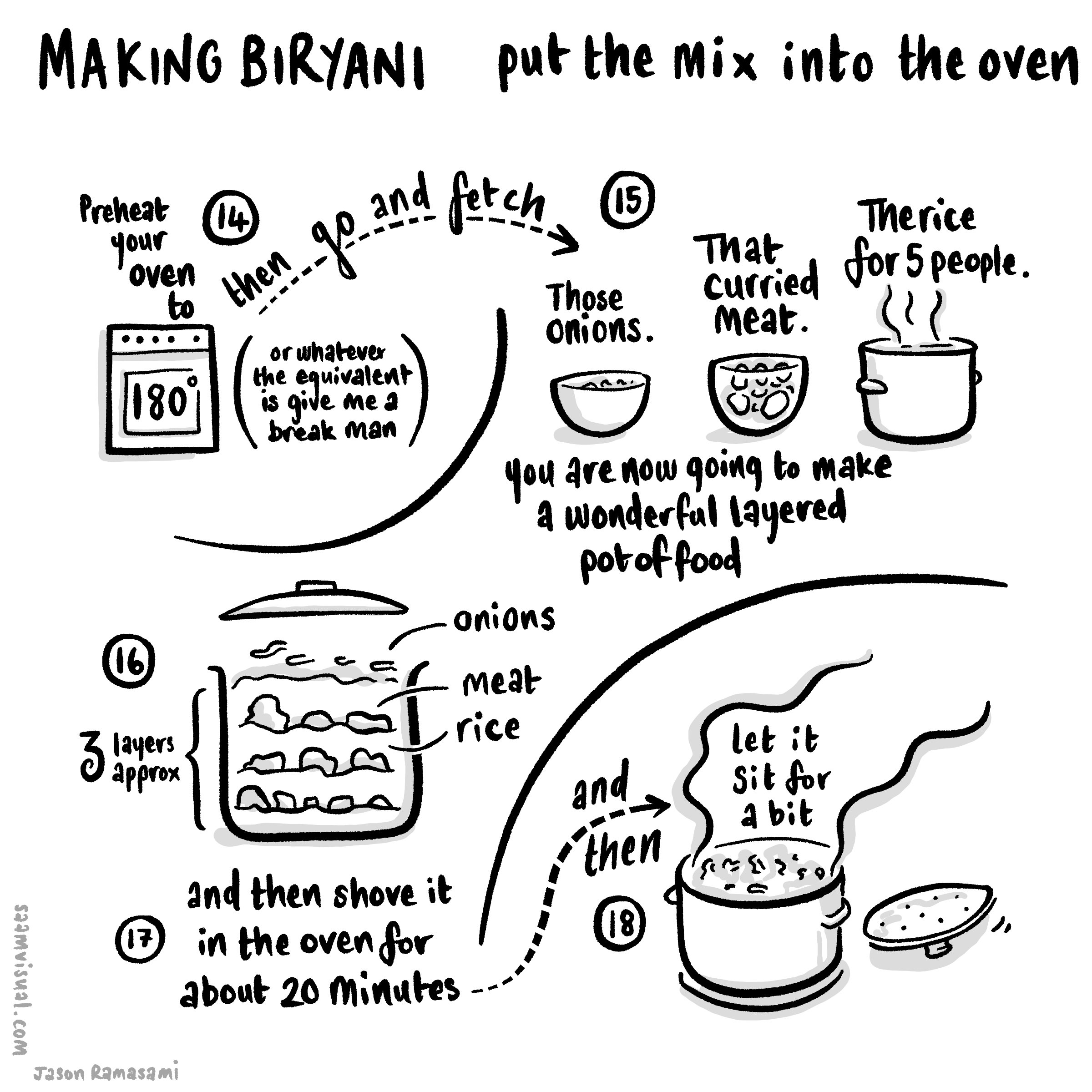
Just to be clear: in this piece I am exploring how to communicate the process of cooking a delicious meal by animating hand-drawn notes to a scripted narration.
Initial notes
I did some early sketches using a square-formatted page thinking this would work as a serious if about 8 Instagram images.

My initial sketch broken into a few stages.
A More Detailed Slideshow (for instagram)
So after a bit of drafting I put this slideshow together.
Forming it into an explainer video
From here I have begun to think through how to create something that animates on a larger canvas. The proprietary vector¹ drawing layers in CSP are genuinely useful in these situations because you can go back to the original artwork and resize/appropriate if needed (something I find myself doing occasionally as the bigger form requires an adjustment).

Here is my initial attempt to corral the eight instagram square images into something continuous. As it turned out I had to scrap this after some initial efforts.
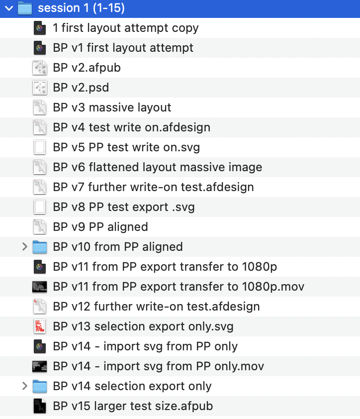
From here I began to do a dance between Affinity Publisher, Pixelmator Pro, Apple Motion and back again. I was careful to number and duplicate all of my steps and then group them into ‘sessions’. Here was session one:
Realising a few things needed tweaking I came back to it the next morning:

I thought it was simpler to just screenshot this instead of boring you with a blow-by-blow explanation.
This is the test export I produced - it has a few issues but some parts are working really well.
The principle technique being used here is to draw vectors over selected items with the pencil tool in Affinity Designer using the iPad pencil like so:

The red is a vector-drawn pencil stroke in Affinity Designer.
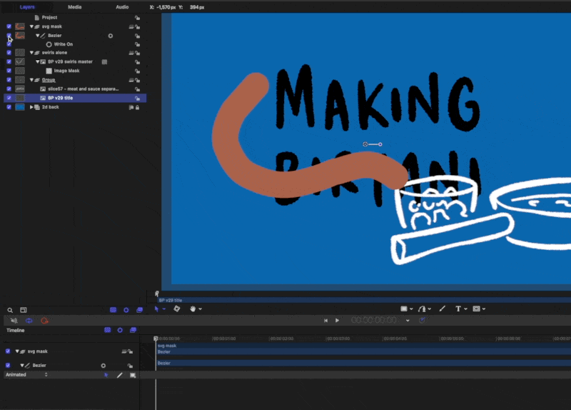
Then in Apple Motion (via the usual PP export option) I would create a write-on behaviour and time it carefully like so:
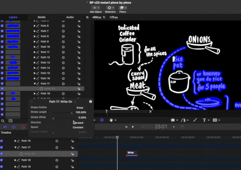
The vector lines are here in a bluey-purple and I have changed the opacity so you can see a bit of how I have done it. Notice that the ‘write-on’ behaviour for ‘Path 17’ is set to erase. In the actual project I have set the entire SVG group to ‘colorize’ as black so it completely masks it out.
At this stage I realised that there were some details I had missed and instead of rehanging the whole thing again I decided to take a break and get some air.
Some thoughts before closing:
making sure the main image is high-resolution enough is really important - in the next session I will re-export those vectors from CSP at twice the size. This version is borderline acceptable. It’s one of those things you can only figure out as you go. I got increasingly frustrated that I couldn’t zoom in with it looking a bit pixelated.
the write-on Apple Motion behaviour works quite well for most elements but it is hard to get handwriting to animate properly without it being excessively fiddly and time-intensive. I am looking for smart and cost-effective ways of doing this kind of stuff and I wasn’t about to do lots of individual lines unless it really required it. In the old days of similar OUP/REC work I did screen recordings of Procreate handwriting but this needs a slightly different approach - I am not sure what to do… (maybe just having it appear via a fade-in is enough?). A related question is: how much more/less effective is this for the audience if you DON’T see things being written? Is it just me being a fussy person sitting alone at his desk in the wee hours getting fixated over nothing? Does it matter to have it appear in this way or is the flow of logical information enough?
My instincts - with a bit of a break - are that if the script and storytelling are engaging then the images don’t have to be super-intensive… I think.
More to come.
(Part 2 - where the dish actually gets served is here)
¹CSP vectors don’t operate like the usual svg tools you find in Affinity, Pixelmator or Adobe - but they are genuinely helpful to have around and I never draw final art these days in CSP without it being on a vector layer.
The Three Forts Challenge film
Here is the final film:
I have posted a bunch of stuff leading up to this (scroll back using the buttons at the bottom of the page) showing my development stages as I tried to eek out ways of making semi-coherent story about running. In the end I am happy with the end result - there is a good mix of stuff going on that serves to communicate the experience. Of course it’s a personal story but I worked hard to not make it all about ‘me’. I hope that it serves a wider audience who are interested in trail running, outdoor adventures and delicious scenery.
Some end thoughts:
1: There are no short cuts.
Whatever process streamlining you can make gains with, editing seems to be one of those activities that sucks a huge amount of time from your week (or in this case spare time in the evenings). I am certainly a lot smarter with my working but - rather like running the marathon itself - you have to go the distance. Even with the key framing and design in Motion much clearer now, it still takes a while to put it all together. There is a certain care that is required - shortcuts aren’t that easy to come by. I suppose the speed and confidence comes from having an idea of how a certain technological ‘bone’ is going to fly when I throw it into the air.
2: Specific gains:
GoPro tech is remarkably good. Very reliable. After some testing I settled on using a Hero10 with the ‘shorty stick’ which fits easily into the Salomon running pack I was wearing. I used the one button record function and kept the footage as wide 4k 60fps. Keeping it simple and not switching modes is quite important. I concentrated on capturing certain kinds of material. As you can see from the end film I was able to zoom in at times and make use of the 1080 frame within the 4k ratio. This is useful. The advantages of using a GoPro over the admittedly superior iPhone three lens system is that it is more rugged and easy to grab. I could have gone with an external mic (and very nearly did - even on the morning of the event) but I decided to keep within the ‘less-moving-parts’ boundary. I could have added another ‘max mod’ lens to the camera but it just added bulk and in the end this was excellent.
For the in/outro shots I did use the ‘media mod’ and Rode Wireless 2 lav-mic combo to see how good it was. As it turned out this was remarkably good and the sound is superior. I can see the two mic-set up being very useful in the future. I have anxieties about filming longer interviews with the GoPro purely because of the battery and overheating issues which seem to be rife online. The iPhone is way better for that kind of thing, but those times are fairly rare. I can see a time where I will be running and interviewing someone with us both having remote wireless mics and it working smoothly.

That’s it - just these two modes. Higher frames for out in the field action and 30 for talky stuff.
The AddMotion plugin for FCP is superb. It enables a lot of easy/interesting functionality when forming the material. I posted about this earlier. I used it a lot in the final piece. It felt surprising how good it was.
Combining keyframe-animated visuals from Affinity Designer - via Pixelmator Pro - into Motion and then out to FCP is now a clear process in my mind. For the film I had to make a lot of detailed notes. There were around 30 ‘moments’ in the end. Here is a snippet from my sketchbook:

I had to go through the whole course and keep a careful eye on the data and exact places to make the sections. Okay so this was a personal project and who cares about accuracy? But I think careful handling of data and information is important so I had to take some time to make sure everything was right.
3: Serve the story, not the design/tech ambition
I had originally planned to have these time and distance tags appear at each of the points where the map line stops but in the end the feel of the sequence was better without them. The footage actually carries a lot of the storytelling in itself so some of that information ended up being a bit superfluous. For that reason I ended up taking this approach:
edit the filmed material as an interesting sequence that is varied and engaging in it’s own right. Compress clips and sequences as needed to get it into a rich enjoyable sequence that flows well.
break this up into sequences (I had 31 but got rid of a couple that I felt didn’t add enough to the overall story) and then look at the graphics needs.
I had the overall design in place but with this edited sequence I now knew that one overview (without the gradient) was useful. I also realised that I had about 30 stopping points where a closer camera for each would be good.
I animated all of those and then found myself enjoying the process of getting the different pieces to flow into each other. This is where AddMotion was used well. (Side note: annoyingly there is some kind of bug in FCP with using these 3rd party plug-ins - I found a fix by moving and re-positioning the adjustment layer).


I really like the way it all slots together in the end, but the process was important so I could improvise in the edit.
4: Music and YouTube
this was an interesting thing to deal with - every filmmaker wants to combine distinctive audio and images. Too often I find myself cringing at the default music choices being wheeled out across the social networks - rather like the use of Comic Sans or clipart in corporate training events. For a lot of my videos I have gone with Khonnor’s lovely 8Bit tunes and I paid for the right to use them. I wanted to use another artist this time but due to timing it didn’t work out so to avoid a copyright strike I went with YT’s Creator Studio rights-free audio library. It took a little purposeful digging but the end result is quite good I think. In the future it is important for me to cultivate some good links with indie musicians so I have made an effort to use Bandcamp a bit more proactively as it seems to be one of the best ways of connecting with that crowd.

It took a while but there is some good stuff on there.
5: If you’re going to make an effort, serve a community
I think this is the bigger underlying principle to aim for. I sent out the video privately to a few friends for some feedback - for me the biggest fear was that I’d made something narcissistic (“hey look at me! I ran here! I am really good! I love being on the camera!” etc etc) as per so many of those awful YT clips that line up on your subscription feed. I was really aiming here for an end result that would be fun to watch, give a sense of what outdoor adventure can be, help potential marathon runners reflect on the experience, give the 3 Forts event a boost to outsiders and say thankyou to all those people who are involved in setting this kind of event up. Richard Askwith’s book Running Free makes the point that there is a ‘Big Running’ industry out there that is really a kind of synthetic substitute for personal running - a theme-park style alternative to the reality of being on a hill in the rain alone in your shorts. 3 Forts is a smaller event and has some of the structure (medal, stations, T-Shirts) of those things but it also has a lot idiosyncratic personality which is endearing. I hope they get lots more people stepping in.