Illustrating for learning
I have written previously about how learning design is fundamentally connected to the idea of creating a hospitable learning environment.
Once the structural aspects of a course are in place, and I've spent some time creating a variety of support resources - I usually round things off with my favourite part of the work: making hand-drawn illustrations. While these might not be absolutely foundational to learning design, they occupy a really important place in the finished course.
A unique function of illustration is to illuminate meaning. This becomes particularly relevant within an educational programme where conveying ideas and helping people move forward in their understanding is of paramount importance.¹

Illustrating the idea of unwitting, institutional racism.
Done well, illustration functions a bit like an athletic neighbour stepping in to unload the shopping when your tottering legs are feeling a little frail. It’s able to do all sorts of heavy-lifting bringing relief to the course text.²
This all started for me in my work as a high school teacher where I would scribble spontaneous whiteboard illustrations to assist verbal explanations. I love the creative energy associated with those moments - something which I have self-consciously carried into my illustration and learning design projects. Keeping it lively and loose - channelling meanings visually - has a rare power that enables all sorts of engagement and understanding that text-only experiences can lack.

From 2011 would you believe…
It's often a lot of fun as well! We get quite a bit of feedback from Crosslands users who say lovely things.
"The illustrations were beautiful and particularly helpful."
"The images were wonderful visual aids."
Being very British, I’m reluctant to attribute too much credit to these things, but it's true that they bring joy to the user which is personally gratifying.³
In my previous post about the importance of creating a place of warmth and trust for the learning experience, I alluded to how illustration can serve this aim.
To be clear: I am NOT talking about AI prompt-generated material or stock footage. I mean bespoke images for a particular point in a particular course. Hand-drawn pictures contribute to the sense that this is a place of warm, intentional hospitality. Your learning journey is important enough to us to furnish it with these things. I remember coming home from junior school once and my mum had made me my first ever fried-egg toasted sandwich. It was delicious! Here I am remembering it nearly fifty years later - that says a lot about her hospitality. This is how we want people to feel about these courses.
In an age of scaled-up digital-delivery platforms it is always a red flag if cold efficiency takes precedence in the cultivation of a learning space. This is why I am convinced about the importance of carefully-curated illustrations in learning design.
(I did write a couple of paragraphs about specific tools and approaches but it felt boring so I compressed it into this footnote⁴ just for the nerds out there)
One more thing: visual course maps
There's one further aspect related to making Crosslands illustrations that I want to highlight here: the fresh tradition of creating a visual course map.
For every course we produce, there is a bread-crumb trail which is automatically generated within the platform coding.

Usability dots showing your unit location: helpful.
While this is a good usability feature, I always longed for something extra - something more fun - that would define the learning journey in a more playful visual form. Hence the arrival of a course 'map' which has now become standard practice across all of our courses.
Isn’t this a bit more fun?
I usually make these towards the end, once I am well acquainted with the material.
As you can see, each map consists of several 'zones' that correspond with the unit being studied. As the course progresses each zone gets highlighted at the relevant point.
Here are some of my favourites.⁵

Who would have thought that a technical relic from the earliest days of the internet - the animated gif⁶ - could be such a blessing in 2025?

At every point, our culture is being drawn deeper into harsher economic realities. There isn’t a strong tradition of creating playful resources.
And yet… they can make such a difference.
¹ It is true that this isn't the only valid use of illustration - decoration, influencing pace, providing reflective experiences - these are all useful for learning design and I occasionally switch it up as required.
² If we are going to get exhaustive here, there's a whole bunch of neighbours who can be employed like video explainers, worksheets, reflective exercises, quizzing etc. Imagine this legion of the most helpful neighbourhood ever pitching in.
³ Within the first twelve months I drew approximately one thousand illustrations - often making more than 100+ per course. Five years later, the number is now likely in excess of 3k.
⁴ At the drafting stage, I often scrawl at high speed without worrying too much. Tools: either a bunch of large post-it notes and a biro - or scribbling across a PDF file of the course using an iPad app like Notability. When it comes to creating final artwork, my combo tool of choice is Clip Studio Paint on an iPad with a cheap bluetooth keyboard to access my personalised shortcuts. CSP is brilliant (if you can get past the steep learning curve and interface).
⁵ At the time of writing this post there are thirty of these. I wanted to create a post with all of them on it but less is always more. Plus it might break the internet.
⁶ Animated gifs are a lovely thing... they don't require the bandwidth-heavy resources of streaming video and they can be uploaded as a single picture while still giving you something that feels alive.
Learners can feel the difference
Learning design is fundamentally connected to the creation of a hospitable learning environment. Educational institutions that ignore this warning do so at their own peril.
We live in harsh economic times. The mantra 'more for less' is surely the virtuous life-goal for every aspiring manager. At every point people are increasingly aware of the tension to stay afloat while cutting corners. The solutions aren't obvious much of the time and there's always the present danger of losing something essential to the buoyancy of whichever life raft you are sitting in.

“More for less” has one or two issues, believe it or not.
Figuring these things out is where learning design comes in. What can you let go of? What should remain at the heart of this thing? Movable feasts vs immovable objects. It takes wise reflection and prudent application to find that peculiar 'sweet spot' in any context that gets you more bang for your buck. There was never a greater need for careful observation and thought when it comes to setting up outstanding learning opportunities.
In the many schools I have worked, I felt that peculiar first hand pressure to get traction in the classroom when everything was usually stacked in the opposite direction: unwilling participants, biological factors,¹ strict time slots, multiple distractions (from all angles) and then your own personal energy limitations as an often lonely figure without support in a sea of expectation (it's okay, I am laughing a little as I write that overly tragic description - but you get the idea). Education is never conducted in an idyllic vacuum - there are always contextual factors to be negotiated and used to find the best possible options for effective learning.
In a nutshell, I think you need the following things as a minimum:
Skilled instruction
Accessible resources
A trusting, hospitable environment
I want to focus on the third with the full recognition that the first two lean heavily into its success.

Dr David I. Smith is a Professor of Education in Michigan who has written some really helpful words on this subject.² His book 'On Christian Teaching' picks up on something so important I made a short video about it:
In any teaching context there are going to be peculiar factors which require careful handling to get the correct balance. You won't always get it right but it's important to recognise what you are or aren't aiming for. (Borrowing from Dr Smith) I am convinced that the curation of a warm and trusting environment is absolutely essential.³
This will of course look different in one million ways but learners know the difference between being a mere data point on a conveyor belt and a person making a valuable journey of discovery.
One example from recent years has been the GCSE exam system.⁴ In the best cases, a well-connected, holistic department would deliver inspiring material and lead students forward with a sense of excitement about what was emerging on the journey. Unfortunately, I saw many examples of dead-eyed and fed up teenagers who had lost enthusiasm because it was all so exhaustive. At some point, somewhere, all the efficiency dots had been joined up by relentless managers. Aspiring high schools now resemble F1 pit-crews where every split second counts.⁵ All of these students knew they were doing something worthy but the spark of life had gone. I could go on to talk about the many online courses I have endured as an adult where my own spark was progressively being snuffed out but I think I'm in good company here.
This is where the curation of a hospitable learning environment becomes a crucial priority. Remember that a successful restaurant isn't just sending you a plate of food through a metal hatch. There is an entire framed experience that means people will wait to get access for its trusted quality and care.
In the same way learning organisations must think carefully about those details which communicate a similar sense of security. Does every learner feel known in some way? Are their needs noticed? Is the course content appropriately challenging enough to provide a fulfilling experience of growth? Or is it carelessly administered - making it a frustrating time of failure - or boredom?
The choice of courses being offered, the pace of completion, the level of accountability at play. These are all coded aspects of the environment that learners are stepping into.
Factory conveyor belts run and run with little care for what they are conveying. They don’t care where they send it or if it falls off and smashes. A learner feels the difference between being an object shuttling down a one-size-fits-all factory line and something more carefully prepared.
What do your learners feel about the environment you are providing?
When I was a high school teacher I worked hard to forge meaningful unique connections with classes - occasionally renaming groups who had been designated impersonal timetable codes (I chuckle at how 10x2 became The Pineapple Gang... I remember the satisfaction of getting them to write it proudly on the front of their books). Straight away there was a sense of personal connection which challenged any sense of being cells in a spreadsheet. I never wanted that dead-eye stare to infect my classroom. It was a warm home for learning, not an impersonal delivery system.
More recently, working for Crosslands - where most of my efforts are focussed online (surely the most impersonal of all possible environments?) I have to find other kinds of solutions. For a start we work hard to push against the sense that users are logging into an impersonal 'platform'. Each course has carefully considered resources - hand drawn illustrations, clear explainer videos carefully located, opportunities for meaningful reflection. We also work hard to emphasise the importance of participating in learner communities alongside our digital offerings.
There is an unexpected richness in connecting, sharing and listening to other learners who are on a similar pathway. Solitary study - however well resourced - is not enough. Therefore a fundamental characteristic of the Crosslands offering is that the learning is offered as a means of growing existing communities - not as an end in itself.
¹ Puberty, dear reader, puberty.
² Although Dr Smith is speaking into an explicitly Christian educational context in the US, his observations are wide-ranging and well worth considering. I have taught in numerous so-called 'secular' settings here in the UK and pretty much everything he says in this book has been immediately applicable in my mind.
³ I realise that there's a lot more that Dr Smith unpacks in his book about the often ignored link between pedagogy and ideology.
⁴ For non-UK folks: a General Certificate of Secondary Education across multiple subjects taken at around age 16. Everyone has to do it by law so you can imagine the best and worst of this.
⁵ Of course there's wholesome truth to this - who wants a poorly run school - but the pendulum has swung so far the other way that it has wrapped tightly around the breathing chords of an entire generation.
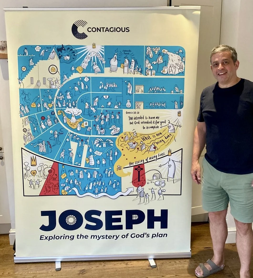
The story of Joseph - compressed into one image
Previously I wrote about my efforts to reinterpret the story of Joseph into a visual form. Most recently I have taken that material and compressed it into an infographic that can be broken up into 30+ separate pieces. The idea is to use this with approximately 1000 teenagers to explain the story this summer. It will be printed large and broken up for booklets/slideshows.
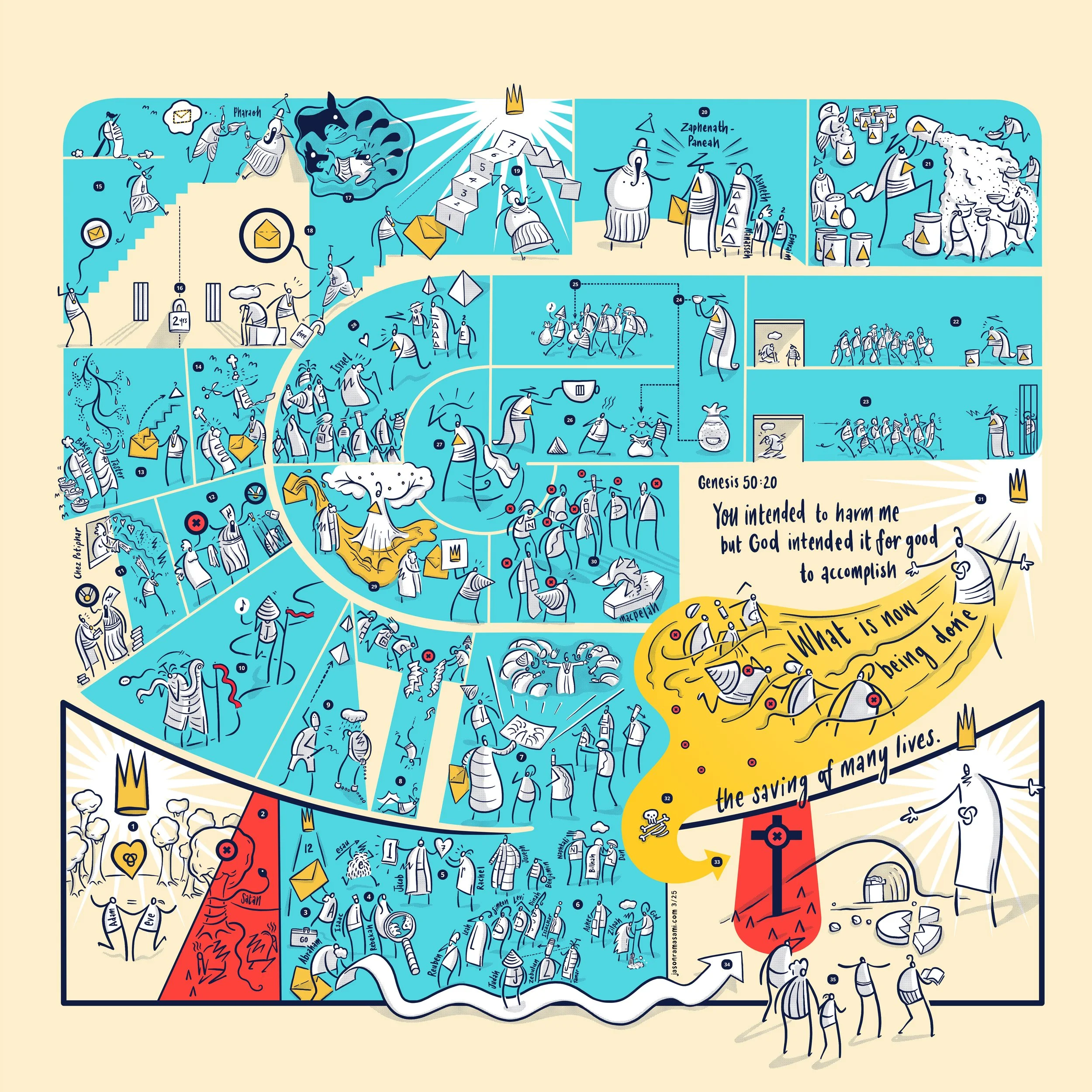
Here is a timelapse (if you are into that kind of thing) which will hopefully prove beyond doubt that it wasn’t created with AI.
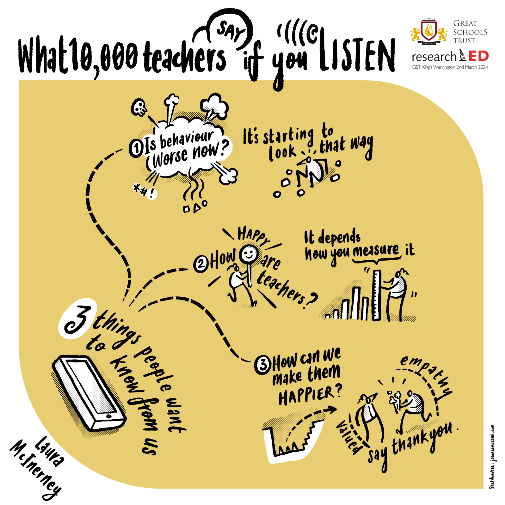
ResearchED Warrington Sketch-notes
Thankyou Michael Chiles and the Great Schools Trust for the invite to do some visual scribing for the keynote speakers at this impressive event back in February. Here are the final pieces:
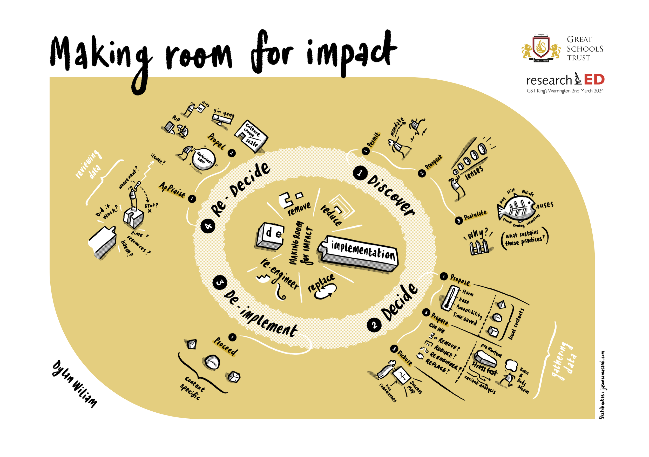
This was based on Dylan Wiliam’s main talk - a decent quality pdf can be downloaded here.